ATM350 Week 3
Thursday, Feb. 6, 2014
Let's continue making
some basic products with the Integrated Data Viewer (IDV). On Tuesday, you were tasked with the
first two products below. Today,
let's tackle the remainder.
Once again, if you have not
completed last Thursday's lab exercise, nor this past
Tuesday's, be sure to do those first.
So items 3-6 are on our to-do
list today:
1.
A 24-hour loop of
surface observations
2.
A map of RAOB
observations at 850 hPa (mb)
3. A visible
satellite image
4. A loop of
forecast 850 hPa height and temperature from the
NCEP's NAM model
5. A national
radar reflectivity composite
6. A Skew-T
based on an Albany, NY RAOB
Task 1: Display a visible satellite image
Start up the IDV. If it was already running, clear out any
previous displays and datasets by clicking on Edit As always, you will see the Map
View and Dashboard windows pop
up. If you haven't already disabled
the Help
Tips window, it appears too.
As you did last week, in the Map
View window, go to the Projections
tab and uncheck Auto-set projection and then set your map projection to CONUS.
Now let's go to the Dashboard
window.
Click on the Data Choosers tab. In the list of data choices in the left
frame, select Images, which appears
just below the Sat & Radar header. By default, the data server and
dataset should be, respectively, adde.ucar.edu
and RTIMAGES.
Click on Connect.
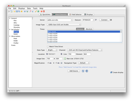
For Image Type, select GOES-East
0.65 um Visible. Select
the 6 most recent times, leave the
rest of the options unchanged, and click on Add Source.
Notice that the Create display box is checked. Upon clicking the Add Source button, the IDV will retrieve the satellite imagery and
then populate the Map View window with a six-frame animation of the most recent
satellite images for the visible part of the spectrum:
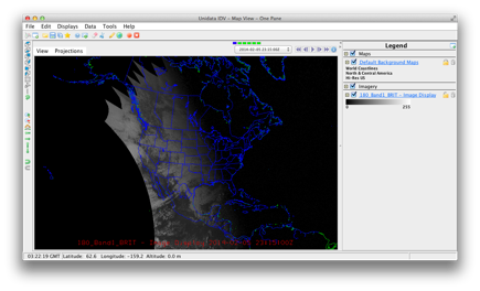
Do you notice that the
eastern part of North America is essentially dark? Recall that on the visible channel, the satellite "sees" what we would see, and after
sunset, the image has no brightness.
Here, we nicely see the shadow of the sunset arcing from north-northwest
to south-southeast in the northern hemisphere, as it would for early Feburary.
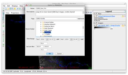
As we've done before, Save your loop as an IDV bundle with the name GOES_East_Vis to your /spare11/atm350/<userid>/idv directory, and
also publish it to your folder on
the RAMADDA server (both the saving to disk and the publishing to RAMADDA are done via the Save
as dialog window).
Task 2: Display a loop of 850 hPa geopotential height and
temperature from the most recent run of the NAM forecast model
Wipe your IDV slate clean via
the Edit
Remove all
displays and data as you've done
before.
Back to the Dashboard
window and the Data Choosers tab
once more. In the left-hand frame,
do you see an entry for Grid, or Model, or the like?
Neither did I!
For gridded model data, we
typically look for them in Catalogs
of data servers. Some of them come
directly from NOAA data servers; some from Unidata, where the IDV is
developed; and many more from data servers all over the globe, including, as it
turns out, our department's RAMADDA
server. For this task, we will
"order" from the Unidata catalog.
Click on Catalogs. The
default catalog in IDV is http://www.unidata.ucar.edu/georesources/idvcatalog.xml.
Dig down to the 80 km NAM
model dataset by clicking/expanding this path: NCEP
Model DataàNorth
American Model (NAM)àNAM-CONUS
80kmàfilesàLatest NCEP NAM CONUS 80km.
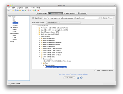
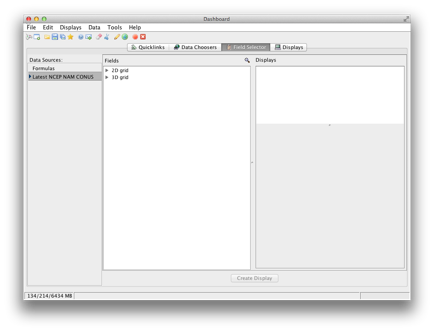
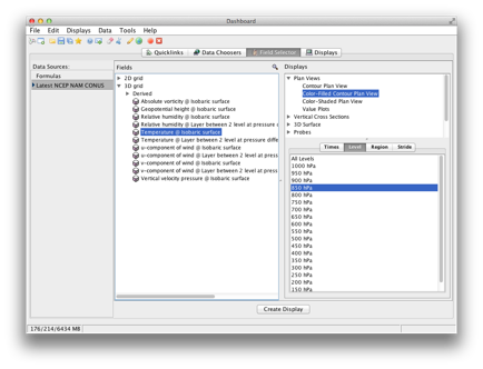
Click on Add Source. Once you
do this, the Dashboard window displays its Field Selector tab:
We will create a map that
plots geopotential height with contour lines, and
also color-filled contours of temperature, at the 850 hPa pressure level. First, let's draw the height
contours. Under the Fields frame, expand the 3d grid entry. Select Geopotential height @ isobaric surface, contour plan view. Under the Times tab, leave it as its default value which
selects all forecast hours. For Level, choose 850 hPa. Leave Region and Stride be.
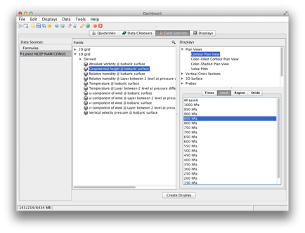
Click on Create Display! The Dashboard now shows its Displays tab. Note that
on the far left of this window, a View 1
frame includes two entries; the first, the Default
Background Maps, which are just your map backgrounds that appear in the Map
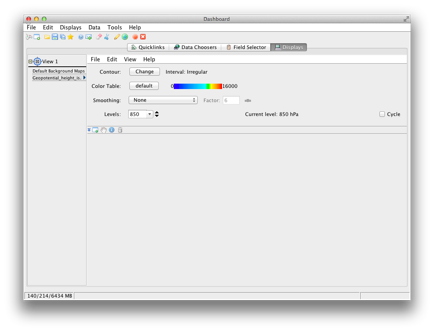
View window whenever you launch the IDV. Below it, and highlighted, is an entry for the geopotential height field you just selected. The main part of the Dashboard
window includes various controls which let you
manipulate how these contour lines are displayed.
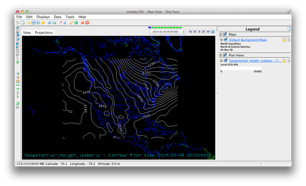
We'll get back to that in a
second, but now, go to your Map View window. It should look something like this:
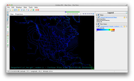
Not bad, but the blue
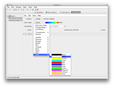
contours don't look great against our blue map background. Let's fix that by clicking on the Geopotential_height_isobaric link just underneath the
Plan Views header in the Legend frame. Note that this brings back up your Dashboard window with its Displays tab active, just as you saw immediately above.
Next to the
Color Table entry, click on the Default button. This will
bring up a variety of color tables you can choose, including ones that you
added when you installed the six color
table plugins last week.
Following the screen shot below, choose a white, solid color for your contour lines:
Once you click on the white
color, the change takes effect immediately, as you can see on the Map
View window:
Now it's time to overlay
isotherms at the 850 hPa
level. Go back to your Dashboard
and select the Field Selector tab. Note that it retains the settings you
made. Make just two changes now;
select Temperature @ isobaric surface
and Color-filled contour plan view.
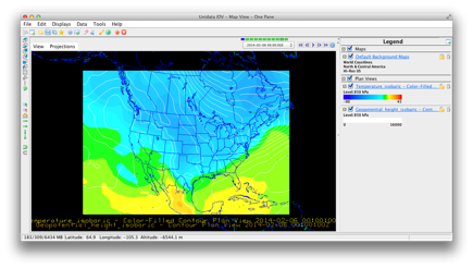
Click on Create Display. Here's
what our Map View displays:

Satisfied? You shouldn't be. We've got a couple problems here; first;
our map backgrounds have seemingly disappeared, as have the labels of our geopotential height contour lines. We'll correct the former now, and save
the explanation for the latter for next week.
Why did the map backgrounds
vanish? Here, we have to remember
that the IDV "knows" about 3-dimensional views. Click on the Default
Map Backgrounds link in the Map
View Legend frame to bring
up its properties once again:
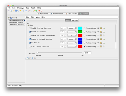
Look at the Position slider. It is set all the way to the left, at
the bottom of the Map
View window. It turns out that the 850
hPa surface is higher than the bottom, in the
IDV's 3-d view space. Our filled
contours of temperature have effectively obscured the map background. So, our geographical map outlines did
not disappear after all! The
simplest thing to do is just place the map backgrounds at the very top of the
view window. So just slide the Position slider all the way to the Top. The effect is visible in the Map View window immediately:
So our map is not perfect,
but it's getting better. Try
zooming in or out so that you get the NAM model data (remember, the NAM is a
regional model that just covers part of North and Central America) filling more
of the Map View window.
Play the animation to see how the geopotential
height and temperature contours change as the forecast cycle progresses. Then, do a Save As and name your IDV bundle 850hPaZandT; as always, don't forget to publish it to RAMADDA.
Task 3: Display a loop of NEXRAD base
reflectivity, national composite
Remove all displays and
data. This time, under the Projections tab in the Map
View window, check the Auto-set projection box.
In the Dashboard, under Data
Choosers, select Images as you
did for the GOES-East Visible task
earlier today. While you will still
connect to our old faithful adde.ucar.edu
data server, this time, scroll down in the Dataset
box and select NEXRCOMP. Click on the Connect button. For Image Type, please choose 1km N0R Base Reflectivity Composite. Select the 10 most recent times.
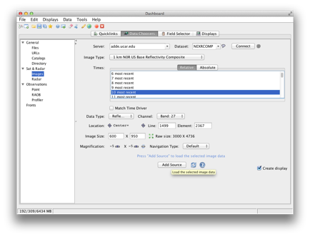
Leave the rest of the window
options as they are set by default, and click on Add Source.
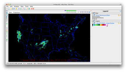
Compared to the battle the
previous task gave us, this is pretty straightforward, and looks pretty
good. Play the animation to see the
progression of the echoes. Save the
bundle in the usual manner as NationalBaseRefl.
Task 4: Create a loop of Skew-T profiles for
Albany, NY
Remove all displays and
data. In the Dashboard's Data Chooser tab, select RAOB under the Observations header in the left-hand frame. By default, the Soundings: Remote tab is active. The data server remains the same, adde.ucar.edu; the Group is RTPTSRC (sounds
like real time point source, ehh?). Be sure
the 00 & 12Z box is
checked. Click on Connect:
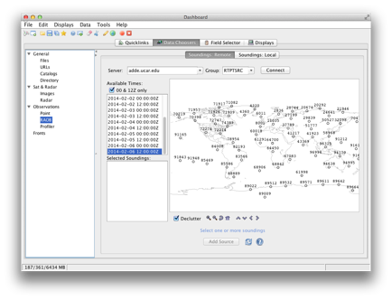
Use a combination of the zoom and directional buttons at the bottom of the world map that appears
until you see Albany's RAOB site number, 72518. Click on it so it turns red.
Choose a date and time of your source (beware ... the latest time may
actually be after the current time!).
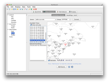
Click on Add Source. The Field Selector tab of the Dashboard
appears.
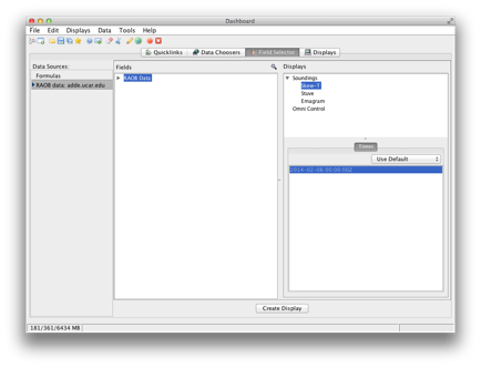
Make no changes; just click
on Create Display. Up pops your skew-t:
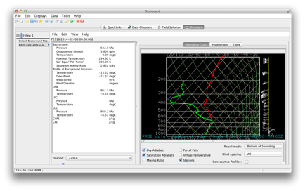
We'll explore it more next
week; one thing you may notice is that there is no option here for relative
time selections. Thus, when
you save this as an IDV bundle, it will always be tied to the date and time you
selected here. Save your settings
as a bundle called AlbSkewT
to your ATM350 and RAMADDA directories.
You've now created a variety
of real-time products with the IDV!
Next week and beyond we will explore additional products, as well as
ways to improve on the look of the products you have made.
Exit out of the IDV, and
remember to log out of your workstation!
Enjoy your weekend and see you next Tuesday!