Introduction to Ensemble Prediction - Print/Text
Version
Return to top.
Section 1: Why Use Ensemble Forecasts?
1.1 Webcast Outline
- Why use ensemble forecasts?
- How do we make ensemble forecasts?
- Ensemble products
- Ensemble verification
- Use of ensemble products: case studies
- Summary and references
Here is what we will cover in this Webcast:
- We’ll start with reasons why ensemble forecasts are useful in
the forecast process and why numerical modeling centers around the world
are now offering them as part of their regular package of products.
- Then, we’ll discuss the ways meteorological centers create ensemble
forecasts.
- Third, we’ll talk about ensemble products using both idealized
and real-world examples, including the types of products and how they are
interpreted and verified.
- Fourth, will be a brief section on some aspects of ensemble verification.
- Next, we’ll demonstrate the use of ensemble products with winter
storm, severe weather, and hurricane examples.
- Finally, we’ll summarize what we presented in the Webcast and
provide references to other materials that offer additional information
on ensemble forecasting.
Return to top.
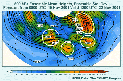
1.2 Different Forecasts Valid at the Same Time?
What if I had a group of different forecasts valid at the same time?
- Where is the forecast of the 1004-hPa contour relatively certain, and
where is it not?
- How would you know how to pick the right sea level pressure contour
to get the forecast information you need?
- If we plot the mean of the forecasts and a quantity showing the size
of their differences, what info would that give you?
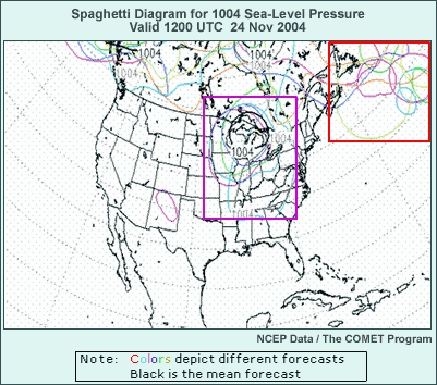
Consider this graphic showing different forecasts for the 1004-hPa sea level
pressure contour over the continental U.S. Think of this from the viewpoint
of a forecaster in an NWS office looking at forecasts from the GFS, Eta,
Canadian, Navy NOGAPS, UKMet, and ECMWF models, and maybe three additional
models, all valid at the time indicated, for a total of eight forecasts.
The only difference is that rather than looking at the full sea level pressure
field, we’re only looking at one sea level pressure contour. Each forecast
has a different contour color, while the mean contour for all forecasts is
shown in bold black.
The graphic shows a number of different positions for the 1004-hPa contour
and thus for the implied position of cyclones for each forecast. Forecasters
typically look at output from multiple NWP models as part of the forecast
process to get a sense of how much they agree. The amount of agreement can
be considered a measure of forecast certainty.
Now, let’s study the graphic to see what we find about the forecast
certainty. Consider the two areas contained in the red and purple boxes.
In which box is the forecast for the 1004-hPa contour relatively certain,
and where is it not so certain?
Well, there’s some uncertainty in both areas. Within the red box,
off the coast of southeastern Canada, almost all the forecasts have a closed
1004-hPa contour somewhere within the box, but there’s so little agreement
on the specific location among the forecasts that no mean 1004-hPa contour
exists. This box can be considered an area of high uncertainty.
Now, let's consider the area enclosed by the purple box, where there’s
evidence of another low center. While there is still some uncertainty, there
seems to be good agreement among five of the forecasts--enough so that in
this case there is a mean 1004-hPa contour centered over the western Great
Lakes. Since five of the forecasts show this general location, and the mean
1004-hPa contour supports it, a forecaster might want to go with a western
Great Lakes cyclone.
But how would a forecaster know which contour to use in assessing the various
NWP forecasts? Would a 1000-hPa, 1008, 1002, or some OTHER contour have been
more useful? Are there other ways to show the data from many forecasts valid
at the same time that would more conveniently convey useful information to
the forecaster? For example, what if we plotted contours of the means of
all the forecasts of sea level pressure or some other forecast variable of
interest, and then somehow indicated the degree of disagreement among the
forecasts?
As this Webcast will show, ensemble forecasts offer a way to take advantage
of multiple forecasts with the same valid time in a way that is both more
convenient, more informative, and more scientifically sound than simply comparing
a few different model outputs.
Return to top.
1.3 NWP Forecast Ensemble
Multiple NWP Forecasts with Same Valid Time = NWP Forecast Ensemble
- Any group of NWP forecasts valid at the same time is an ensemble.
- Different NWP models have different forecast evolutions. What contributes
to this?
- Different initial conditions
- Atmosphere is sensitive to initial condition differences (chaotic).
- Different dynamical calculation methods
- Different methods for estimating the effect of unresolved physical
processes
- One or more sources of uncertainty can be used to create an ensemble
of NWP forecasts.
- Most major meteorological centers have ensemble prediction systems (EPSs).
The single sea level pressure contour graphic we just saw is an example
of a plot from an ensemble forecast, in this case an ensemble of
different NWP models. But in fact, any group of NWP forecasts with the same
valid time is an ensemble, whether they’re from many models or from
a single model.
We know from experience that forecasts from different NWP models have differences,
and that those differences can become large in a relatively short time. What
are the aspects of NWP models that contribute to the differences or uncertainty among
NWP forecasts?
First, each NWP model starts its forecast from slightly different initial
conditions because they each assimilate and analyze meteorological data somewhat
differently. As Edward Lorenz showed in the 1960s, the atmosphere and NWP
models emulating it behave chaotically, meaning they are
highly sensitive to initial conditions. This means that small changes in
initial conditions can result in large differences over time.
Second, different NWP models generally use different methods to calculate
the effects of atmospheric dynamics, including differing horizontal and vertical
resolutions, and differing vertical coordinate systems. For example, the
National Centers for Environmental Prediction, or NCEP, uses the sigma coordinate
for its global forecasting system, while it uses the step-mountain or eta
coordinate for its regional model, the Eta.
Finally, models can have different ways of estimating the effects of physical
processes that cannot be explicitly modeled. Examples of such processes are
convection, solar and long wave radiation, and microphysics that produce
precipitation.
One or more of these sources of NWP forecast uncertainty can be used as
the starting point for an ensemble of NWP forecasts. Most major meteorological
centers produce ensemble forecasts using their own brand of ensemble prediction
system or EPS.
This Webcast is devoted to introducing forecasters to the construction and
use of these EPSs.
Return to top.
1.4 Why Use Ensembles?
Why Use Ensembles?
- NWP model forecasts are UNCERTAIN because the atmosphere is a chaotic
system.
- Model-to-model and run-to-run NWP forecast inconsistencies
- Ensembles represent the best scientific use of our understanding of
the atmosphere.
- Don’t precisely know initial conditions
- Have to estimate dynamical and physical processes to make forecasts
- National Weather Service Long Range Plan
- The NWS will issue weather, water, and climate
forecasts in probabilistic terms.
- Ensemble Prediction Systems (EPSs) give all forecasters
the framework to provide users of their forecasts with:
- Probabilities that weather events will occur
- The degree of uncertainty in the forecast
So, why should we use ensemble prediction systems? Well, as weather forecasters
are painfully aware, NWP model forecasts are uncertain! We’ve already
discussed model-to-model differences among forecasts. These uncertainties
often lead us to choose a so-called “model of the day,” sometimes
without adequate scientific reasons for this choice. Uncertainty, in the
form of conflicting forecast outcomes, also often shows up in consecutive
runs of the same NWP model forecasts at 3-7 days, and can even appear in
the short range (1-2 days)! Again, this is the result of the NWP models emulating
a chaotic atmospheric system.
Ensemble forecasting represents the best scientific use of our understanding
of how the atmosphere works because we don’t exactly know
the initial conditions from which to start an NWP forecast and because we
can only approximate the effects of dynamical and physical processes when
we make NWP forecasts.
Finally, at least in the case of the National Weather Service, the Long
Range Plan mandates issuing weather, water, and climate forecasts in probabilistic
terms.
However, any government agency, branch of the military or private company
responsible for providing forecasts can benefit from ensemble prediction
systems. By using EPSs, the forecaster will have an objective probability
that a weather event will occur and will know the degree of uncertainty to
convey to the public.
Return to top.
1.5 Ensemble Terminology
- Ensemble perturbation: Slightly changed initial conditions
from the coarse-resolution analysis
- Ensemble member: One of the forecasts in an ensemble
prediction system
- Control forecast: The ensemble member or members run
from unperturbed initial conditions
- Perturbation forecast: Forecasts started from perturbed
initial conditions
- Ensemble Prediction System (EPS):
- NWP model(s) used for the ensemble forecasts
- Methods used to create the ensemble
- Ensemble forecast products
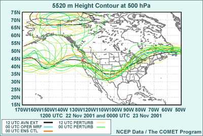
Before we go into the making of an ensemble prediction system, we’ll
briefly go over some of the terminology we use to describe aspects of these
systems. To illustrate what these terms are, we’ll use an ensemble
forecast product called a “spaghetti plot.” Later in the Webcast,
I’ll talk more about how to use and interpret a spaghetti plot. This
particular plot shows the 552-decameter height contour at 500 hPa from each
of two operational GFS runs and the 21 forecasts from two ensemble forecast
runs.
Ensemble perturbations refer to slight changes in the initial
conditions using a coarse-resolution version of the model analysis. From
this coarse-resolution analysis and these ensemble perturbations, the individual
ensemble forecasts are run.
Each of these forecasts is referred to as an ensemble member.
In the graphic, any one of the thin green or yellow contours represents an
ensemble member. Sometimes operational forecasts, in this case the high resolution
GFS, are also treated as ensemble members. These are shown as bold blue and
bold black contours.
The ensemble control forecast is the ensemble member run
from the unperturbed, coarse-resolution initial conditions. The ensemble
control is represented by the bold orange contour in this graphic.
The perturbation forecasts are the ensemble forecasts
started from the ensemble perturbations described above.
Finally, an Ensemble Prediction System, or EPS, includes
the NWP model or models used to create the initial conditions and ensemble
forecasts, the methods used to create the ensemble, and the products used
to interpret the ensemble forecast. We’ll discuss each of these elements
of the system within the Webcast.
Return to top.
Section 2: How Do We Make Ensemble Forecasts?
2.1 How Do We Make an EPS?
- Change or perturb initial conditions in the same model
to create ensemble members
- Perturb the model dynamics and/or physics
- Perturb the lateral boundary conditions (for regional EPSs) and/or bottom
boundary conditions
- Any combination of these three methods
Now that we’ve talked about the WHY of ensemble prediction systems,
it’s time to consider HOW we go about creating an EPS.
As discussed before, to make an ensemble prediction system, we make use
of the sources of uncertainty in model forecasts to construct EPSs in one
or more of three ways:
1. We can make changes to, that is perturb, the initial conditions to create
the ensemble members, using one model.
When using initial condition perturbation methods to create ensemble members,
the EPS will need to find the perturbations that both represent the amount
of initial condition uncertainty and result in an ensemble that best covers
the full range of potential forecast outcomes. Because we can only run a
small ensemble membership due to the costs of computational resources, we
need to find the perturbations to which the forecast is most sensitive. This
will give us the best chance of covering all physically possible outcomes,
including extreme events.
2. Another method involves use of different computational or physical parameterization
methods within a model framework to create the ensemble membership. That
is, rather than perturbing initial conditions, we are perturbing the model.
With this method, we have to make sure that any new combinations of dynamics
and physics used produce reasonable results.
Frequently, altogether different NWP models are used to create an ensemble.
For example, we can combine ensemble forecasts from multiple prediction centers.
The U.S. National Centers for Environmental Prediction (NCEP) and the Meteorological
Service of Canada are in the process of doing just this.
3. A third method involves perturbing either the lateral boundary conditions
for regional ensemble prediction systems, and/or the bottom boundary conditions,
as is usually done for climate forecast models.
Lateral boundary condition perturbations for use in a regional ensemble
prediction system usually come from global-scale ensemble members. For example,
the NCEP short-range ensemble uses lateral boundary conditions from the NCEP
medium-range ensemble forecast.
Bottom boundary condition perturbations can be done on sea surface temperatures,
soil moisture content, snow or ice cover, or any bottom boundary variable
with uncertain values. Climate forecasts often use bottom boundary perturbations
to obtain a range of possible seasonal forecasts. For example, the Climate
Prediction Center at NCEP uses an ensemble of 20 Sea Surface Temperature
forecasts to make seasonal predictions of temperature and precipitation anomalies
over the next 9 months.
4. Finally, any combination of these methods can be used
in an EPS. Combining the three methods generally should result in an ensemble
prediction system with larger forecast spread, or variability. Since most
ensembles using initial condition perturbations alone tend not to have enough
spread, combined ensemble methods should, at least theoretically, give better
results in terms of covering all possible forecast outcomes.
An example of a multiple-method ensemble is the NCEP short-range ensemble
prediction system, which uses initial condition perturbations, different
forecast models, and perturbed boundary conditions from the medium-range
ensemble prediction system.
Return to top.
2.2 Perturb the Initial Conditions
- Control (black), perturbation (red), difference shaded
- Initial differences are generally small
- Largest where initial condition is especially uncertain (oceans
and other data void areas)
- Placed where they have most effect on ensemble member forecasts
- Why do this, rather than get best possible initial conditions for forecast?
- Can’t get initial conditions good enough to do this
- Want to capture all feasible forecast outcomes
- Not enough computer time to do this using only random perturbations

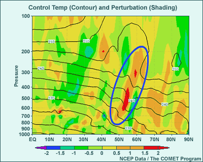
An example of control and perturbed initial conditions is shown in this
graphic. The black contours in the graphic show the control, or unperturbed,
00-hour forecast for 500-hPa heights (at 60-meter intervals) from a medium
range ensemble forecast run. The perturbed initial condition is shown in
red, with the same contour values. Some of the more interesting features
include the trough off the West Coast of the CONUS and the cutoff low over
the southwestern U.S.
Since the contours really aren’t very different, the graphic also
uses shading to show the height difference between the two initial conditions,
perturbation minus control. Note that the differences are rather small for
the most part, on the order of 10-20 meters. This is because the perturbation
size is made to be representative of the observation error, which tends to
be small, especially over areas with lots of good observations.
The only significantly larger difference is found with the trough off the
U.S. West Coast. The perturbation initial condition has a trough up to 60
meters deeper than the control. This is an area with only limited data, so
the initial conditions are more uncertain. Additionally, the ensemble prediction
system found that the forecast is more sensitive to differences in the initial
conditions in this area.
In general, the initial condition perturbations are calculated to get the
fastest growth in forecast differences among the ensemble members. Why do
we want to maximize the forecast differences, rather than try to zero in
on the best possible initial conditions and make a single forecast from that?
Well, this goes back to the fundamental reason for using ensemble forecasting.
First, it’s been shown that we cannot at present get good enough initial
conditions to have a single forecast consistently outperform an ensemble
forecast. The second point follows from the first: Since we cannot guarantee
the best forecast from the initial conditions, we want to capture all feasible
forecast outcomes from all plausible initial conditions. Finally, there is
not enough computer time to get all possible forecast outcomes from a large
number of random perturbations. By picking the most important initial condition
differences to the forecast, we can at least theoretically cover the full
range of forecast outcomes with fewer initial condition perturbations.
More details on how the initial condition perturbations are determined can
be found in the Ensemble
Forecasting Explained module.
Return to top.
2.3 Perturb the Model (Dynamics and/or Physics)
- Methods currently used to “perturb” an NWP model configuration:
- Perturb physical parameterization method (e.g., differing convective
schemes, BMJ versus Kain-Fritsch)
- Perturb coordinate system (e.g., sigma vs. eta)
- Perturb numerical methods (e.g., spectral vs. grid-point)
- Perturbed model usually combined with perturbed initial conditions
- Graphic shows effect of BMJ vs. KF convective schemes on 36-hr precip
Eta forecast started from same initial conditions
- Different precipitation patterns represent differences in condensation
heating, resulting from uncertainty in where convection will fire up
- Results in big differences in winds, heights (temperature), and relative humidity (moisture) downwind
of precipitation
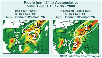
The next method used to create ensemble members is the perturbation of NWP
models. There are three commonly used methods, but there many other possibilities
as well.
First, we can perturb physical parameterizations. The NCEP short-range ensemble
forecast (SREF) applies this method by using some Eta members with the Betts-Miller-Janjic
convective parameterization scheme and others with the Kain-Fritsch scheme.
Second, we can perturb the coordinate system. For example, we use sigma
in the Regional Spectral Model (RSM) members at the same time we use the
eta vertical coordinate within the Eta model members in the NCEP SREF.
Third, we can perturb the numerical methods used to solve the dynamical
forecast equations. For example, in the NCEP SREF we have RSM members that
use the spectral method combined with Eta model members that use the gridpoint
method.
Typically, perturbed models are used in combination with perturbed initial
conditions to create an EPS.
As an example of what the effect of a model perturbation can be, check out
this two-panel graphic. Both panels represent Eta model runs at 32-km with
45 vertical layers, using identical initial conditions, but showing very
different results for accumulated 24-hour precipitation at the same 36-hour
valid time. The panel on the left shows the Eta model using the operational
Betts-Miller-Janjic convective parameterization scheme, while the panel on
the right shows the Eta model using the Kain-Fritsch scheme.
The forecasts of 24-hour accumulated precipitation have some significant
differences as a result of the different convective schemes. The heavy precipitation
from Kentucky through the mid-Atlantic states is farther south in the Kain-Fritsch
run than in the Betts-Miller-Janjic run. Heavy precipitation over coastal
South Carolina and Georgia in the Betts-Miller-Janjic run is missing from
the Kain-Fritsch run on the right. Finally, heavy precipitation from Alabama
south into the Gulf of Mexico is present in Kain-Fritsch but absent in the
Betts-Miller-Janjic run.
These different precipitation patterns represent the uncertainty in where,
when, and how deep convection will be, and the resulting downstream impacts
on winds, heights, and relative humidity.
Return to top.
2.4 Perturb the Boundary Conditions
Lateral or Bottom Boundary Conditions (BCs)
- Example 1: Hypothetical lateral BC temperature perturbation for regional
ensemble forecast system
- Ensemble control contoured
- Perturbation shaded (±2°C), comes from NCEP GFS
- Blue oval has +2°C perturbation
- Example 2: Ensemble of area-averaged SST from El Niño 3.4 region (in map inset)
- From ocean ensemble prediction system, used by Climate Prediction
Center global seasonal ensemble forecasts
- Each ensemble member provided with different SSTs
The third method used to produce ensemble forecasts involves perturbing
variables at the bottom or lateral boundaries of the model. We’ll look
at two examples of such perturbations.
The first is a lateral boundary temperature perturbation along the international
date line from the equator to 90°N, used for a hypothetical regional
ensemble forecast system. The ensemble control is contoured, while the perturbation
size is shaded. At 50° to 60° N we have a north-south tilted, positive
perturbation of 1-2°C. Generally, however, the temperature perturbation
size is less than 1°C.
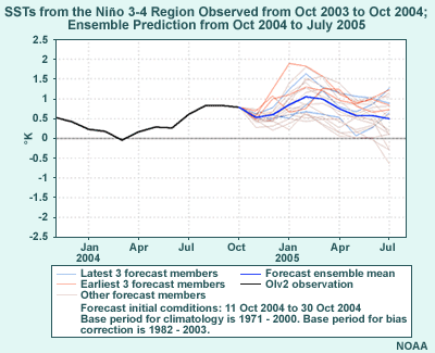
The second example is from an actual ensemble used by the NCEP Climate Prediction
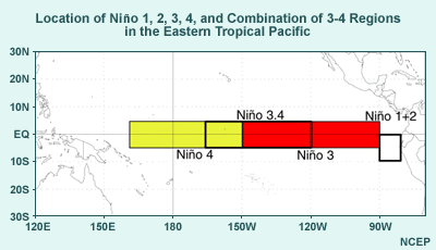
Center (CPC) and shows the area-averaged SSTs from the El Niño 3.4
region over 9 months. This region is shown in the inset map. The SST differences
are developed from an ocean ensemble prediction system. They are then used
to force a coarse resolution version of the GFS, resulting in a climate ensemble
forecast that is one of many tools used by the CPC to develop seasonal forecasts.
Each ensemble member is provided with a different set of SSTs at the bottom
boundary.
Return to top.
Section 3: Ensemble Products
3.1 The Need to Summarize Ensemble Data
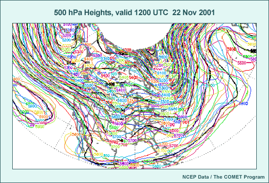
The next section discusses how we get useful information from an ensemble
prediction system. This isn’t a simple task. Think about trying to
visualize all the data from 10, 15, or 50 ensemble member forecasts for the
same valid time in a forecast graphic, as in this 500-hPa height graphic
from the MREF. You can see that you’d have a hard time even making
sense of the forecast, let alone being able to assess its quality.
The problem of potential data overload from ensemble forecasts is obvious.
So to make sense of ensemble data, we have to either use statistical methods
to compact the ensemble forecast information, or plot less data while still
providing useful information. In this section we’ll talk about some
of the forecast tools, unique to ensemble prediction systems, which distill
huge amounts of data into a useful form.
Return to top.
3.2 “Spaghetti” Plot
- Plot at most two or three contours for ease of readability (just 564-dm
line here), each member in a different color
- Give qualitative picture of distribution of 500-hPa heights near chosen
contour
- Note East Coast trough in different longitudinal positions and strength
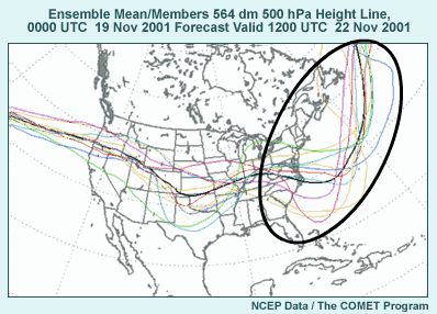
We’ll start with a simple yet informative diagram that can be produced
from ensemble prediction system forecasts, the so-called “spaghetti” plot
or diagram. The example here is based on the same data as the previous unreadable
graphic. You can see that it is much more useful when we don’t have
all the ensemble member contours at 60-meter intervals.
Spaghetti diagrams plot at most two or three contours for ease of readability.
Here we’ve only plotted one contour line, the 564-decameter height
contour at 500-hPa. As before, each ensemble member has its own unique contour
color. Also, the average value of all the ensemble members, called the ensemble
mean, is shown in black. We’ll be talking about the ensemble mean for
this case in a bit.
From the position of each contour, we can get a qualitative idea of how
the 500-hPa height from this ensemble run is distributed.
Off the East Coast of the U.S., for example, we can see that three ensemble
members are indicating a deep trough. Four others show a moderate trough,
and the final four contours show a weak trough well offshore. The contour
for the 564-decameter mean is plotted in bold black. Note that this contour
is smoother than the others overall as one would expect; the uncertainties
in the forecast are smoothed out, leaving us with the relatively predictable
features.
Return to top.
3.3 Advantages and Limitations of Spaghetti Plots
- Advantages
- Compact presentation of information
- All ensemble members shown with distance of members from each other
giving a notion of uncertainty
- Idea of the probability distribution for the forecast for the contours
displayed
- Disadvantages
- Incomplete picture of the forecast probability distribution
- Additional information helpful for better interpretation of products
Advantages of the spaghetti diagram include compact presentation of ensemble
information and display of ALL ensemble member forecasts, rather than a summary.
The distance between the ensemble members gives us the sense of the forecast
uncertainty. By seeing one or a few contour levels for all the ensemble members,
the forecaster gets an idea of the probability distribution for the variable
of interest, at least for areas near the depicted contour values.
There is a disadvantage to using spaghetti plots, however. We don’t
get a complete picture of the forecast probability distribution
for other useful values or other areas. For this reason, additional information
helps to interpret spaghetti plots. We’ll see a good example when we
discuss ensemble mean and spread products next.
Return to top.
3.4 Mean/Spread Plots
- Ensemble mean
- Arithmetic average of all ensemble member values
- Less predictable features smoothed out; more predictable features
remain
- Performs better on average than the high resolution
operational model on which it is based
- Ensemble spread
- Standard deviation of ensemble members (two-thirds lie within ± the
value of the spread)
- Allows assessment of uncertainty since more spread means more uncertainty
Another way to simplify ensemble data is to plot what are called the ensemble
mean and spread on a map.
The ensemble mean is the arithmetic average of all ensemble
members. Through averaging, the predictable features in the forecast remain
intact, while less predictable features are smoothed out. As a result, ensemble
mean contours are also smoother than contours for the individual
ensemble members. Because of smoothing, the ensemble mean forecast also performs
better on average than the higher resolution NWP model on
which it is based.
The ensemble spread is the standard deviation of the ensemble
members. This means that if, for a forecast variable, the ensemble members
have a bell-curve shaped distribution around the ensemble mean, two-thirds
of them are within the distance of one unit of standard deviation or spread
from the ensemble mean. The spread is useful to know in that where it is
large, high uncertainty in the forecast is indicated since the ensemble members
are spread far apart.
The graphic shown here comes from the same data as the previous spaghetti
plot. The ensemble mean is contoured at 60-meter intervals, while the ensemble
spread is shaded, with values as indicated by the color bar. Note the high
values of spread indicated by the “warmer” colors over the West
Coast of the U.S., the central plains, the mid-Atlantic coast, and near and
east of Labrador.
Return to top.
3.5 Advantages and Limitations of Mean/Spread Plots
- Advantages
- Summarizes all data in an easy-to-read form
- Information provided for the full domain
- Unpredictable features smoothed out of ensemble mean....
- ....but spread indicates their presence
- Disadvantages
- Ensemble mean can be misleading (and may not be the best forecast)
if clusters of similar forecast outcomes exist.
What are the advantages of ensemble mean and spread diagrams? First of all,
the vast amount of data in the ensemble forecast system is simplified into
one easy-to-read graphic. Second, the information provided is for the full
domain, rather than just the areas around specific height contours, as in
the spaghetti diagrams. Third, the less predictable features are smoothed
out in the ensemble mean, while the more predictable features remain. Finally,
the presence of hard-to-predict features not easily found in the ensemble
mean plot can be picked out by finding the regions where there is high spread.
The principal disadvantage of the ensemble mean forecast is that it can be
misleading and will not be the best forecast if clusters of similar forecast
outcomes exist, and the ensemble mean lies between those clusters. We can
see this in the graphic we saw previously, with a trough axis off the U.S.
East Coast shown with a white dashed line and an area of high uncertainty
behind the trough circled with a white oval. In this case, we can see that
the ensemble mean heights hide a second solution. The associated spaghetti
diagram for a height contour going through this area of uncertainty shows
several ensemble members with a trough upstream of the ensemble mean trough
axis.
Return to top.
3.6 Interpreting Mean and Spread Products
Interpreting Mean and Spread Products in Conjunction with Spaghetti Diagrams:
Idealized Examples
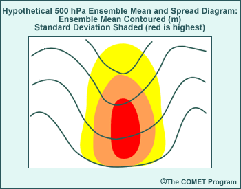 1.
Large spread within ensemble mean feature =
1.
Large spread within ensemble mean feature =
Uncertainty in amplitude of the feature
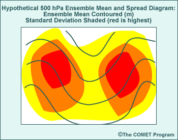 2.
Large spread up- and downstream of an ensemble mean feature =
2.
Large spread up- and downstream of an ensemble mean feature =
Uncertainty in the location of the feature
 3.
Large spread on one side (asymmetric spread) of an ensemble mean
feature indicates a small cluster of forecast solutions different from
the ensemble mean.
3.
Large spread on one side (asymmetric spread) of an ensemble mean
feature indicates a small cluster of forecast solutions different from
the ensemble mean.
We can use the ensemble mean and spread product to interpret the potential
location of ridges and troughs, as well as the uncertainty regarding their
existence. Let's look at several idealized product graphics for some guidelines
in doing this.
In graphic number 1, we see large ensemble spread indicated by the warm
color shading at the center of the trough. Mean and spread graphics with
these characteristics indicate uncertainty with regard to the forecast amplitude of
that feature.
For graphic number 2, we see a mean and spread diagram with large spread
up- and downstream of the ensemble mean trough. This spread indicates differences
in the location of the trough among the ensemble members.
In graphic number 3, the mean and spread diagram shows large spread to one
side of the ensemble mean trough. This large spread to one side or the other
of an ensemble mean feature indicates a likely cluster of forecast solutions
in the area of large spread that is significantly different from the ensemble
mean forecast. Examination of a spaghetti diagram for the same valid time
can be used to confirm whether or not there is a cluster of different solutions.
We'll be talking about use of spaghetti and mean/spread diagrams together
shortly.
Return to top.
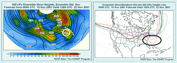
3.7 Using Mean/Spread and Spaghetti Plots Together
- Use mean/spread diagrams to choose spaghetti contour containing the
most information (i.e., with contour value near or equal to an ensemble
mean contour crossing area of maximum uncertainty).
- Region 2: Uncertainty in depth and existence (to a lesser extent)
- Region 3: Uncertainty in position and depth
- Region 1: Uncertainty in location of jet/height gradient
- Combined use of mean/spread and spaghetti helps determine uncertainty
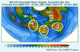
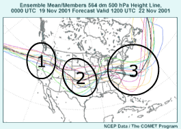
Here we have two products from the ensemble run we've been using in previous
slides. These diagrams show that the mean/spread and spaghetti diagrams can
be used together to get a better interpretation of the ensemble forecast
than either one alone.
First, the mean and spread diagram can be used to guide your selection of
a spaghetti plot. You will want to use a contour value near or equal to the
ensemble mean contour that crosses an area of interest with high uncertainty.
Here, we'll concentrate on the relatively large uncertainty over the CONUS
in regions 1, 2, and 3. Region 1 shows some ridging with a very strong height
gradient, while Regions 2 and 3 indicate ensemble mean troughs. We also note
that the 564 decameter 500-hPa ensemble mean height contour passes through
all of these high-uncertainty regions. Now we can compare this mean and spread
graphic with the previous 564-decameter spaghetti diagram over the same general
area for the same valid time.
In region 2, there is uncertainty in both the depth of the feature and,
to a lesser extent, in whether or not it will actually exist at verification
time. Six ensemble members show deeper troughs than are indicated by the
ensemble mean, three show a slower, weaker trough, and two show almost no
feature at all.
In region 3, we have a position and depth issue for a short-wave trough.
Five members show a deeper trough than the ensemble mean in various locations
both up- and downwind of the ensemble mean trough axis, three members are
faster and at about the same depth as the ensemble mean, and three more are
faster and shallower with their short-wave. Also, note that some members
have an additional short-wave trough downwind of the depicted one.
Finally, we have a somewhat different situation in region 1. Rather than
a trough position, we're dealing with the location of a strong height gradient,
and thus the position of a jet entering the U.S. from the Pacific. Note that
because of the strong height gradient, the height contours are close together,
so the ensemble members aren't as far apart from each other in the spaghetti
diagram as in the other two locations. We can see that three members are
a good distance north of the ensemble mean 5640-meter height contour, while
two or three are a good distance south. The others are tightly clustered
around the ensemble mean. This can be interpreted as uncertainty in the north-south
position of the jet entering the CONUS from the eastern Pacific.
From this illustration, we can see that viewing the spaghetti diagram for
an ensemble mean contour that passes through high-spread regions will give
you a good idea of the nature of the uncertainty. These different solutions
have a significant impact on the expected weather over different regions
of the CONUS and are important to consider.
Return to top.
3.8 Mean/Spread and Spaghetti Plots for Precipitation
- Ensemble mean/spread
- Shaded 12-hr mean precipitation and contoured 12-hr prec spread
(typical cyclone)
- In NE and NC regions, spread is ½ of mean; in Ctr and SC
regions, spread is 2-4 times the ensemble mean
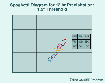
- Corresponding spaghetti diagram for 12-hr, 1.5" contours
- 7 of 11 members show precip exceeding threshold over relatively
small area, while none is shown in the NE/NC regions.
- Where is heavy precip potential greatest? (Use 1.5" as definition.)
- Lesson: Don't ignore areas with low ensemble mean precip if the
ensemble spread is large!
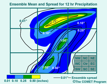
Before we leave this topic, let's look at an example of how to interpret precipitation ensemble
mean and spread products, with the help of precipitation spaghetti diagrams.
The first graphic is a hypothetical ensemble mean and spread diagram of a
typical cyclone. The data are 12-hour accumulated precipitation, with ensemble
mean precipitation shaded at intervals indicated by the color bar, along
with ensemble spread contours at 0.01", 0.1", 0.25", 0.5",
and 1" contour intervals. Note that this is the reverse of the previous
mean and spread products we've seen so far, where spread was indicated by
shading and the mean by contours. Also note that the area is divided into
9 regions as indicated by the legend at the lower right; NW is northwest,
NC is north-central, NE is northeast, and so on. We see that in the north-central
and northeast portion of the region--an area of overrunning north of a warm
front--the largest spread is less than 0.5". On the other hand, in the
central and south-central areas (corresponding to a warm sector in advance
of a cold front), the spread is as high as 1" or more, or 2-4 times as
large as the mean in some locations. What's the significance of this for
extreme QPF events?
To help explain the significance, let's look at a spaghetti diagram for
the 1.5" 12-hour accumulated precipitation contour valid at the same
time as the mean and spread diagram. In the high-spread area of the graphic,
7 of the 11 ensemble members show 12-hour accumulated precipitation exceeding
1.5" within a small area of the central and south-central regions. On
the other hand, no members predict greater than 1.5" of precipitation
in the overrunning area to the north and northeast.
Generally speaking, even with a relatively small ensemble mean value, large
ensemble spread in a precipitation mean/spread diagram may signal potential
for an extreme precipitation event, since at least one or more ensemble members
forecast this outcome. Forecasters need to pay attention to such areas in
the ensemble forecast. They should consider looking at the spaghetti diagrams
for high precipitation thresholds in such areas.
Return to top.
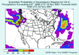
3.9 Probability of Exceedance Plots
- Help determine the probability of extreme events
- Gives probability of exceeding a meaningful threshold
- Counting ensemble members that exceed threshold of interest and dividing result by total number of ensemble members
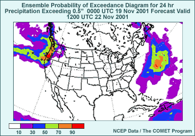
- Advantages
- Compact display
- Focus on critical threshold values
- Disadvantages
- Information provided about the uncertainty for only one quantity
of the variable. For example, we don't know what the probability is
for either 0.25" or 1" precipitation in the example product.
Probability of exceedance diagrams can also help with extreme weather events
or other events involving the exceedance of a threshold.
The probability of exceedance is calculated by taking a count of the number
of ensemble members that exceed the chosen threshold and then dividing by
the total number of members in the ensemble. Sometimes, an adjustment is
made to the probability of exceedance based on verifications over some prior
period of time. This is called bias adjustment, because its intent
is to remove bias resulting from systematic model errors in the ensemble
mean, spread, or both.
In this graphic, we see the probability of 6-hour precipitation amounts
exceeding 0.5". Over the CONUS, we see that the only areas with a 50%
or greater likelihood of having 0.5" or more of precipitation for the
6-hour period are found from the Cascades of OR and WA westward, along with
the mountains of northern CA.
The advantages of the probability of exceedance diagrams are the compact
display and the focus on critical threshold values of interest to the forecaster.
Disadvantages include getting information about the uncertainty related
to only one quantity of the variable. For example, we don't know what the
probability is for either 0.25" or 1" precipitation in the example
product.
Return to top.
3.10 Most Likely or Dominant Event Plots
- Used to show which significant impact event is most often predicted by
the ensemble forecast
- A common example
- Precipitation type (snow, sleet, freezing rain, rain)
- Good for winter weather warnings if combined with QPF probability
of exceedance products
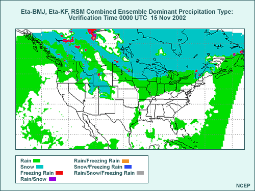
Advantages/Limitations of Most Likely Event Graphics
- Advantages
- Compact display
- Give most likely event
- Disadvantages
- May hide other forecast outcomes almost as likely
- Probability of the “most likely”forecast outcome unknown
- Could be only one ensemble with precipitation!
- Could be a number of almost as likely precipitation types among
the ensemble members
A product that is somewhat related to the Probability of Exceedance diagram
is the Most Likely or Dominant Event diagram. We count the number of members
predicting events of concern and then produce a graphic showing those most
frequently predicted in the ensemble run. The most common example of this
is the Dominant Precipitation Type graphic, which can be used in combination
with probability of exceedance products for precipitation amount for winter
weather warnings.
The graphic shown is an example from the NCEP Short-Range Ensemble Prediction
system. Precipitation type is indicated by shading, based on the legend in
the lower left side of graphic. Note that sleet and snow were combined in
this graphic into a “snow”precipitation type for purposes of
counting.
“Dominant precipitation type”here is the one that occurs most
frequently where precipitation occurs in at least one ensemble member. If
there is a tie among two or more ensemble members, a mix of dominant precipitation
types is indicated.
In this case, rain is indicated in green, snow in blue, freezing rain in
red, purple for a tie for snow and freezing rain, and orange for a tie between
rain and freezing rain. Because only one ensemble member indicating precipitation
can cause a dominant precipitation type to appear on that product, we suggest
you pair it with the appropriate probability of precipitation product to
assess the actual risk.
In combination with the QPF probability of exceedance products we discussed
previously, the most likely or dominant event graphic can help provide guidance
for the issuance of winter weather warnings and advisories.
The advantages of most likely forecast graphics include the compact display
of ensemble information. Additionally, they succinctly give in one map the
most likely event type over the domain of interest.
The disadvantages include the potential hiding of other forecast outcomes
that are almost as likely. We do not know the actual probability of the “most
likely" forecast outcome. It may not even represent a majority of ensemble
members. For example, if six ensemble members predict snow, five freezing
rain, and four rain in a 15-member EPS run, snow will be indicated as the
most likely precipitation type even though it occurs in only 40% of the members.
In reality, the dominant precipitation type may represent only one ensemble
member if there is only one member forecasting precipitation! So it is critical
to combine this product with others.
Return to top.
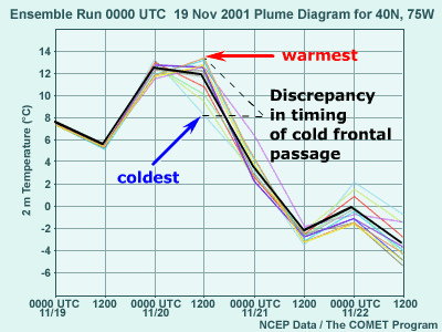
3.11 Plume Diagrams
- To depict ensemble forecasts from a point, or more properly, from a grid
box, data are typically plotted as a time series.
- Plume diagram
- Time evolution of a forecast variable for each ensemble member plus
the ensemble mean (equivalent to the spaghetti plots in plan view)
- Difference of 5°C at 36 hours results from discrepancy in the
timing of a cold frontal passage
Up to this point, we've covered products that use regional maps. But we
also might want to show the results from ensemble members for a single grid
box closest to the forecast point of interest. In this case, the resulting
data are typically plotted as a time series.
The first type of plot we'll consider is a plume diagram.
Plume diagrams show the evolution of a forecast variable for each ensemble
member, plus the ensemble mean. This graphic can be considered the point
or grid-box equivalent to a spaghetti plot.
This plume diagram is for forecast 2-meter temperature at 40°N, 75°W
at 12-hour intervals out to 84 hours. Each member is color-coded and the
mean is in bold black.
Note that the differences from highest to lowest temperature among ensemble
members increases with time initially, to as much as 5°C at 36 hours.
This difference is the result of a discrepancy in the timing of a cold frontal
passage in the ensemble forecast, but it resolves itself to some extent thereafter,
once all ensemble members forecast the cold front to have passed. Note that
plume diagrams can have outliers and clusters, just like spaghetti diagram
spatial maps.
Return to top.
3.12 Box and Whisker Diagrams
- Ensemble median, maximum and minimum, two middle quartiles for a forecast
variable in the form of a box and whisker
- Graphic shows same data as plume diagram in box/whisker form.
- Whiskers indicate extremes; box indicates middle quartiles.
- Large spread at 36 hours again indicates uncertain cold frontal passage
timing.
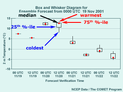
A second type of point graphic is the Box and Whisker diagram. Using boxes
and vertical lines, or “whiskers,”this diagram shows the ensemble
median, the maximum and minimum, and the two middle quartiles for a forecast
variable. The box and whisker diagram can be considered analogous to a mean
and spread plot graphic for a point or grid box.
This box and whisker diagram is from the same forecast and location as the
plume diagram we just looked at. The top whiskers extend to the warmest ensemble
member value, while the bottom whiskers extend to the coldest value. The
top and bottom of the box give the lower and upper limits of the middle two
quartiles, that is, the ensemble members ranked from 25% to 75%. The ensemble median
(not mean) temperature is indicated by a red circle. Remember, this is
the value of the member with half of the members higher and half of the members
lower. At 36 hours, where the spread is largest, the warmest and coldest
values are labeled, along with the quartile values and the median.
Note that the median is not always in the middle of the "box." Anywhere
a median point is displaced from the middle indicates that the ensemble members
are not distributed evenly. For example, at 36 hours, the median has almost
as high a value as the 75th percentile, and the maximum value is only about
1°C higher. This indicates that the upper half of the ranked ensemble
members are within 1°C or so of each other, while the other half are
more spread out and as much as 4°C colder than the median value. Note
that this corresponds with the spaghetti diagram from the same time, where
a cluster of seven of the ensemble members are warm, with three having the
same temperature, while four are considerably colder, but more spread out
than the warm cluster.
As with the plume diagram, we can use plan view graphics from the ensemble
forecast to help with understanding the synoptic-scale situations that are
the cause of significant spread.
Return to top.
3.13 Ensemble Soundings
- For same point and time as previous two graphics
- Each member color coded, with ensemble mean in black
- 2-meter warm cluster from the plume diagram also appears within red
circles in plume and box/whisker inset
- Cool outliers also appear
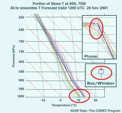
Ensemble soundings, which show the vertical structure of temperature and
moisture from each ensemble member, can also be depicted for an individual
grid box, but are only shown for a single time. An example from the same
grid column and valid at the same time as the plume and box and whisker diagrams
we just looked at is shown here. The skew-T diagram shows temperature forecasts
from 1000 to 600 hPa. Each ensemble member is color coded using the same
scheme as in the plume diagram. Note the warm cluster with 1000-hPa temperatures
well above 10°C, and a cool outlier in light blue.
Recall that in the plume diagram, there was a 2-meter temperature difference
of 5°C at 36 hours due to the difference in timing of a cold frontal
passage in the ensemble members, with most of the ensemble members clustered
on the warm side of the distribution. Also remember that in the box and whisker
diagram, the median was near the top of the middle quartiles box, and the
lower whisker extended far below the box. We can see that each of these three
point graphics depicts the same member distribution, including the low temperature
outlier, in its own unique way.
Return to top.
Section 4: Ensemble Verification
4.1 What Do We Verify for Ensembles?
What aspects of the EPS do we need to verify?
- EPS ensemble mean forecast
- Probability distributions
- How accurate are probabilities of forecast outcomes?
- Do ensemble forecasts cover all forecast scenarios?
- Do ensemble forecasts allow good assessment of probability of high-impact
events (e.g. winter storms)?
- Comparison of ensemble probability forecasts to
the frequency of observations over time required for verification
- Large set of ensemble forecasts needed to obtain stable results
For any forecast tool to be useful, we need to understand how well it is
performing. This next section will briefly go over some ways in which ensembles
are verified.
What aspects of an ensemble prediction system forecast do we need to verify?
We can answer this by considering what EPSs are used for.
Because the averaging process removes the less predictable features that
might be contained in operational forecasts, the ensemble mean is a frequently
used ensemble forecast quantity. So we want to verify the ensemble mean forecast
and compare it to the verification for the standard, single-model forecast.
These verification measures, such as root-mean-square error and anomaly correlation,
are pretty standard, so I won’t be going into them.
The unique thing about EPS forecasts is that they forecast
more than a single outcome. Instead, they forecast probabilities for a range
or distribution of forecast outcomes, or what are known as probability distributions.
We also use ensembles to identify the range of possible forecast scenarios.
In addition, we use ensembles to determine the probability of specific high-impact
forecast outcomes, such as winter storms, heat indices, or precipitation
amount thresholds.
Because of these unique uses for EPS forecasts, we need to verify forecast
probability distributions and other statistics of the EPS by comparing ensemble
forecast probabilities to the frequency of observations over time. This type
of verification requires a large set of ensemble forecasts, often over an
entire season, to obtain stable results.
Next, we’ll look at two tools used for this kind of verification,
the reliability diagram and the rank histogram or Talagrand diagram.
Return to top.
Section 5: Use of Ensemble Products: Case Studies
5.1 Ensemble Forecast Example: Winter Storm
- 5-6 December 2002, Washington, DC
- From The NWP Case Study
Library at: http://meted.ucar.edu/nwp/pcu3/cases
- Graphics here similar to those found at the SREF
Website (http://www.emc.ncep.noaa.gov/mmb/SREF)
- 850-T -12 and 0°C spaghetti diagram and 12-hr 0.5" precipitation
- Green contours: Eta ensemble member contours
- Red contours: Regional Spectral Model (RSM) contours
- Bold green and red contours: Eta & RSM controls
- Bold black contour: SREF ensemble mean forecast
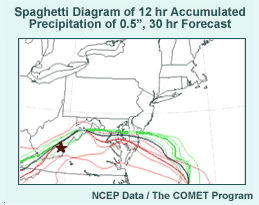
- Use 850-hPa 0°C contour as rough estimate of rain-snow line.
- Question: Does the ensemble mean 850-hPa temperature represent the
most likely location of the rain-snow line in the SREF? Why or why
not?
- Answer: No, because the solutions cluster around two different
solutions. One cluster is the Eta (green); the other more spread
solution is the RSM (red).
- Use 12-hr precip amount of 0.5" as critical threshold for winter
storm warning (ice or snow) at the point indicated in the graphic.
- Question: What is the SREF indicating as the probability for winter
storm criteria precipitation at this point? (Clue: How many ensemble
members show winter storm criteria precipitation amounts? Note there
are 10 ensemble members.)
- Answer: 80% or eight of them. The ensemble mean also exceeds
0.5" in 12 hours.
- Question: What other ensemble product could be used to assess the
probability of exceeding the critical winter storm warning criterion?
- Answer: We can look at a probability of exceedance for the 0.5" 12-hour
precipitation threshold.
- Note clustering by model
- Eta model members cluster together while RSM produces a different, yet closely-grouped cluster.
- SREF upgrade will addresses this.
- More convective schemes
- More ensemble forecast spread
- Forecaster should consider systematic model biases on ensemble products to
adjust EPS forecast.
Now that we've covered the ensemble basics, we'll show how to actually
use ensembles with some forecast examples. We'll present examples from the
cold and warm seasons for a variety of important forecast quantities, using
different ensemble forecasting tools.
These graphics are from a Washington D.C. winter storm case study from the
5th and 6th of December 2002. You can find this case on the COMET
NWP case study page.
The graphics show two spaghetti plots; the first shows 850-hPa -12°C
and 0°C temperature contours from an NCEP 30-hour short range ensemble
forecast, or SREF. The second is the 0.5" 12-hour accumulated precipitation
contour, valid at the same time.
Green contours are Eta ensemble member contours, while red contours are
from the regional spectral model, or RSM. Bold green and red contours are
the control runs for the Eta and RSM, respectively.
The bold, black contour is the SREF ensemble mean forecast, including all
Eta and RSM members.
Before we had more sophisticated post-processing of model output, the 850-hPa
0°C temperature contour was often used as rough guidance for the rain-snow
line. Let's assume we don't have any other information to assess the rain-snow
line location. If you were forecasting for this area, would you consider
that the ensemble mean 850-hPa 0°C temperature represents the most likely
location of the rain-snow line here? Why or why not?
The answer is no. The first thing we notice is that the green Eta contours
and the red RSM contours cluster together with relatively little overlap.
The SREF ensemble mean falls between the two models' ensemble members. It's
more likely that the rain-snow line will lie to the north or the south of
the ensemble mean 0°C contour.
Now let's consider the point indicated by the brown star in southern West
Virginia. Use a 0.5" precipitation amount over 12 hours as the critical
threshold for winter storm warnings for ice or snow. What is the probability
of winter storm warning criteria precipitation according to the SREF? Note
that there are 10 ensemble members in the SREF.
The answer is 80% because 8 of 10 members show a precipitation amount in
excess of 0.5" in 12 hours. What other ensemble product could be used
to assess the probability of winter storm warning criteria precipitation?
A probability of exceedance product with a threshold of 0.5" of precipitation
in 12 hours could give us the same information.
I should comment about the clustering by model we see here, in which the
Eta produces one cluster, and the RSM another, very different cluster. This
clustering by model was one of the biggest complaints about the NCEP SREF
during the winter of 2003-4, and was a major reason for a revamping of the
SREF for its next implementation. The SREF during winters from 2004-05 on
will have more convective schemes in the mix of ensemble runs, which in preliminary
tests seemed to make for less clustering and more ensemble forecast spread,
both desirable outcomes for the SREF.
In cases where clustering is by model, the forecaster should consider the
effects of systematic model biases and errors on the ensemble products. Your
forecast should be adjusted accordingly taking this into consideration.
Return to top.
5.2 Winter Storm Forecast Verification
- 850-hPa temps for 0°C
- Verification farther south than Eta ensemble mean
- RSM ensemble mean on the mark
- 12-hour accumulated precipitation > 0.5" from radar/gauge analysis
blend
- Forward advance about right in eastern WV, VA, and MD in Eta members;
farther north than RSM members
- Short-range ensemble captured the event, but because different models
were used.
- Single model with initial condition perturbations was not sufficient!
- Result was 6” of snow in Washington, DC, earliest winter storm criteria
snowfall since 1987 and only 3rd in December since 1966.
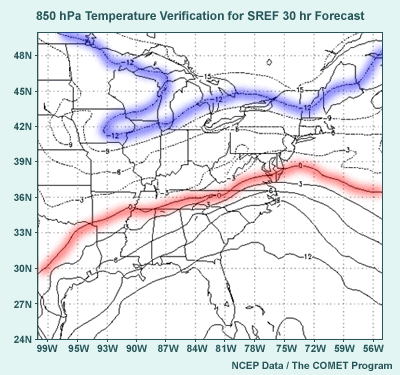
How did the short-range ensemble prediction system verify?
The top graphic shows the 850-hPa temperature analysis for the verification
time, and the bottom graphic shows an analysis of the 12-hour 0.5" accumulated
precipitation area at the verification time.
For the 850-hPa temperature contours, the -12° and 0°C contours
are shown in broken blue and red. The -12°C contour over northern NY
was well predicted. The critical 0°C isotherm was farther south than
the ensemble Eta members in general, but fell pretty much in line with the
RSM ensemble mean contour. For precipitation, it turns out that the ensemble
Eta members were about right, while the RSM was not far enough north. Net
result: The storm verified wetter than the RSM, but colder than the Eta.
The short-range ensemble included the verification, but only through putting
initial condition and model perturbations together. A single model using
initial condition perturbations wasn't enough.
The result, which was well predicted by the Sterling, VA WFO, was the earliest
winter storm criteria snowfall since 1987, and only the third in December
since 1966.
Return to top.
5.3 Ensemble Forecast Example: Severe Weather
- From Storm Prediction Center (SPC) (http://www.spc.noaa.gov/exper/sref/)
- 29 May 2003, Central U.S.
- SREF graphic is spaghetti diagram of CAPE > 1000 J/kg.
- Question: Based on the CAPE graphic, where would you be most concerned
about possible severe weather on the afternoon and evening of 28 May
2003?
- Answer: South-central Illinois, then W-SW through central Missouri
to SE Kansas where a number of the ensemble members show in excess
of 1000 J/kg CAPE
- Note that the SPC verification indicates severe weather occurred over
northeast to central Illinois and central Indiana, but not elsewhere.
- Verification highlights the importance of considering multiple factors
in assessing severe weather risk.
- Use SREF graphics on SPC Website to view graphics for joint
occurrence of these factors (e.g., combined wind shear and CAPE as various “CravenBrooks _SigSvr” items, from “Main SREF Product Menu” item “Composite Severe”). (Note: Experimental site; retrieved 24 June 2005)
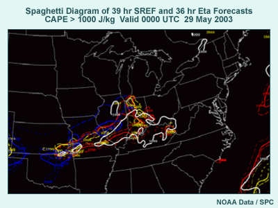
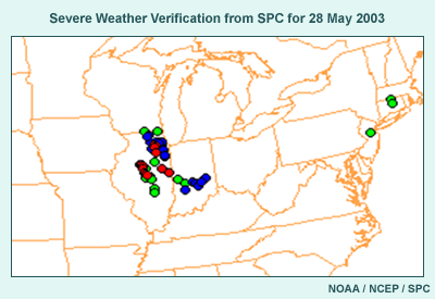
Our severe weather example comes from a presentation from Dr. David Bright
of the Storm Prediction Center. The graphic shows the 1000 Joule/kg spaghetti
plot from a 39-hour SREF forecast from late May 2003. The Eta ensemble members
using the operational Betts-Miller-Janjic convection scheme are shown in
red, Eta members using the Kain-Fritsch scheme are shown in yellow, and RSM
members are shown in blue. Also included in white is the operational Eta
forecast from the same forecast cycle. For the purpose of this discussion,
assume that that 1000 J/kg value is a threshold for severe weather. Considering
the graphic, where would you be most concerned about possible severe weather
on the afternoon and evening of 28 May 2003?
The SREF has a number of ensemble members exceeding 1000 J/kg over south-central
IL, western IN, and through central MO into southeast KS, probably along
a cold front. The highest likelihood of 1000 J/kg CAPE seems to be over western
IN, eastern and south-central IL, and west-southwestward through central
MO into southeastern KS. These areas, given only these data, would be of
most concern. This information is used at the SPC to help with the issuance
of the day 1 and 2 severe weather risk guidance.
When we look at the verification, we see that the severe weather, including
14 tornados, occurred over northeastern to central IL and central IN. This
represents, qualitatively, a pretty good verification of the SREF in IL and
IN, in terms of the shape of the area covered by severe weather, though
the SREF was shifted a bit to the east of the verification. But what about
the areas where no severe weather occurred but high CAPE was forecast? This
fact highlights the need to consider multiple criteria to determine the risk
of severe weather from the SREF, such as a spaghetti diagram showing the
areas where CAPE and vertical wind shear both exceed critical thresholds
at the same time. Graphics for these are also available on the SPC Website
under the “Forecast Tools”menu item and “Composite Severe”products.
Return to top.
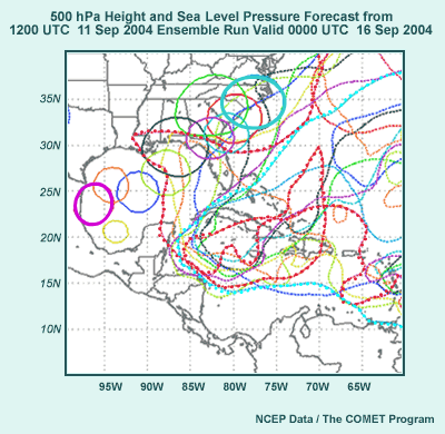
5.4 Ensemble Forecast Example: Tropical Storm
- From Web page at EMC: http://www.emc.ncep.noaa.gov/gmb/tpm/emchurr/tcgen/
- 12 UTC on 11 Sep 2004 MREF ensemble members and operational GFS; purple
dots are position at 03 UTC 17 on Sep 2004.
- Ensemble forecast shows the large uncertainty for ultimate path of Hurricane
Ivan.
- Tendency for clustering of tracks of Ivan
- Five members to east of GFS track and east or northeast of GFS at
03 UTC on 17 Sep
- Four members to west of GFS in western Gulf
- Operational GFS and one ensemble member in the middle of ensemble
solutions
- Question: Under normal circumstances, what would you say about the usefulness
of the ensemble mean forecast track for Ivan?
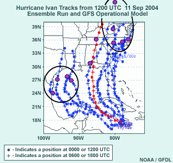
Finally, we'll look at a tropical storm example. The Environmental Modeling
Center Ensemble Web page includes a link to cyclone paths, the URL for which
you can see here.
This graphic is from the period when Hurricane Ivan was active and initially
centered just south of Jamaica. We have in blue the cyclone paths from each
ensemble member forecast by the 12 UTC on 11 September 2004 medium-range
forecast ensemble run, with the operational GFS track in red. Crosses along
the tracks are positions at 06 or 18 UTC, with the dots along the tracks
at 12 UTC and 00 UTC.
Uncertainty comes into play almost immediately in the track of Hurricane
Ivan and increases rapidly as the ensemble forecast evolves.
We have a 5-member cluster of tracks over and then northward from the FL
peninsula with a variety of forward speeds. You can see a four-member cluster
over the Yucatan, the western Gulf of Mexico, and to TX and LA, because in
these ensemble runs the anticyclone either weakens less rapidly or does not
weaken at all. One ensemble member and the operational GFS are in the middle
of the ensemble envelope, though the ensemble member is slower than the GFS,
as some kind of compromise between the other possibilities.
Now that we've looked at the ensemble forecast, let's consider the following
question:
Under normal circumstances, what would you say about the usefulness of the
ensemble mean forecast track for Ivan?
Return to top.
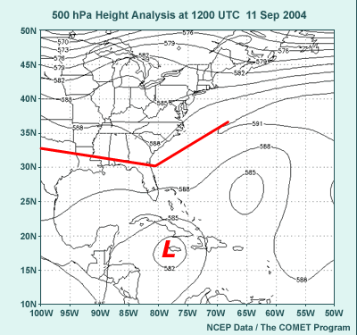
5.5 Tropical Storm Forecast Initial Conditions
- Before we answer the question, lets consider the analysis:
- PMSL shows Ivan near Jamaica (L), ridge (red lines) over New England
extending southwestward to TX.
- 500-hPa height analysis shows ridge in northwest Atlantic extending
over southeast U.S. (red lines). Cutoff low near Jamaica represents
midtrop reflection of Hurricane Ivan (L).
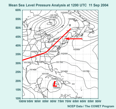
Before we discuss the answer to this question, let's look at the sea level
pressure analysis from 12 UTC on 11 September 2004. Note the surface low
near Jamaica. It represents Hurricane Ivan at this resolution. Also note
the anticyclone centered over New England with a ridge extending southwestward
into TX.
The 500-hPa height analysis looked like this. Note the ridge from the northwest
Atlantic into the southeast and then westward into TX. The 582-decameter
cutoff low near Jamaica is the 500-hPa reflection of the hurricane.
Return to top.
5.6 Tropical Storm Ensemble Forecast
- 108 hour ensemble forecast
- 500-hPa 589-dm heights (dashed contour) and 1000-hPa PMSL (solid
contour), color coded by ensemble member
- Degree of weakening of western Atlantic ridge determines position
of Hurricane Ivan
- Ridge strongest in magenta: Low near northern Mexico coast,
589-dm height contour in mid-Gulf
- Ridge weakest in light blue: Low over east Carolinas, 589-dm
height contour over west Atlantic
- Question: How useful is the ensemble mean track forecast for Hurricane Ivan?
Finally, here's the 108-hour forecast from the ensembles. We show the 500-hPa,
589-dm contours with broken curves, which indicate the location of the midtropospheric
ridge. The solid contours of sea level pressure reflect the position of Hurricane
Ivan. The colors identify ensemble members. The ensembles with the westernmost
hurricane tracks show a ridge extending to the central Gulf of Mexico, while
those with the easternmost track only have a ridge extending into the western
Atlantic (the broken light blue contour). Corresponding hurricane positions
are at the coast of northern Mexico (magenta solid contour) and the eastern
Carolinas (light blue solid contour). It is clear from this graphic that
there is significant linkage between the degree of weakening of the 500-hPa
ridge and the location of the hurricane, and that this ridge is a major issue
to be focused on by forecasters.
Now, considering the ensemble graphic and the additional information I just
gave you about the ridging to the north of Hurricane Ivan, would an ensemble
mean position be best for showing the expected position of Ivan? If so, why?
If not, why not?
Return to top.
5.7 Discussion and Verification
- Answer: Typically we do not use the ensemble mean when there is clustering.
HOWEVER...
- Because of uncertainty in weakening of Atlantic ridge, it turns out
to be the best solution. It averages the members that break down the
500-hPa ridge too much and those that do not break down the 500-hPa
ridge enough.
- National Hurricane Center had wide envelope of possible paths.
- Verification: Ultimate path in black went just east of Mobile Bay, not
too far from GFS and in the middle of the ensemble envelope.
- The ensemble forecast showed the large uncertainty in ultimate path
of Hurricane Ivan at 12 UTC on 11 Sep 2004.
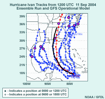
Normally, when there is clustering of members in an ensemble forecast, the
ensemble mean is not considered the best forecast. In this case, however,
it turns out that a “middle-of-the-road”forecast track gives
the best forecast. This is because the degree of weakening of the anticyclonic
ridging to the north of Ivan turned out to be somewhere between the two clusters.
The National Hurricane Center also took the ensemble forecast into account
by providing a wide envelope of possible landfall locations. Not long after
this forecast cycle, the ensemble forecasts began to hone in on the solution
that ultimately verified well.
The actual path shown in black, went just east of Mobile Bay, not too far
from the GFS and in the middle of the ensemble envelope.
This example shows that ensemble forecasts can give us a plausible range
of possible hurricane forecast tracks and indicate a degree of uncertainty
in the track that cannot be quantified with a single forecast. In this case,
the information as of 12 UTC on 11 September 2004 on Hurricane Ivan is quite
clear: its future track is highly uncertain!
The three examples we've just shown illustrate a few ways of using ensemble
products in the forecast process.
Return to top.
Section 6: Summary and References
6.1 Summary: Theory and Construction of Ensemble Systems
- First, we discussed the need for EPSs.
- EPSs represent application of sound science.
- Atmosphere is chaotic, highly sensitive to initial conditions.
- Initial conditions are imperfectly known.
- NWP models are imperfect.
- We use known imperfections of models to create EPS.
- Perturb initial conditions, boundary conditions, or both
- Perturb model numerics or physical parameterizations
- Ensemble products summarize large amounts of data into a useable form…and
require interpretation!
- Use statistical methods to summarize the data
- Plot only some of the data
Now to summarize what we've discussed in the Webcast:
First, we discussed why we should use ensemble prediction systems.
EPSs represent the application of sound science to the process of numerical
weather prediction. They take into consideration several facts:
- The atmosphere is chaotic.
- The initial conditions we provide NWP models are always imperfectly known.
- And model formulations are imperfect as well.
We can make use of our knowledge of the chaotic nature of the atmosphere
and the imperfections in NWP models to create ensemble prediction systems.
We can perturb initial conditions, bottom or lateral boundary conditions,
or both. With respect to the imperfections of NWP models, we can change the
grid on which numerical computations are done, the horizontal or vertical
coordinate (for example, spectral versus gridpoint in the horizontal, sigma
versus eta in the vertical), or the physical parameterizations (such as convective
schemes).
Once we have a working ensemble prediction system, how do we make forecast
products, and what kinds of products are useful? Since so much data are produced
by an EPS forecast, ensemble information is summarized using statistical
methods for all the data or plotting a portion of the data from each ensemble
member. We can take into account past EPS performance to make adjustments
for predictability of the flow or for systematic biases and errors in the
forecast model that is the basis for the EPS.
Return to top.
6.2 Summary: Ensemble Products
- Spaghetti diagrams plot one or a few contours for a forecast variable
of interest.
- Determine certainty of forecast based on distance between contours,
clustering of possible forecast outcomes
- Most likely forecast outcome where most ensemble members cluster
together
- Example: Spaghetti diagram at right showing large uncertainty,
off East Coast of U.S., central Plains, lesser extent
on U.S. West Coast
- Ensemble mean and spread
- Mean verifies better on average because unpredictable features are
removed.
- Size of spread indicates predictability; large spread means
high uncertainty.
- Example: Mean and spread diagram at right showing high spread
off East Coast of U.S., over central High Plains, and U.S. West
Coast
- Can use mean/spread and spaghetti diagrams together to interpret
ensemble data.
- Ensemble probabilities
- Can be used for probability of exceeding important thresholds
or specific events
- Most likely outcome is a variant of this type of product
- Work best when adjusted for systematic biases in mean and spread
Ensemble products include spaghetti, mean and spread, and probability diagrams.
Spaghetti diagrams plot one or a few contours for a forecast variable of
interest. We can determine the certainty of the forecast based on the distance
between the different ensemble member contours. We also get a qualitative
view of the most likely forecast outcome or of multiple clusters of similar
forecast outcomes. An example we used previously is shown at the right. There
are three areas of uncertainty highlighted with ovals: the trough off the
eastern U.S. coast, the trough in the central Plains, and to a lesser extent
an area over the U.S. West Coast.
The ensemble mean and spread is highly useful because, on average, the ensemble
mean verifies better than other NWP forecasts. This is because less predictable
features in the atmospheric flow are removed though smoothing. The size of
the ensemble spread, like the distance between ensemble members in the spaghetti
diagram, indicates the degree of uncertainty. Large spread values mean high
uncertainty.
One of the examples we used before is shown at the right, and is from the
same data that were used for the spaghetti plot. The high spread is in the
same areas where the spaghetti diagram showed large distances from between
ensemble members, and is highlighted by ovals. An additional area of uncertainty
can be found offshore of eastern Canada and Greenland.
Note was made that we can also use the mean and spread and spaghetti diagrams
together to improve the interpretation of the ensemble forecast output.
Ensemble probabilities in various forms can be used to assess the probability
of exceeding important forecast thresholds, such as winter weather, heat
index, frost or freeze, wind chill, or other criteria. We also use ensemble
probabilities to determine most likely outcomes, such as precipitation type.
Ensemble probabilities work best when they are adjusted for systematic biases
in the mean and spread found over a long enough verification or training
period.
Return to top.
6.3 Summary: Ensemble Verification and Forecast Examples
- Ensemble verification
- Measure performance of the ensemble mean and the probability distribution
- Relating to probabilities:
- Determine if the frequency a forecast value is predicted matches
the frequency that the value actually occurs in the real world
- Determine if the verification is always somewhere in range of
ensemble solutions
- Determine if extreme events are under- or overforecast
- Ensemble forecast examples
- Can be used at all times of year, for a variety of phenomena
- Longer time ranges --> larger-scale features
- Shorter time ranges --> smaller-scale features
Part and parcel of using ensemble prediction systems is verification. Since
the ensemble mean forecast generally does better than the higher resolution
operational NWP model, the ensemble mean forecast is verified in a way similar
to individual operational forecast data, for example, by calculating anomaly
correlations over a broad region or calculating root-mean-square error over
smaller regions.
But since the primary reason for ensemble prediction is to provide probabilities,
we need to assess how good the probability distributions are. We need to
determine if the frequency that a forecast value is predicted matches the
frequency that the value actually occurs in the real world. We need to determine
if the verification is always somewhere in range of ensemble solutions, and
if extreme events are under- or overforecast.
Finally, we went over some ensemble forecast examples. We saw cold and warm
season examples for a synoptic-scale extratropical system, a severe weather
situation, and a tropical storm.
In general, at longer time ranges, we look to the ensembles to tell us something
about the uncertainty in larger-scale features, such as synoptic-scale and
planetary-scale waves. At shorter time ranges, we can look at smaller-scale
features such as short-wave troughs, frontal locations, mesoscale detail in
severe weather parameters, rain-snow lines, and other features.
Return to top.