Moist Processes
Contents
7. Moist Processes
Supplement to Chapter 7 of A First Course in Atmospheric Thermodynamics by Grant W. Petty, Sundog Publishing, 2008
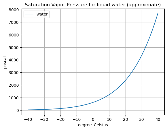
Plots of saturation vapor pressure
import numpy as np
import matplotlib.pyplot as plt
from metpy.units import units

# constants for liquid water referenced to zero C
A = 2.53E11 * units.Pa
B = 5420 * units.K

def es(T, A=A, B=B):
    return A * np.exp(-B/T)
T = np.linspace(-40,40) * units.degC
plt.plot(T, es(T), label='water')  # the unit conversion is handled automatically
plt.legend()
plt.title('Saturation Vapor Pressure for liquid water (approximate)')
plt.grid()
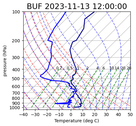
Plotting vapor lines on a Skew-T diagram
We are going to add lines of constant saturation mixing ratio \(w_s\) to a Skew-T thermodynamic diagram.
Lines of constant \(w_s\) are often called vapor lines or mixing lines.
Import necessary packages
from datetime import datetime
from siphon.simplewebservice.wyoming import WyomingUpperAir
from metpy.plots import SkewT
from metpy import calc as mpcalc
from metpy.plots import SkewT
Grab some data
date = datetime(year=2023, month=11, day=13, hour=12) # year, month, day, hour
station = 'BUF'  # station code for Buffalo, NY
df = WyomingUpperAir.request_data(date, station)
Make a plot
fig = plt.figure(figsize=(9, 9))
skew = SkewT(fig=fig, subplot=(2,1,2), rotation=45)
skew.plot(df['pressure'], df['temperature'],
        'darkblue', linewidth=2)
skew.ax.set_title(f'{station} {date}', fontsize=18);
skew.plot_dry_adiabats()
skew.ax.set_xlabel('Temperature (deg C)')
skew.ax.set_ylabel('pressure (hPa)');
# Here's where we add the new feature
w = np.array([0.028, 0.020, 0.014, 0.010, 0.006, 0.004, 0.002, 0.001, 0.0005, 0.0002])[:, None] * units('g/g')
p = units.hPa * np.linspace(1000, 400, 7)
top_p = p[-1]
skew.plot_mixing_lines(mixing_ratio=w, pressure=p)
dewpt = mpcalc.dewpoint(mpcalc.vapor_pressure(pressure=top_p, mixing_ratio=w))
for i in range(len(w)):
    label_value = w[i].to('g/kg').magnitude[0]
    if label_value >= 1:
        label_value = int(label_value)
    skew.ax.text(dewpt[i][0], top_p, label_value,
                 horizontalalignment='center', fontsize=9)
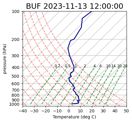
Plotting dewpoint temperatures on a Skew-T diagram
The sounding data includes the dewpoint temperature \(T_d\). We can plot that alongside the air temperature \(T\).
Here we just add a new line to the existing figure and replot:
skew.plot(df['pressure'], df['dewpoint'],
        'blue', linewidth=2)
fig
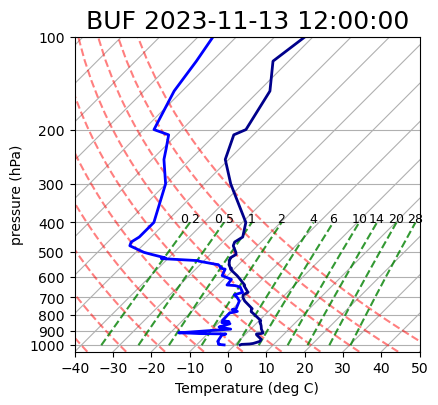
Adding moist adiabats to the Skew-T
Let’s now add the final important set of reference lines to our plot: the moist adiabats. These lines represent the temperature changes experienced by a saturated rising air parcel.
As the parcel cools through adiabatic expansion, its saturation vapor pressure decreases. The resulting condensation of water vapor releases latent heat into the air parcel, which causes some warming which partially offsets the adiabatic cooling. As a result, temperature decreases less rapidly with height compared to an unsaturated parcel.
Compare the slopes of the moist adiabats (light blue) and dry adiabats (light red) in this Skew-T:
skew.plot_moist_adiabats()
fig