MetPy Intro: NYS Mesonet Map
Overview
In this notebook, we’ll use Cartopy, Matplotlib, and Pandas (with a bunch of help from MetPy) to read in, manipulate, and visualize current data from the New York State Mesonet.
Prerequisites
| Concepts | Importance | Notes |
|---|---|---|
| Matplotlib | Necessary | |
| Cartopy | Necessary | |
| Pandas | Necessary | |
| MetPy | Necessary | Intro |
- Time to learn: 30 minutes
Imports
import matplotlib.pyplot as plt
import numpy as np
import pandas as pd
from datetime import datetime
from cartopy import crs as ccrs
from cartopy import feature as cfeature
from metpy.calc import wind_components, dewpoint_from_relative_humidity
from metpy.units import units
from metpy.plots import StationPlot, USCOUNTIES
Create a Pandas DataFrame object pointing to the most recent set of NYSM obs.
nysm_data = pd.read_csv('https://www.atmos.albany.edu/products/nysm/nysm_latest.csv')nysm_data.columnsIndex(['station', 'time', 'temp_2m [degC]', 'temp_9m [degC]',
'relative_humidity [percent]', 'precip_incremental [mm]',
'precip_local [mm]', 'precip_max_intensity [mm/min]',
'avg_wind_speed_prop [m/s]', 'max_wind_speed_prop [m/s]',
'wind_speed_stddev_prop [m/s]', 'wind_direction_prop [degrees]',
'wind_direction_stddev_prop [degrees]', 'avg_wind_speed_sonic [m/s]',
'max_wind_speed_sonic [m/s]', 'wind_speed_stddev_sonic [m/s]',
'wind_direction_sonic [degrees]',
'wind_direction_stddev_sonic [degrees]', 'solar_insolation [W/m^2]',
'station_pressure [mbar]', 'snow_depth [cm]', 'frozen_soil_05cm [bit]',
'frozen_soil_25cm [bit]', 'frozen_soil_50cm [bit]',
'soil_temp_05cm [degC]', 'soil_temp_25cm [degC]',
'soil_temp_50cm [degC]', 'soil_moisture_05cm [m^3/m^3]',
'soil_moisture_25cm [m^3/m^3]', 'soil_moisture_50cm [m^3/m^3]', 'lat',
'lon', 'elevation', 'name'],
dtype='object')Create several Series objects for some of the columns.
stid = nysm_data['station']
lats = nysm_data['lat']
lons = nysm_data['lon']
Our goal is to make a map of NYSM observations, which includes the wind velocity. The convention is to plot wind velocity using wind barbs. The MetPy library allows us to not only make such a map, but perform a variety of meteorologically-relevant calculations and diagnostics. Here, we will use such a calculation, which will determine the two scalar components of wind velocity (u and v), from wind speed and direction. We will use MetPy’s wind_components method.
This method requires us to do the following:
- Create Pandas
Seriesobjects for the variables of interest - Extract the underlying Numpy array via the
Series’valuesattribute - Attach units to these arrays using MetPy’s
unitsclass
Perform these three steps
wspd = nysm_data['max_wind_speed_prop [m/s]'].values * units['m/s']
drct = nysm_data['wind_direction_prop [degrees]'].values * units['degree']Examine these two units aware Series
wspddrctConvert wind speed from m/s to knots
wspk = wspd.to('knots')wspkPerform the vector decomposition
u, v = wind_components(wspk, drct)Take a look at one of the output components:
uCreate a 2-meter temperature object; attach units of degrees Celsius (degC) to it, and then convert to Fahrenheit (degF).
tmpc = nysm_data['temp_2m [degC]'].values * units('degC')
tmpf = tmpc.to('degF')
Now, let’s plot several of the meteorological values on a map. We will use Matplotlib and Cartopy, as well as MetPy’s StationPlot method.
Create units-aware objects for relative humidity and station pressure
rh = nysm_data['relative_humidity [percent]'].values * units('percent')
pres = nysm_data['station_pressure [mbar]'].values * units('mbar')
Plot the map, centered over NYS, with add some geographic features, and the mesonet data.
Determine the current time, for use in the plot’s title and a version to be saved to disk.
timeString = nysm_data['time'][0]
timeObj = datetime.strptime(timeString,"%Y-%m-%d %H:%M:%S")
titleString = datetime.strftime(timeObj,"%B %d %Y, %H%M UTC")
figString = datetime.strftime(timeObj,"%Y%m%d_%H%M")
Matplotlib provides the ax.scatter and ax.text methods to plot markers for the stations and their site id’s. The latter method does not provide an intuitive means to orient several text stings relative to a central point as we typically do for a meteorological surface station plot. Let’s take advantage of the Metpy package, and its StationPlot method!
Be patient: this may take a minute or so to plot, if you chose the highest resolution for the shapefiles!
Specify two resolutions: one for the Natural Earth shapefiles, and the other for MetPy’s US County shapefiles.
res = '10m'
resCounty = '5m'
# Set the domain for defining the plot region.
latN = 45.2
latS = 40.2
lonW = -80.0
lonE = -72.0
cLat = (latN + latS)/2
cLon = (lonW + lonE )/2
proj = ccrs.LambertConformal(central_longitude=cLon, central_latitude=cLat)
fig = plt.figure(figsize=(18,12),dpi=150) # Increase the dots per inch from default 100 to make plot easier to read
ax = fig.add_subplot(1,1,1,projection=proj)
ax.set_extent ([lonW,lonE,latS,latN])
ax.set_facecolor(cfeature.COLORS['water'])
ax.add_feature (cfeature.STATES.with_scale(res))
ax.add_feature (cfeature.RIVERS.with_scale(res))
ax.add_feature (cfeature.LAND.with_scale(res))
ax.add_feature (cfeature.COASTLINE.with_scale(res))
ax.add_feature (cfeature.LAKES.with_scale(res))
ax.add_feature (cfeature.STATES.with_scale(res))
ax.add_feature(USCOUNTIES.with_scale(resCounty), linewidth=0.8, edgecolor='darkgray')
# Create a station plot pointing to an Axes to draw on as well as the location of points
stationplot = StationPlot(ax, lons, lats, transform=ccrs.PlateCarree(),
fontsize=8)
stationplot.plot_parameter('NW', tmpf, color='red')
stationplot.plot_parameter('SW', rh, color='green')
stationplot.plot_parameter('NE', pres, color='purple')
stationplot.plot_barb(u, v,zorder=2) # zorder value set so wind barbs will display over lake features
plotTitle = f'NYSM Temperature(°F), RH (%), Station Pressure (hPa), Peak 5-min Wind (kts), {titleString}'
ax.set_title (plotTitle);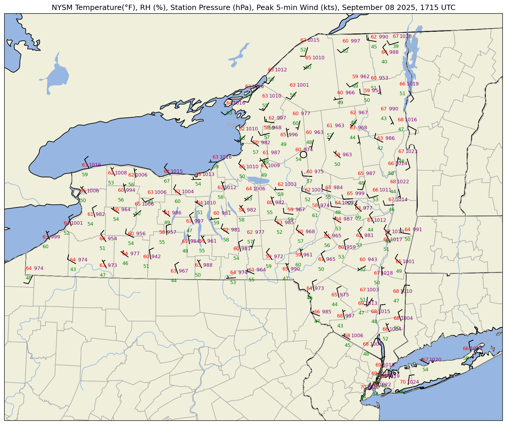
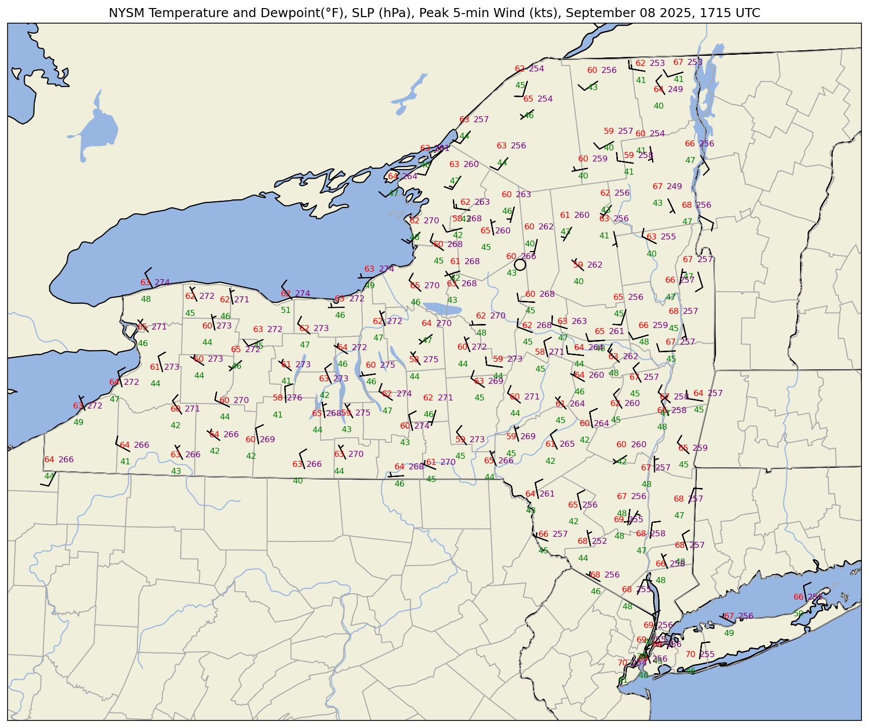
What if we wanted to plot sea-level pressure (SLP) instead of station pressure? In this case, we can apply what’s called a reduction to sea-level pressure formula. This formula requires station elevation (accounting for sensor height) in meters, temperature in Kelvin, and station pressure in hectopascals. We assume each NYSM station has its sensor height .5 meters above ground level.
pres.marray([ 967.03, 965.42, 994.17, 1015.05, 971.5 , 1009.52, 977.36,
980.59, 964.19, 1021.62, 1001.13, 1003.67, 1006.5 , 1018.66,
967.43, 1011.47, 1005.59, 960.59, 1015.84, 1008.74, 1016.31,
1018.45, 986.22, 976.88, nan, 1004.32, 973.7 , 987.22,
956.87, 975.35, 1000.98, 996.52, 976.61, 1010.43, 954.08,
989.7 , 1010.35, 976.93, 982.43, 987.22, 1000.77, 984.76,
989.84, 987.53, 1018.89, 1005.59, 998.71, 962.44, 1013.9 ,
995.7 , 980.88, 955.52, 1012.22, 965.2 , 968.07, 941.95,
1000.79, 1002.65, 967.57, 999.09, 1012.39, 1017.09, 968.42,
953.56, 1015.14, 997.27, 1014.19, 1007.61, 980.96, 981.83,
972.51, 966.7 , 989.66, 963.24, 972.82, 1015.3 , 983.72,
987.14, 1016.04, 997.19, 974.12, 997.34, 1010.22, 962.93,
1009.99, 1019. , 973.87, 962.56, 981.59, 1017.96, 958.97,
1005.54, 987.82, 985.65, 1013.94, 1013.31, 1021.86, 980.52,
985.1 , 1003.76, 1024.33, 1002.52, 973.59, 1021.41, 991.35,
1020.3 , 1004.38, 943.16, 1015.54, 982.34, 966.47, 983.53,
1012.01, 1012.63, 960.95, 1024.42, 963.57, 1006.1 , 1009.69,
974.7 , 1015.62, 1003.06, 953.34, 974.1 , 1021.31, 1012.61,
1005.95])elev = nysm_data['elevation']
sensorHeight = .5
# Reduce station pressure to SLP. Source: https://www.sandhurstweather.org.uk/barometric.pdf
slp = pres.m/np.exp(-1*(elev+sensorHeight)/((tmpc.m + 273.15) * 29.263))slp0 1026.625179
1 1026.463696
2 1027.255035
3 1025.830563
4 1027.334012
...
122 1025.404819
123 1026.589137
124 1025.738245
125 1027.230958
126 1027.211368
Name: elevation, Length: 127, dtype: float64Make a new map, substituting SLP for station pressure. We will also use the convention of the three least-significant digits to represent SLP in hectopascals.
fig = plt.figure(figsize=(18,12),dpi=150) # Increase the dots per inch from default 100 to make plot easier to read
ax = fig.add_subplot(1,1,1,projection=proj)
ax.set_extent ([lonW,lonE,latS,latN])
ax.set_facecolor(cfeature.COLORS['water'])
ax.add_feature (cfeature.STATES.with_scale(res))
ax.add_feature (cfeature.RIVERS.with_scale(res))
ax.add_feature (cfeature.LAND.with_scale(res))
ax.add_feature (cfeature.COASTLINE.with_scale(res))
ax.add_feature (cfeature.LAKES.with_scale(res))
ax.add_feature (cfeature.STATES.with_scale(res))

ax.add_feature(USCOUNTIES.with_scale(resCounty), linewidth=0.8, edgecolor='darkgray')

stationplot = StationPlot(ax, lons, lats, transform=ccrs.PlateCarree(),
                          fontsize=8)

stationplot.plot_parameter('NW', tmpf, color='red')
stationplot.plot_parameter('SW', rh, color='green')
# A more complex example uses a custom formatter to control how the sea-level pressure
# values are plotted. This uses the standard trailing 3-digits of the pressure value
# in tenths of millibars.
stationplot.plot_parameter('NE', slp, color='purple', formatter=lambda v: format(10 * v, '.0f')[-3:])
stationplot.plot_barb(u, v,zorder=2)
plotTitle = f'NYSM Temperature(°F), RH (%), SLP(hPa), Peak 5-min Wind (kts), {titleString}'
ax.set_title (plotTitle);

One last thing to do ... plot dewpoint instead of RH. MetPy’s dewpoint
dwpc = dewpoint_from_relative_humidity(tmpf, rh)dwpcThe dewpoint is returned in units of degrees Celsius, so convert to Fahrenheit.
dwpf = dwpc.to('degF')Plot the map
res = '10m'
fig = plt.figure(figsize=(18,12),dpi=150) # Increase the dots per inch from default 100 to make plot easier to read
ax = fig.add_subplot(1,1,1,projection=proj)
ax.set_extent ([lonW,lonE,latS,latN])
ax.set_facecolor(cfeature.COLORS['water'])
ax.add_feature(cfeature.STATES.with_scale(res))
ax.add_feature(cfeature.RIVERS.with_scale(res))
ax.add_feature (cfeature.LAND.with_scale(res))
ax.add_feature(cfeature.COASTLINE.with_scale(res))
ax.add_feature (cfeature.LAKES.with_scale(res))
ax.add_feature (cfeature.STATES.with_scale(res))

ax.add_feature(USCOUNTIES.with_scale(resCounty), linewidth=0.8, edgecolor='darkgray')

stationplot = StationPlot(ax, lons, lats, transform=ccrs.PlateCarree(),
                          fontsize=8)

stationplot.plot_parameter('NW', tmpf, color='red')
stationplot.plot_parameter('SW', dwpf, color='green')
# A more complex example uses a custom formatter to control how the sea-level pressure
# values are plotted. This uses the standard trailing 3-digits of the pressure value
# in tenths of millibars.
stationplot.plot_parameter('NE', slp, color='purple', formatter=lambda v: format(10 * v, '.0f')[-3:])
stationplot.plot_barb(u, v,zorder=2)
plotTitle = f'NYSM Temperature and Dewpoint(°F), SLP (hPa), Peak 5-min Wind (kts), {titleString}'
ax.set_title (plotTitle);
Save the plot to the current directory.
figName = f'NYSM_{figString}.png'
figName'NYSM_20250908_1715.png'fig.savefig(figName)Summary
- The MetPy library provides methods to assign physical units to numerical arrays and perform units-aware calculations
- MetPy’s
StationPlotmethod offers a customized use of Matplotlib’s Pyplot library to plot several meteorologically-relevant parameters centered about several geo-referenced points.