01_GriddedDiagnostics_TempAdvection_ERA5
Overview
Select a date and access the ERA5 dataset
Subset the desired variables along their dimensions
Calculate and visualize diagnostic quantities.
Smooth the diagnostic field.
Imports
import xarray as xr
import pandas as pd
import numpy as np
from datetime import datetime as dt
from metpy.units import units
import metpy.calc as mpcalc
import cartopy.crs as ccrs
import cartopy.feature as cfeature
import matplotlib.pyplot as plt
Specify a starting and ending date/time, regional extent, vertical levels, and access/subset the ERA5
# 1. Set the bounds of your map.
# Set the four values in the code cell below. Test the values.

lonW = -100
lonE = -65
latS = 30
latN = 50
if ( latN > latS ) and ( lonE > lonW):
    cLat = (latN + latS)/2
    cLon = (lonW + lonE)/2
else:
    e = ("Northern (eastern) latitude (longitude) must be greater than southern (western). Go back and re-adjust!")
    raise ValueError(f"Error in lat/lon specification: {e}")

# Recall that in ERA5, longitudes run between 0 and 360, not -180 and 180
if (lonW < 0 ):
    lonW = lonW + 360
if (lonE < 0 ):
    lonE = lonE + 360

# 2. Select the map projection for your figure.
proj_map = ccrs.LambertConformal(central_latitude=cLat, central_longitude=cLon)

# 3. Select the projection on which the dataset is based
proj_data = ccrs.PlateCarree()

# 4. Select the resolution of the Cartopy cartographic features, and, if desired, MetPy's county shapefiles.

# Uncomment / comment as desired
#res = '10m' # Most detailed, best for small regions (e.g. NYS)
res = '50m' # Medium detail, best for medium-sized regions (e.g. CONUS)
#res = '110m' # Least detailed, best for large/global maps

#res_county = '5m' # Higher-res MetPy US County shapefiles
res_county = '20m' # Lower-res MetPy US County shapefiles

# Apply the latitude/longitude ranges and extend the data region if desired

expand_lon = 1
expand_lat = 1
latRange = np.arange(latS - expand_lat,latN + expand_lat,.25) # expand the data range a bit beyond the plot range
lonRange = np.arange((lonW - expand_lon),(lonE + expand_lon),.25) # Need to match longitude values to those of the coordinate variable

# Specify desired pressure levels: in this case, a list of one or more
plevel_list = [850, 925, 1000]

startYear = 2007
startMonth = 2
startDay = 14
startHour = 0
startMinute = 0
startDateTime = dt(startYear,startMonth,startDay, startHour, startMinute)

endYear = 2007
endMonth = 2
endDay = 14
endHour = 0
endMinute = 0
endDateTime = dt(endYear,endMonth,endDay, endHour, endMinute)

delta_time = endDateTime - startDateTime
time_range_max = 7*86400

if (delta_time.total_seconds() > time_range_max):
    raise RuntimeError("Your time range must not exceed 7 days. Go back and try again.")

# Create a list of date and times based on what we specified for the initial and final times,
#  using Pandas’ date_range function
dateRange = pd.date_range(startDateTime, endDateTime,freq="6h")
Print out the lat/lon, pressure, and date/time arrays
print ("Summary of subsetted dimensions: \n\n")
print (f'Longitude Range: {lonRange} \n')
print (f'Latitude Range: {latRange} \n')
print (f'Pressure levels: {plevel_list} \n')
print(f'Date Range: {dateRange}')
Summary of subsetted dimensions:
Longitude Range: [259. 259.25 259.5 259.75 260. 260.25 260.5 260.75 261. 261.25
261.5 261.75 262. 262.25 262.5 262.75 263. 263.25 263.5 263.75
264. 264.25 264.5 264.75 265. 265.25 265.5 265.75 266. 266.25
266.5 266.75 267. 267.25 267.5 267.75 268. 268.25 268.5 268.75
269. 269.25 269.5 269.75 270. 270.25 270.5 270.75 271. 271.25
271.5 271.75 272. 272.25 272.5 272.75 273. 273.25 273.5 273.75
274. 274.25 274.5 274.75 275. 275.25 275.5 275.75 276. 276.25
276.5 276.75 277. 277.25 277.5 277.75 278. 278.25 278.5 278.75
279. 279.25 279.5 279.75 280. 280.25 280.5 280.75 281. 281.25
281.5 281.75 282. 282.25 282.5 282.75 283. 283.25 283.5 283.75
284. 284.25 284.5 284.75 285. 285.25 285.5 285.75 286. 286.25
286.5 286.75 287. 287.25 287.5 287.75 288. 288.25 288.5 288.75
289. 289.25 289.5 289.75 290. 290.25 290.5 290.75 291. 291.25
291.5 291.75 292. 292.25 292.5 292.75 293. 293.25 293.5 293.75
294. 294.25 294.5 294.75 295. 295.25 295.5 295.75]
Latitude Range: [29. 29.25 29.5 29.75 30. 30.25 30.5 30.75 31. 31.25 31.5 31.75
32. 32.25 32.5 32.75 33. 33.25 33.5 33.75 34. 34.25 34.5 34.75
35. 35.25 35.5 35.75 36. 36.25 36.5 36.75 37. 37.25 37.5 37.75
38. 38.25 38.5 38.75 39. 39.25 39.5 39.75 40. 40.25 40.5 40.75
41. 41.25 41.5 41.75 42. 42.25 42.5 42.75 43. 43.25 43.5 43.75
44. 44.25 44.5 44.75 45. 45.25 45.5 45.75 46. 46.25 46.5 46.75
47. 47.25 47.5 47.75 48. 48.25 48.5 48.75 49. 49.25 49.5 49.75
50. 50.25 50.5 50.75]
Pressure levels: [850, 925, 1000]
Date Range: DatetimeIndex(['2007-02-14 00:00:00'], dtype='datetime64[ns]', freq='6h')
Access either the cloud-served or local ERA5 repository. Then subset it according to your choices above.
endDate = dt(2023,1,10)
if (endDateTime <= endDate): # Use WeatherBench archive

    cloud_source = True
    ds = xr.open_dataset(
     'gs://weatherbench2/datasets/era5/1959-2023_01_10-wb13-6h-1440x721.zarr',
     chunks={'time': 48},
     consolidated=True,
     engine='zarr'
    )

    # Attach units to the pressure coordinate
    ds.coords['level'].attrs['units'] = 'hPa'

    # Rename the variable names in this dataset so they use their corresponding short_name attributes
    # Construct a dictionary whose keys are the original variable names, and whose values are their
    # short names

    rename_data_vars = {}
    seen_short_names = set()

    for var_name in ds.data_vars:
        short = ds[var_name].attrs.get("short_name")
        # Only rename if:
        # 1. short_name exists
        # 2. We haven't already used it
        if short and short not in seen_short_names:
            rename_data_vars[var_name] = short
            seen_short_names.add(short)
    # Apply renaming
    ds = ds.rename(rename_data_vars)

else: # Use local archive
    import glob, os
    cloud_source = False
    input_directory = '/free/ktyle/era5'
    files = glob.glob(os.path.join(input_directory,'*_era5.nc'))
    ds = xr.open_mfdataset(files,coords='minimal',compat='override')
    # Rename two of the coordinate variables so they match what is in the WeatherBench archive
    ds = ds.rename({'valid_time': 'time', 'pressure_level': 'level'})

# Perform the initial subset
ds = ds.sel(time = dateRange, longitude = lonRange, latitude = latRange, level = plevel_list)Examine the subsetted Dataset
dsNow create DataArray objects for the data variables we are interested in. Since we are interested in computing temperature advection, we will need temperature and the u- and v- components of the wind.
T = ds['t']
U = ds['u']
V = ds['v']UIn preparation for calculating diagnostics, let’s first select just a single isobaric surface from the four that we previously listed. Subset the data variables based on that level.
p_level = 850
Tp = T.sel(level=p_level).compute()
Up = U.sel(level=p_level).compute()
Vp = V.sel(level=p_level).compute()Calculate and visualize diagnostic quantities.
Next, let’s just plot contour lines of temperature and wind barbs.
Unit conversions
We will create new objects for T, U and V in knots, since we will want to preserve the original units (m/s) when it comes time to calculate temperature advection.
TCel = Tp.metpy.convert_units('degC')
UKts = Up.metpy.convert_units('kts')
VKts = Vp.metpy.convert_units('kts')
Create an array of values for the temperature contours: since we are using contour lines, simply define a range large enough to encompass the expected values, and set a contour interval.
TCel.min().values, TCel.max().values(array(-26.590408, dtype=float32), array(13.81308, dtype=float32))T_cint = 2
minT, maxT = (-30,16)
TContours = np.arange(minT, maxT, T_cint)Make the map
lats = Tp.latitude
lons = Tp.longitude
constrainLat, constrainLon = (0.5, 4.0)
proj_map = ccrs.LambertConformal(central_longitude=cLon, central_latitude=cLat)Although there is just a single time in our time range, we’ll still employ a loop here in case we wanted to include multiple times later on.
for time in dateRange:
    print(f"Processing {time}")

    # Create the time strings, for the figure title as well as for the file name.
    timeStr = dt.strftime(time,format="%Y-%m-%d %H%M UTC")
    timeStrFile = dt.strftime(time,format="%Y%m%d%H")

    tl1 = f'ERA5, Valid at: {timeStr}'
    tl2 = f'{p_level} hPa temperature (°C) and wind (kts)'

    title_line = f'{tl1}\n{tl2}\n'

    fig = plt.figure(figsize=(21,15)) # Increase size to adjust for the constrained lats/lons
    ax = fig.add_subplot(1,1,1,projection=proj_map)
    ax.set_extent ([lonW+constrainLon,lonE-constrainLon,latS+constrainLat,latN-constrainLat])
    ax.add_feature(cfeature.COASTLINE.with_scale(res))
    ax.add_feature(cfeature.STATES.with_scale(res),edgecolor='brown')

    # Need to use Xarray's sel method here to specify the current time for any DataArray you are plotting.

    # 1. Contour lines of temperature
    cT = ax.contour(lons, lats, TCel.sel(time=time), levels=TContours, colors='orange', linewidths=3, transform=proj_data)
    ax.clabel(cT, inline=1, fontsize=12, fmt='%.0f')

    # 2. wind barbs
    # Plotting wind barbs uses the ax.barbs method. Here, you can't pass in the DataArray directly; you can only pass in the array's values.
    # Also need to sample (skip) a selected # of points to keep the plot readable.
    # Remember to use Xarray's sel method here as well to specify the current time.
    skip = 5
    ax.barbs(lons[::skip],lats[::skip],UKts.sel(time=time)[::skip,::skip].values, VKts.sel(time=time)[::skip,::skip].values, color='purple',zorder=2,transform=proj_data)

    title = ax.set_title(title_line,fontsize=16)
Processing 2007-02-14 00:00:00
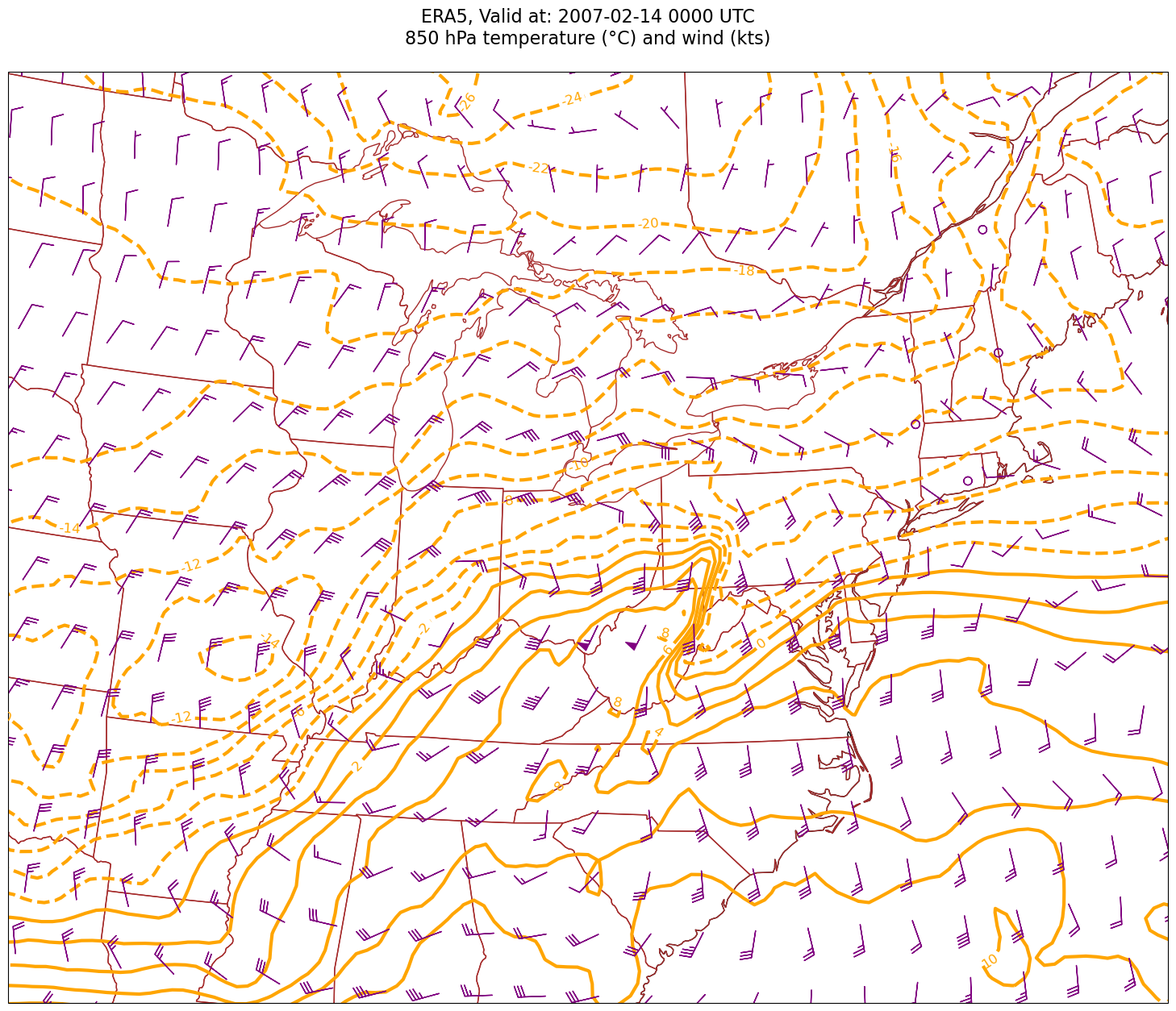
Look at the map and you should easily be able to identify the areas of prominent warm and cold advection. Instead of qualitatively assessing a diagnostic quantity such as temperature advection, how about we quantify it? For that, we will use MetPy’s diagnostic library, which we have imported as mpcalc.
Let’s explore the advection diagnostic: https://
In order to calculate horizontal tempareture advection, we need a scalar quantity (temperature, the “thing” being advected), and a vector field (wind, the “thing” doing the advecting).
For MetPy’s advection function, we pass in the scalar, followed by the vector ... in this case, T followed by U and V.
Up# Calculate temperature advection by the horizontal wind:
tAdv = mpcalc.advection(Tp, Up, Vp)/tmp/ipykernel_1117146/2961651707.py:2: UserWarning: Vertical dimension number not found. Defaulting to (..., Z, Y, X) order.
tAdv = mpcalc.advection(Tp, Up, Vp)
Let’s look at the output DataArray, containing the calculated values (and units) of temperature advection. Note how these values scale ... on the order of 10**-5.
tAdvLet’s get a quick visualization, using Xarray’s built-in interface to Matplotlib.
tAdv.isel(time=0).plot(figsize=(15,10),cmap='coolwarm');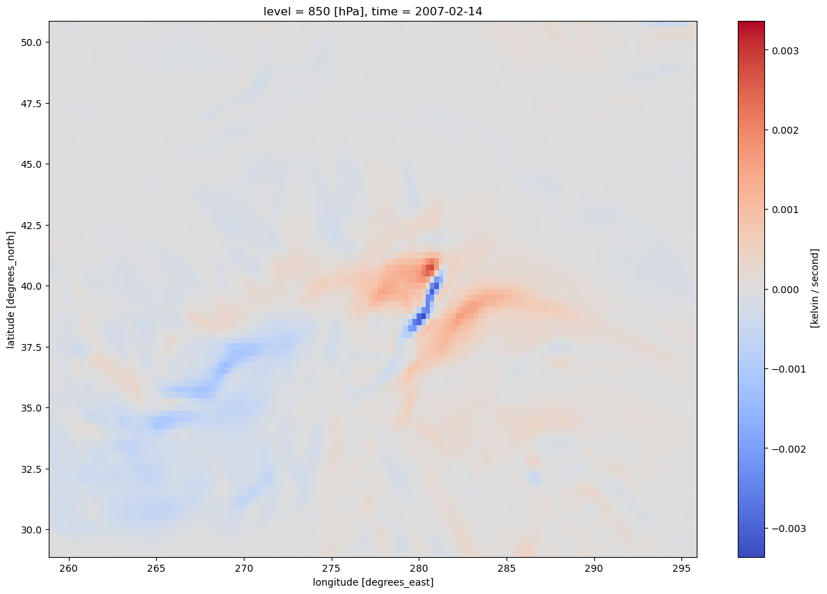
We have three strategies to make the resulting map look nicer:
Scale up the values by an appropriate power of ten
Focus on the more extreme values of temperature advection: thus, do not contour values that are close to zero.
Smooth the values of temperature advection ... especially important in datasets with a high degree of horizontal resolution.
Let’s take care of the first two strategies, and then assess the need for smoothing.
Scale these values up by 1e5 (or 1 * 10**5, or 100,000) and find the min/max values. Use these to inform the setting of the contour fill intervals.
scale = 1e5
minTAdv = (tAdv*scale).min().values
maxTAdv = (tAdv*scale).max().values
print (minTAdv, maxTAdv)
-336.41820366407217 277.2340834560026
Usually, we wish to avoid plotting the “zero” contour line for diagnostic quantities such as divergence, advection, and frontogenesis. Thus, create two lists of values ... one for negative and one for positive.
advInc = 50
negAdvContours = np.arange (-300, 0, advInc)
posAdvContours = np.arange (50, 350, advInc)negAdvContoursarray([-300, -250, -200, -150, -100, -50])Now, let’s plot temperature advection on the map.
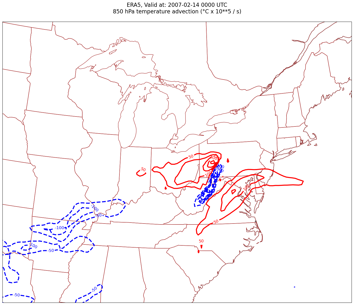
for time in dateRange:
    print(f'Processing {time}')

    # Create the time strings, for the figure title as well as for the file name.
    timeStr = dt.strftime(time,format="%Y-%m-%d %H%M UTC")
    timeStrFile = dt.strftime(time,format="%Y%m%d%H")

    tl1 = f'ERA5, Valid at: {timeStr}'
    tl2 = f'{p_level} hPa temperature advection (°C x 10**5 / s)'

    title_line = f'{tl1}\n{tl2}\n'

    fig = plt.figure(figsize=(21,15)) # Increase size to adjust for the constrained lats/lons
    ax = fig.add_subplot(1,1,1,projection=proj_map)
    ax.set_extent ([lonW+constrainLon,lonE-constrainLon,latS+constrainLat,latN-constrainLat])
    ax.add_feature(cfeature.COASTLINE.with_scale(res))
    ax.add_feature(cfeature.STATES.with_scale(res),edgecolor='brown')

    # Need to use Xarray's sel method here to specify the current time for any DataArray you are plotting.

    # 1a. Contour lines of warm (positive temperature) advection.
    # Don't forget to multiply by the scaling factor!
    cPosTAdv = ax.contour(lons, lats, tAdv.sel(time=time)*scale, levels=posAdvContours, colors='red', linewidths=3, transform=proj_data)
    ax.clabel(cPosTAdv, inline=1, fontsize=12, fmt='%.0f')

    # 1b. Contour lines of cold (negative temperature) advection
    cNegTAdv = ax.contour(lons, lats, tAdv.sel(time=time)*scale, levels=negAdvContours, colors='blue', linewidths=3, transform=proj_data)
    ax.clabel(cNegTAdv, inline=1, fontsize=12, fmt='%.0f')

    title = ax.set_title(title_line,fontsize=16)
    #Generate a string for the file name and save the graphic to your current directory.
    fileName = f'{timeStrFile}_ERA5_{p_level}_TAdv.png'
    fig.savefig(fileName)
Processing 2007-02-14 00:00:00
Smooth the diagnostic field
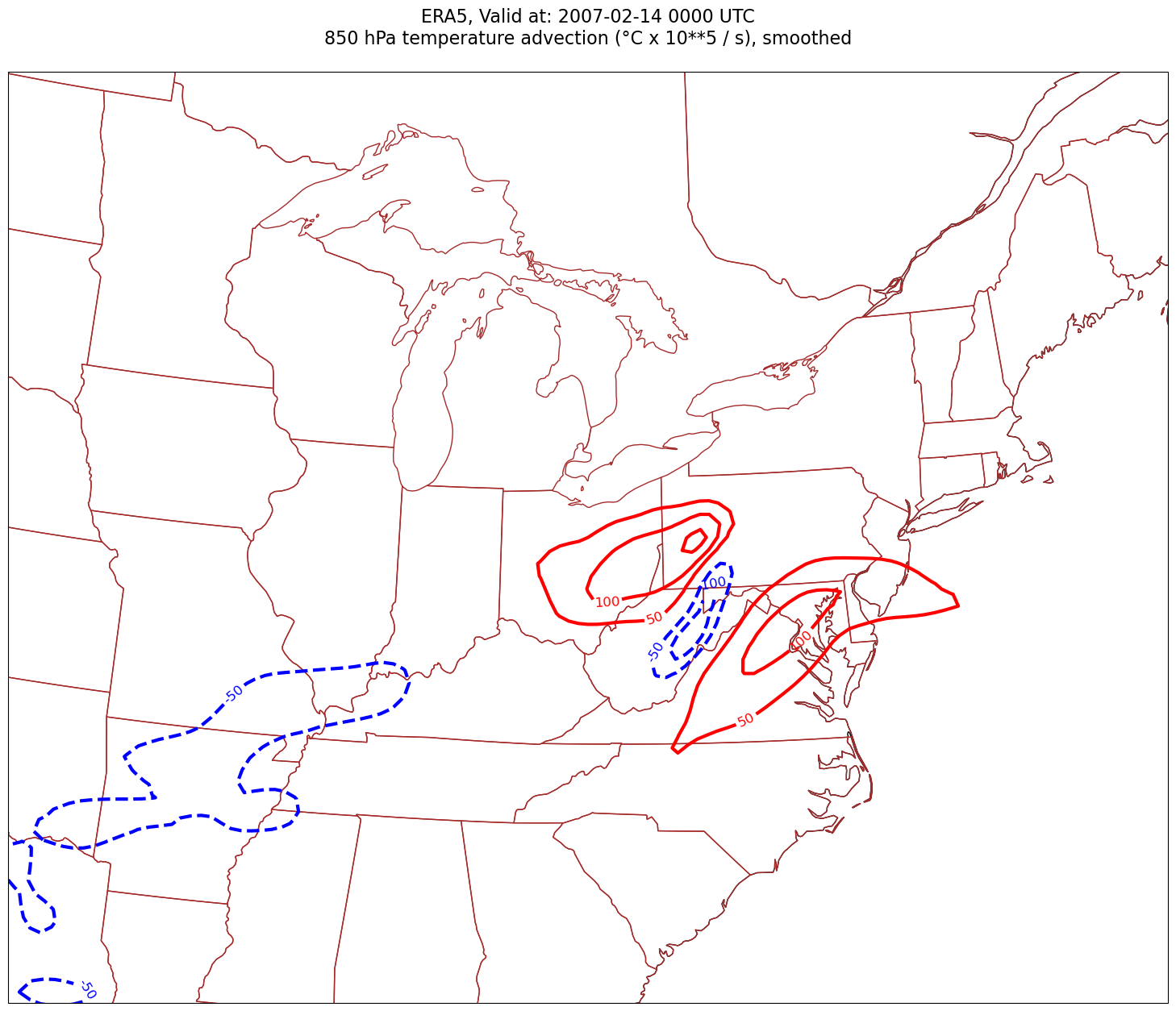
This is not a terribly “noisy” field. But let’s demonstrate the technique of employing a smoothing function. We will use a Gaussian filter, from the SciPy library, which, along with NumPy and Pandas, is one of the core packages in Python’s scientific software ecosystem.
MetPy includes the Gaussian smoother as one of its diagnostics.
sigma = 8.0 # this depends on how noisy your data is, adjust as necessary

tAdvSmooth = mpcalc.smooth_gaussian(tAdv, sigma)
As we did before with the unsmoothed values, let’s look at the resulting DataArray and its extrema.
tAdvSmoothscale = 1e5
minTAdv = (tAdvSmooth * scale).min().values
maxTAdv = (tAdvSmooth * scale).max().values
print (minTAdv, maxTAdv)-131.9038344996918 164.59686160599466
Not surprisingly, the magnitude of the extrema decreased.
Plot the smoothed advection field.
for time in dateRange:
    print(f'Processing {time}')

    # Create the time strings, for the figure title as well as for the file name.
    timeStr = dt.strftime(time,format="%Y-%m-%d %H%M UTC")
    timeStrFile = dt.strftime(time,format="%Y%m%d%H")

    tl1 = f'ERA5, Valid at: {timeStr}'
    tl2 = f'{p_level} hPa temperature advection (°C x 10**5 / s), smoothed'

    title_line = f'{tl1}\n{tl2}\n'

    fig = plt.figure(figsize=(21,15)) # Increase size to adjust for the constrained lats/lons
    ax = fig.add_subplot(1,1,1,projection=proj_map)
    ax.set_extent ([lonW+constrainLon,lonE-constrainLon,latS+constrainLat,latN-constrainLat])
    ax.add_feature(cfeature.COASTLINE.with_scale(res))
    ax.add_feature(cfeature.STATES.with_scale(res),edgecolor='brown')

    # Need to use Xarray's sel method here to specify the current time for any DataArray you are plotting.

    # 1a. Contour lines of warm (positive temperature) advection.
    # Don't forget to multiply by the scaling factor!
    cPosTAdv = ax.contour(lons, lats, tAdvSmooth.sel(time=time)*scale, levels=posAdvContours, colors='red', linewidths=3, transform=proj_data)
    ax.clabel(cPosTAdv, inline=1, fontsize=12, fmt='%.0f')

    # 1b. Contour lines of cold (negative temperature) advection
    cNegTAdv = ax.contour(lons, lats, tAdvSmooth.sel(time=time)*scale, levels=negAdvContours, colors='blue', linewidths=3, transform=proj_data)
    ax.clabel(cNegTAdv, inline=1, fontsize=12, fmt='%.0f')

    title = ax.set_title(title_line,fontsize=16)
    #Generate a string for the file name and save the graphic to your current directory.
    fileName = f'{timeStrFile}_ERA5_{p_level}_TAdvSmth.png'
    fig.savefig(fileName)
Processing 2007-02-14 00:00:00
What’s next?
We will calculate a different diagnostic from another event.