Pandas Notebook 2, ATM350 Spring 2026
Motivating Science Questions:
What was the daily temperature and precipitation at Albany last year?
What were the the days with the most precipitation?
Motivating Technical Question:
How can we use Pandas to do some basic statistical analyses of our data?
We’ll start by repeating some of the same steps we did in the first Pandas notebook.
import pandas as pd
import numpy as np
import matplotlib.pyplot as plt
import seaborn as snssns.set()year = 2025file = f'/spare11/atm350/common/data/climo_alb_{year}.csv'Display the first five lines of this file using Python’s built-in readline function
fileObj = open(file)
nLines = 5
for n in range(nLines):
    line = fileObj.readline()
    print(line)
DATE,MAX,MIN,AVG,DEP,HDD,CDD,PCP,SNW,DPT
2025-01-01,43,36,39.5,13.2,25,0,0.58,T,0
2025-01-02,38,30,34.0,7.9,31,0,0.07,1.4,0
2025-01-03,35,25,30.0,4.1,35,0,T,T,1
2025-01-04,29,21,25.0,-0.7,40,0,T,T,1
df = pd.read_csv(file, dtype='string')

nRows = df.shape[0]
print (f"Number of rows = {nRows}" )
nCols = df.shape[1]
print (f"Number of columns = {nCols}")

date = df['DATE']
date = pd.to_datetime(date,format="%Y-%m-%d")

maxT = df['MAX'].astype("float32")
minT = df['MIN'].astype("float32")
Number of rows = 365
Number of columns = 10
Let’s generate the final timeseries we made in our first Pandas notebook, with all the “bells and whistles” included.
from matplotlib.dates import DateFormatter, AutoDateLocator,HourLocator,DayLocator,MonthLocatorfig, ax = plt.subplots(figsize=(15,10))
ax.plot (date, maxT, color='red',label = "Max T")
ax.plot (date, minT, color='blue', label = "Min T")
ax.set_title (f"ALB Year {year}")
ax.set_xlabel('Date')
ax.set_ylabel('Temperature (°F)' )
ax.xaxis.set_major_locator(MonthLocator(interval=1))
dateFmt = DateFormatter('%b %d')
ax.xaxis.set_major_formatter(dateFmt)
ax.legend (loc="best")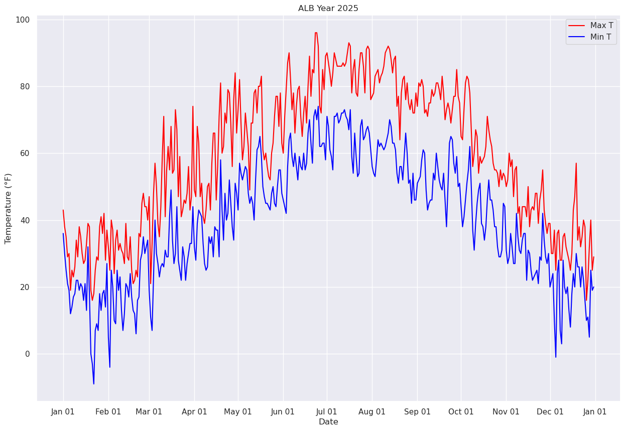
Read in precip data. This will be more challenging due to the presence of T(races).
Let’s remind ourselves what the Dataframe looks like, paying particular attention to the daily precip column (PCP).
df# Write your code in this cell.
Click to reveal only AFTER you have tried your own code!
precip = df['PCP']
precipprecip = df['PCP']
precip0 0.58
1 0.07
2 T
3 T
4 T
...
360 0.10
361 0.17
362 0.76
363 0.03
364 0.02
Name: PCP, Length: 365, dtype: stringThe task now is to convert these values from strings to floating point values. Our task is more complicated due to the presence of strings that are clearly not numerical ... such as “T” for trace.
As we did in the first Pandas notebook with max temperatures greater than or equal to 90, create a subset of our Dataframe that consists only of those days where precip was a trace.
traceDays = df[precip=='T']
traceDays# Write your code in this cell
Click to reveal only AFTER you have tried your own code!
numTraceDays = df[precip == 'T'].shape[0]
print (f"The total # of days in Albany in {year} that had a trace of precipitation was {numTraceDays}")numTraceDays = df[precip == 'T'].shape[0]
print (f"The total # of days in Albany in {year} that had a trace of precipitation was {numTraceDays}")The total # of days in Albany in 2025 that had a trace of precipitation was 71
Getting back to our task of converting precip amounts from strings to floating point numbers, one thing we could do is to create a new array and populate it via a loop, where we’d use an if-else logical test to check for Trace values and set the precip value to 0.00 for each day accordingly.
There is a more efficient way to do this, though!
We use the loc method of Pandas to find all elements of a DataSeries with a certain value, and then change that value to something else, all in the same line of code!
In this case, let’s set all values of ‘T’ to ‘0.00’
The line below is what we want! Before we execute it, let’s break it up into pieces.
df.loc[df['PCP'] =='T', ['PCP']] = '0.00'First, create a Series of booleans (i.e., a truth table) corresponding to the specified condition ... as we just did above (as well as for various maximum temperature criteria in the last notebook).
df['PCP'] == 'T'0 False
1 False
2 True
3 True
4 True
...
360 False
361 False
362 False
363 False
364 False
Name: PCP, Length: 365, dtype: booleanNext, build on that cell by using loc to display all rows that correspond to the condition being True.
df.loc[df['PCP'] == 'T']Further build this line of code by only returning the column of interest.
df.loc[df['PCP'] =='T', ['PCP']]Finally, we have arrived at the full line of code! Take the column of interest, in this case precip only on those days where a trace was measured, and set its value to 0.00.
df.loc[df['PCP'] =='T', ['PCP']] = '0.00'df['PCP']0 0.58
1 0.07
2 0.00
3 0.00
4 0.00
...
360 0.10
361 0.17
362 0.76
363 0.03
364 0.02
Name: PCP, Length: 365, dtype: stringThis operation actually modifies the Dataframe in place ... i.e., the individual cell values have changed, and henceforth in the notebook, the Dataframe will reflect these changed values. We can prove this by printing out a row from a date that we know had a trace amount.
But first, how do we simply print a specific row from a dataframe? Since we know that Jan. 3 had a trace of precip, try this:
jan03 = df['DATE'] == '2025-01-03'
jan030 False
1 False
2 True
3 False
4 False
...
360 False
361 False
362 False
363 False
364 False
Name: DATE, Length: 365, dtype: booleanThat produces a series of booleans; the one matching our condition is True. Now we can retrieve all the values for this date.
df[jan03]We see that the precip has now been set to 0.00.
Having done this check, and thus re-set the values, let’s now convert this series into floating point values.
precip = df['PCP'].astype("float32")precip0 0.58
1 0.07
2 0.00
3 0.00
4 0.00
...
360 0.10
361 0.17
362 0.76
363 0.03
364 0.02
Name: PCP, Length: 365, dtype: float32Plot each day’s precip total.
fig, ax = plt.subplots(figsize=(15,10))
ax.plot (date, precip, color='blue', marker='+',label = "Precip")
ax.set_title (f"ALB Year {year}")
ax.set_xlabel('Date')
ax.set_ylabel('Precip (in.)' )
ax.xaxis.set_major_locator(MonthLocator(interval=1))
dateFmt = DateFormatter('%b %d')
ax.xaxis.set_major_formatter(dateFmt)
ax.legend (loc="best")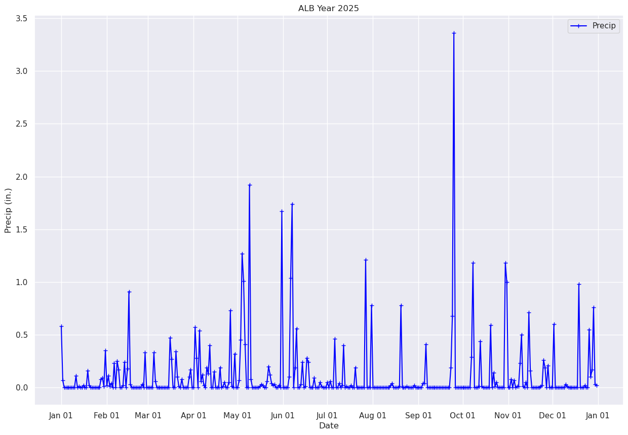
What if we just want to pick a certain time range? One simple way is to just pass in a subset of our x and y to the plot method.
# Plot out just the trace for October. Corresponds to Julian days 215-246 ... thus, indices 214-245 (why?).
fig, ax = plt.subplots(figsize=(15,10))
ax.plot (date[214:245], precip[214:245], color='blue', marker='+',label = "Precip")
ax.set_title (f"ALB Year {year}")
ax.set_xlabel('Date')
ax.set_ylabel('Precip (in.)' )
ax.xaxis.set_major_locator(MonthLocator(interval=1))
dateFmt = DateFormatter('%b %d')
ax.xaxis.set_major_formatter(dateFmt)
ax.legend (loc="best")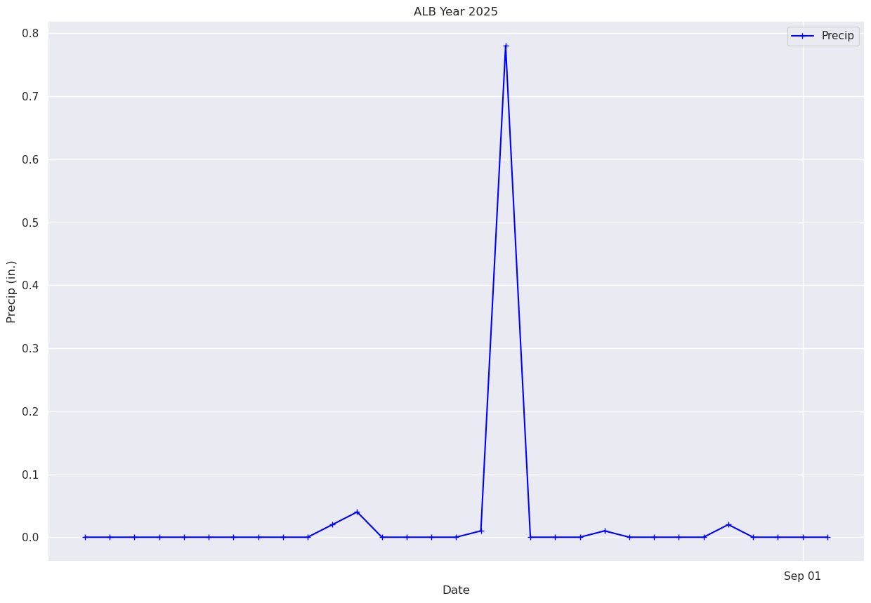
Pandas has a function to compute the cumulative sum of a series. We’ll use it to compute and graph Albany’s total precip over the year.
precipTotal = precip.cumsum()
precipTotal0 0.580000
1 0.650000
2 0.650000
3 0.650000
4 0.650000
...
360 40.379982
361 40.549980
362 41.309978
363 41.339977
364 41.359978
Name: PCP, Length: 365, dtype: float32We can see that the final total is in the last element of the precipTotal array. How can we explicitly print out just this value?
One of the methods available to us in a Pandas DataSeries is values. Let’s display it:
precipTotal.valuesarray([ 0.58 , 0.65 , 0.65 , 0.65 , 0.65 ,
0.65 , 0.65 , 0.65 , 0.65 , 0.65 ,
0.76 , 0.76 , 0.77 , 0.77 , 0.77 ,
0.78999996, 0.78999996, 0.78999996, 0.9499999 , 0.9699999 ,
0.9699999 , 0.9699999 , 0.9699999 , 0.9699999 , 0.9699999 ,
0.9699999 , 0.9699999 , 1.05 , 1.14 , 1.15 ,
1.5 , 1.52 , 1.63 , 1.64 , 1.68 ,
1.68 , 1.91 , 1.91 , 2.1599998 , 2.33 ,
2.33 , 2.33 , 2.35 , 2.59 , 2.59 ,
2.77 , 3.68 , 3.71 , 3.71 , 3.71 ,
3.71 , 3.71 , 3.71 , 3.71 , 3.71 ,
3.74 , 3.74 , 4.07 , 4.07 , 4.07 ,
4.07 , 4.07 , 4.07 , 4.4 , 4.46 ,
4.46 , 4.46 , 4.46 , 4.46 , 4.46 ,
4.46 , 4.46 , 4.46 , 4.46 , 4.93 ,
5.2 , 5.2 , 5.2 , 5.54 , 5.64 ,
5.65 , 5.65 , 5.73 , 5.73 , 5.73 ,
5.73 , 5.73 , 5.83 , 6. , 6. ,
6. , 6.57 , 6.8500004 , 6.8500004 , 7.3900003 ,
7.4500003 , 7.57 , 7.59 , 7.59 , 7.78 ,
7.9100003 , 8.31 , 8.31 , 8.31 , 8.46 ,
8.46 , 8.46 , 8.46 , 8.65 , 8.65 ,
8.66 , 8.71 , 8.71 , 8.71 , 8.76 ,
9.49 , 9.5 , 9.5 , 9.82 , 9.82 ,
9.82 , 9.889999 , 10.339999 , 11.609999 , 12.619999 ,
13.029999 , 13.029999 , 13.029999 , 14.949999 , 15.029999 ,
15.029999 , 15.029999 , 15.029999 , 15.029999 , 15.029999 ,
15.039999 , 15.069999 , 15.089999 , 15.089999 , 15.089999 ,
15.15 , 15.349999 , 15.469999 , 15.509999 , 15.53 ,
15.559999 , 15.559999 , 15.559999 , 15.58 , 15.58 ,
17.25 , 17.25 , 17.25 , 17.25 , 17.25 ,
17.35 , 18.39 , 20.13 , 20.13 , 20.32 ,
20.88 , 20.88 , 20.88 , 20.91 , 21.15 ,
21.15 , 21.16 , 21.44 , 21.68 , 21.68 ,
21.68 , 21.68 , 21.77 , 21.77 , 21.77 ,
21.77 , 21.82 , 21.83 , 21.83 , 21.83 ,
21.83 , 21.88 , 21.88 , 21.939999 , 21.939999 ,
21.939999 , 22.399998 , 22.399998 , 22.399998 , 22.439999 ,
22.439999 , 22.46 , 22.859999 , 22.859999 , 22.869999 ,
22.869999 , 22.869999 , 22.89 , 22.89 , 22.89 ,
23.08 , 23.08 , 23.08 , 23.08 , 23.08 ,
23.08 , 23.08 , 24.29 , 24.29 , 24.29 ,
24.29 , 25.070002 , 25.070002 , 25.070002 , 25.070002 ,
25.070002 , 25.070002 , 25.070002 , 25.070002 , 25.070002 ,
25.070002 , 25.070002 , 25.070002 , 25.070002 , 25.090002 ,
25.130003 , 25.130003 , 25.130003 , 25.130003 , 25.130003 ,
25.140003 , 25.920004 , 25.920004 , 25.920004 , 25.920004 ,
25.930004 , 25.930004 , 25.930004 , 25.930004 , 25.930004 ,
25.950005 , 25.950005 , 25.950005 , 25.950005 , 25.950005 ,
25.950005 , 25.990005 , 26.030006 , 26.440006 , 26.440006 ,
26.440006 , 26.440006 , 26.440006 , 26.440006 , 26.440006 ,
26.440006 , 26.440006 , 26.440006 , 26.440006 , 26.440006 ,
26.440006 , 26.440006 , 26.440006 , 26.440006 , 26.440006 ,
26.630007 , 27.310007 , 30.670008 , 30.670008 , 30.670008 ,
30.670008 , 30.670008 , 30.670008 , 30.670008 , 30.670008 ,
30.670008 , 30.670008 , 30.670008 , 30.670008 , 30.960009 ,
32.140007 , 32.140007 , 32.140007 , 32.140007 , 32.150005 ,
32.590004 , 32.600002 , 32.600002 , 32.600002 , 32.600002 ,
32.600002 , 32.600002 , 33.190002 , 33.190002 , 33.33 ,
33.34 , 33.39 , 33.39 , 33.39 , 33.39 ,
33.39 , 33.39 , 34.57 , 35.57 , 35.57 ,
35.57 , 35.65 , 35.65 , 35.72 , 35.72 ,
35.73 , 35.739998 , 35.969997 , 36.469997 , 36.479996 ,
36.479996 , 36.529995 , 36.529995 , 37.239994 , 37.399994 ,
37.399994 , 37.399994 , 37.399994 , 37.399994 , 37.399994 ,
37.399994 , 37.409992 , 37.429993 , 37.68999 , 37.87999 ,
37.87999 , 38.08999 , 38.08999 , 38.08999 , 38.08999 ,
38.689987 , 38.689987 , 38.689987 , 38.689987 , 38.689987 ,
38.689987 , 38.689987 , 38.689987 , 38.719986 , 38.729984 ,
38.729984 , 38.729984 , 38.729984 , 38.729984 , 38.729984 ,
38.729984 , 38.729984 , 39.709984 , 39.709984 , 39.709984 ,
39.709984 , 39.729984 , 39.729984 , 39.729984 , 40.279984 ,
40.379982 , 40.54998 , 41.30998 , 41.339977 , 41.359978 ],
dtype=float32)We can output the last element of this list of values. Remember how to do that? Recall that in a Python list, we can use negative integers to reverse the sense of the list. The last element ... i.e. the value corresponding to the final day of the year, would correspond to what index number?
# Substitute the appropriate index for the ??? in the next line.
precipTotal.values[???] Cell In[28], line 2
precipTotal.values[???]
^
SyntaxError: invalid syntax
Plot the timeseries of the cumulative precip for Albany over the year.
fig, ax = plt.subplots(figsize=(15,10))
ax.plot (date, precipTotal, color='blue', marker='.',label = "Precip")
ax.set_title (f"ALB Year {year}")
ax.set_xlabel('Date')
ax.set_ylabel('Precip (in.)' )
ax.xaxis.set_major_locator(MonthLocator(interval=1))
dateFmt = DateFormatter('%b %d')
ax.xaxis.set_major_formatter(dateFmt)
ax.legend (loc="best")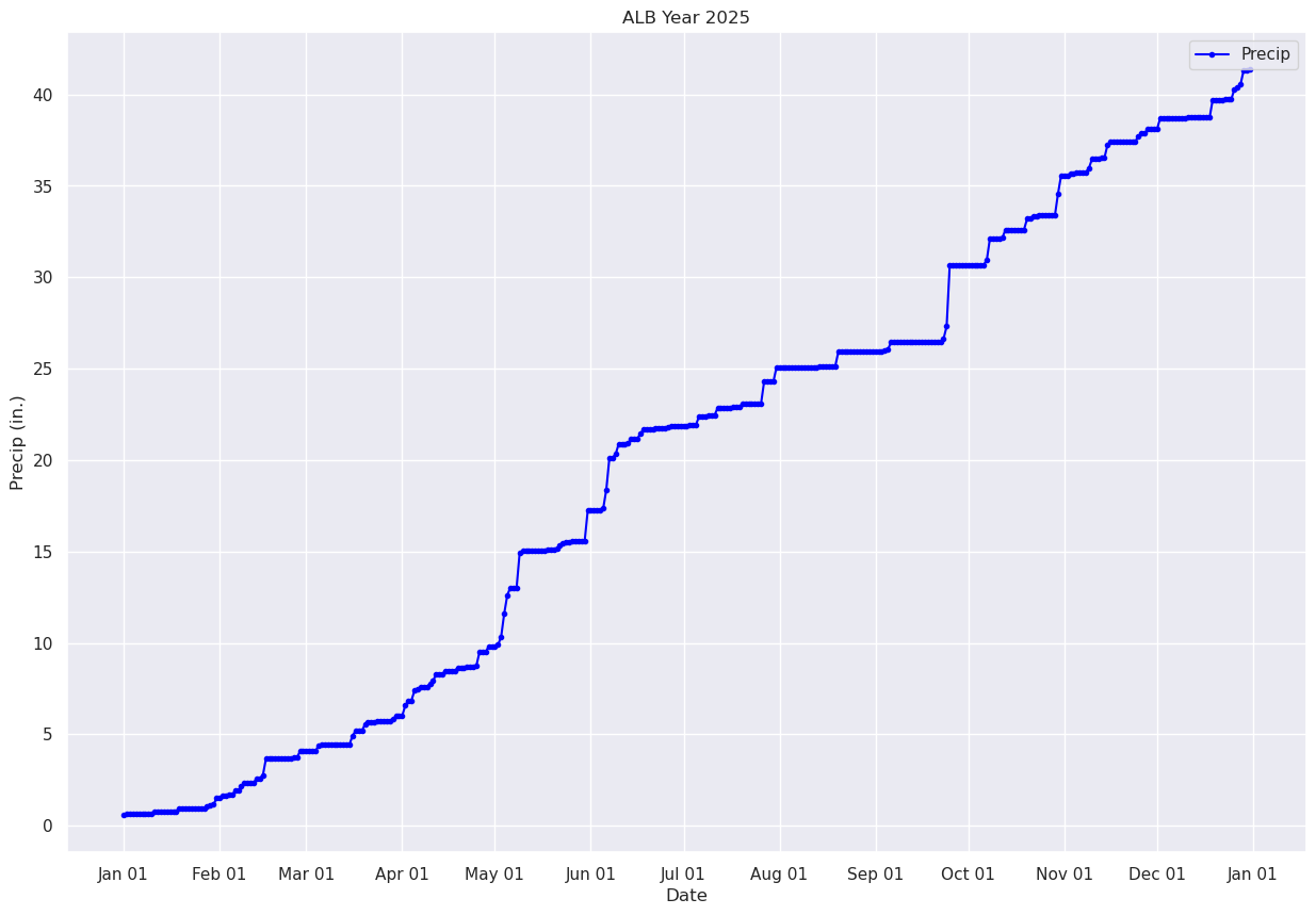
Pandas has a plethora of statistical analysis methods to apply on tabular data. An excellent summary method is describe.
maxT.describe()count 365.000000
mean 59.120548
std 20.885399
min 16.000000
25% 41.000000
50% 60.000000
75% 78.000000
max 96.000000
Name: MAX, dtype: float64minT.describe()count 365.000000
mean 40.054794
std 18.425003
min -9.000000
25% 26.000000
50% 41.000000
75% 55.000000
max 74.000000
Name: MIN, dtype: float64precip.describe()count 365.000000
mean 0.113315
std 0.315258
min 0.000000
25% 0.000000
50% 0.000000
75% 0.050000
max 3.360000
Name: PCP, dtype: float64Pandas is ideally suited for time-series analyses on tabular datasets. We’ll wrap up by calculating and then plotting rolling means over a period of days in the year, in order to smooth out the day-to-day variations.
First, let’s replot the max and min temperature trace for the entire year, day-by-day.
fig, ax = plt.subplots(figsize=(15,10))
ax.plot (date, maxT, color='red',label = "Max T")
ax.plot (date, minT, color='blue', label = "Min T")
ax.set_title (f"ALB Year {year}")
ax.set_xlabel('Date')
ax.set_ylabel('Temperature (°F)' )
ax.xaxis.set_major_locator(MonthLocator(interval=1))
dateFmt = DateFormatter('%b %d')
ax.xaxis.set_major_formatter(dateFmt)
ax.legend (loc="best")Now, let’s calculate and plot the daily mean temperature.
meanT = (maxT + minT) / 2.meanT0 39.5
1 34.0
2 30.0
3 25.0
4 24.5
...
360 16.5
361 18.5
362 32.5
363 22.0
364 24.5
Length: 365, dtype: float32fig, ax = plt.subplots(figsize=(15,10))
ax.plot (date, meanT, color='green',label = "Mean T")
ax.set_title (f"ALB Year {year}")
ax.set_xlabel('Date')
ax.set_ylabel('Temperature (°F)' )
ax.xaxis.set_major_locator(MonthLocator(interval=1))
dateFmt = DateFormatter('%b %d')
ax.xaxis.set_major_formatter(dateFmt)
ax.legend (loc="best")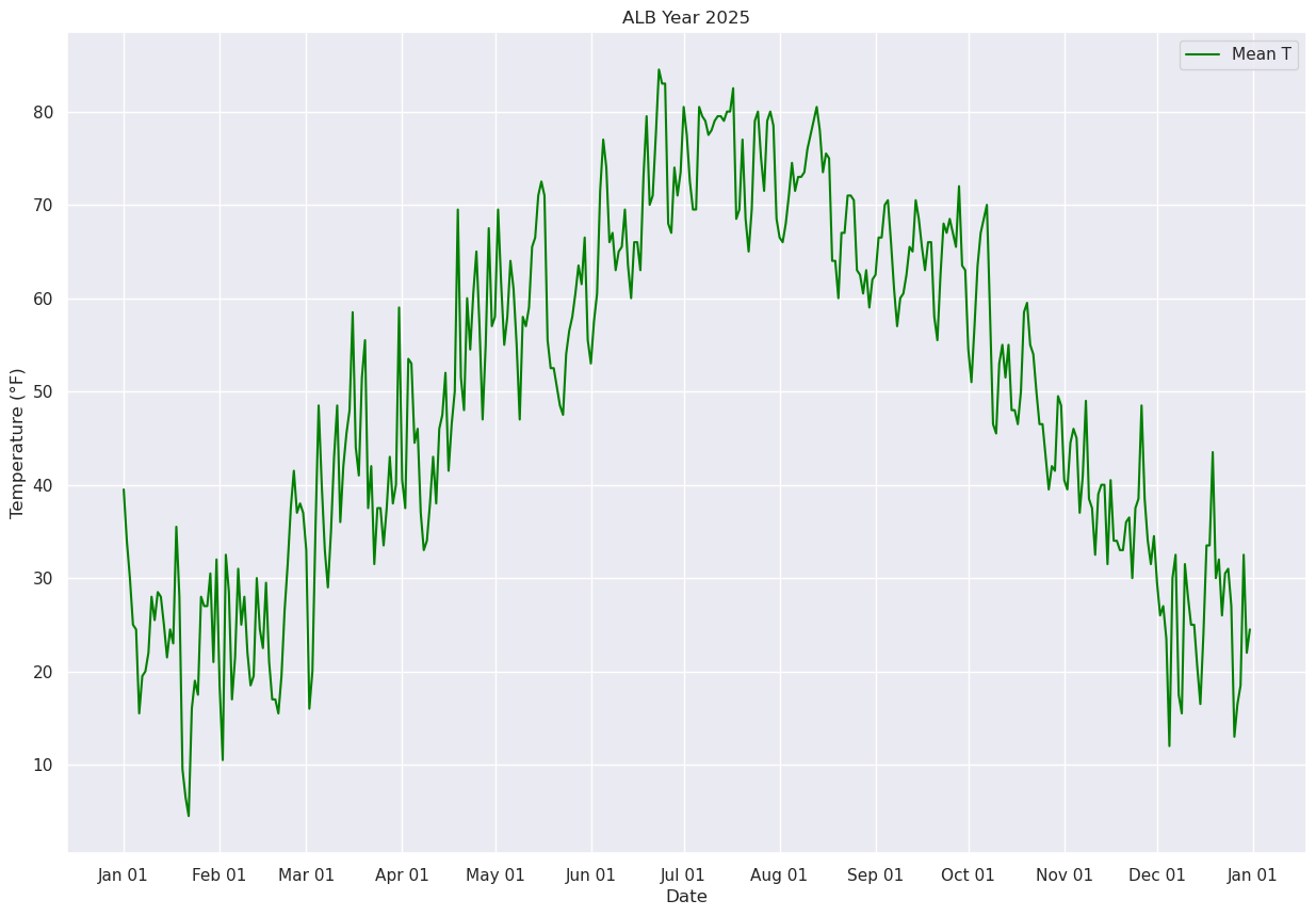
Next, let’s use Pandas’ rolling method to calculate the mean over a specified number of days. We’ll center the window at the midpoint of each period (thus, for a 30-day window, the first plotted point will be on Jan. 16 ... covering the Jan. 1 --> Jan. 30 timeframe.
meanTr5 = meanT.rolling(window=5, center=True)
meanTr10 = meanT.rolling(window=10, center=True)
meanTr15 = meanT.rolling(window=15, center=True)
meanTr30 = meanT.rolling(window=30, center=True)meanTr30.mean()0 NaN
1 NaN
2 NaN
3 NaN
4 NaN
..
360 NaN
361 NaN
362 NaN
363 NaN
364 NaN
Length: 365, dtype: float64meanTr5.mean()0 NaN
1 NaN
2 30.6
3 25.8
4 22.9
...
360 21.5
361 20.5
362 22.8
363 NaN
364 NaN
Length: 365, dtype: float64fig, ax = plt.subplots(figsize=(15,10))
ax.plot (date, meanT, color='green',label = "Mean T",alpha=0.2)
ax.plot (date, meanTr5.mean(), color='blue',label = "5 Day", alpha=0.3)
ax.plot (date, meanTr10.mean(), color='purple',label = "10 Day", alpha=0.3)
ax.plot (date, meanTr15.mean(), color='brown',label = "15 Day", alpha=0.3)
ax.plot (date, meanTr30.mean(), color='orange',label = "30 Day", alpha=1.0, linewidth=2)
ax.set_title (f"ALB Year {year}")
ax.set_xlabel('Date')
ax.set_ylabel('Temperature (°F)' )
ax.xaxis.set_major_locator(MonthLocator(interval=1))
dateFmt = DateFormatter('%b %d')
ax.xaxis.set_major_formatter(dateFmt)
ax.legend (loc="best")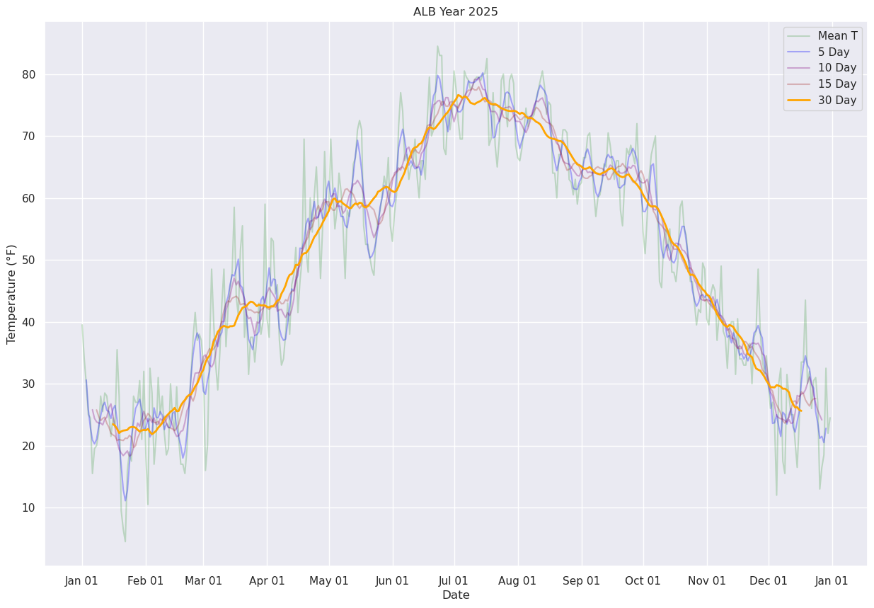
Display just the daily and 30-day running mean.
fig, ax = plt.subplots(figsize=(15,10))
ax.plot (date, meanT, color='green',label = "Mean T",alpha=0.2)
ax.plot (date, meanTr30.mean(), color='orange',label = "30 Day", alpha=1.0, linewidth=2)
ax.set_title (f"ALB Year {year}")
ax.set_xlabel('Date')
ax.set_ylabel('Temperature (°F)' )
ax.xaxis.set_major_locator(MonthLocator(interval=1))
dateFmt = DateFormatter('%b %d')
ax.xaxis.set_major_formatter(dateFmt)
ax.legend (loc="best")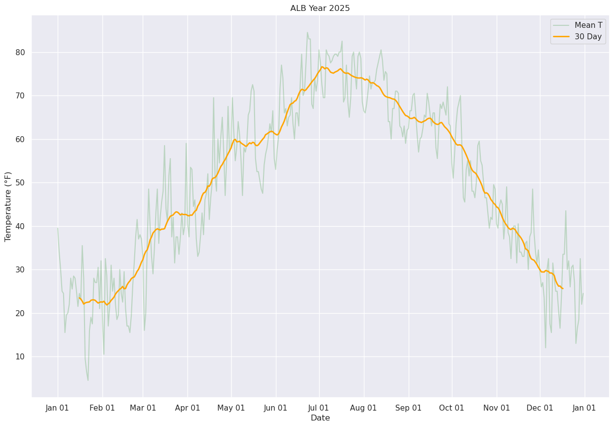
References
Rolling means in Pandas: