Tropical cyclone track map and time series
Overview
In this notebook, you will create visualizations of tropical cyclone data, using Pandas, Matplotlib and Cartopy.
Imports
import pandas as pd
import matplotlib.pyplot as plt
import cartopy.crs as ccrs
import cartopy.feature as cfeature
from matplotlib.dates import DateFormatter, AutoDateLocator,HourLocator,DayLocator,MonthLocator
Part 1: Minimum central sea-level pressure and maximum wind speed of Hurricane Helene (2024)
Open the csv file containing 6-hourly data from Helene, as archived in NHC’s HURDAT.
Use Matplotlib and create a single Figure with two subplots (i.e., Axes), one on top of the other:
- On the top subplot, plot date and time on the x-axis, and central sea-level pressure in hPa on the y-axis.
- On the bottom subplot, as in the top, but plot maximum sustained wind speed in mph on the y-axis.
- Save your figure as a PNG
Set the name and year of the tropical cyclone to use in figure captions
tc_name = 'Helene'
tc_year = '2024'
Read in the CSV file as a Pandas DataFrame
df = pd.read_csv('/spare11/atm533/data/helene_2024.csv')Examine the DataFrame
dfRead in columns, termed as Series in Pandas, of parameters of interest:
- Latitude (deg)
- Longitude (deg)
- Central SLP (hPa)
- Maximum wind speed (kts)
- Date and time (format: YYYY-MM-DD HH:MM:SS; time zone: UTC)
lat = df.Lat
lon = df.Lon
slp = df.Min_SLP
wspd = df.Max_Speed
dattim = df.Time
Create a Figure with two subplots (aka, Axes) and make two line graphs. On the top (bottom) Axes, plot SLP (max wind) versus date/time.
fig = plt.figure(figsize=(12,9))
ax1 = fig.add_subplot (2,1,1)
ax1.plot(dattim, slp)
ax2 = fig.add_subplot(2,1,2)
ax2.plot(dattim, wspd)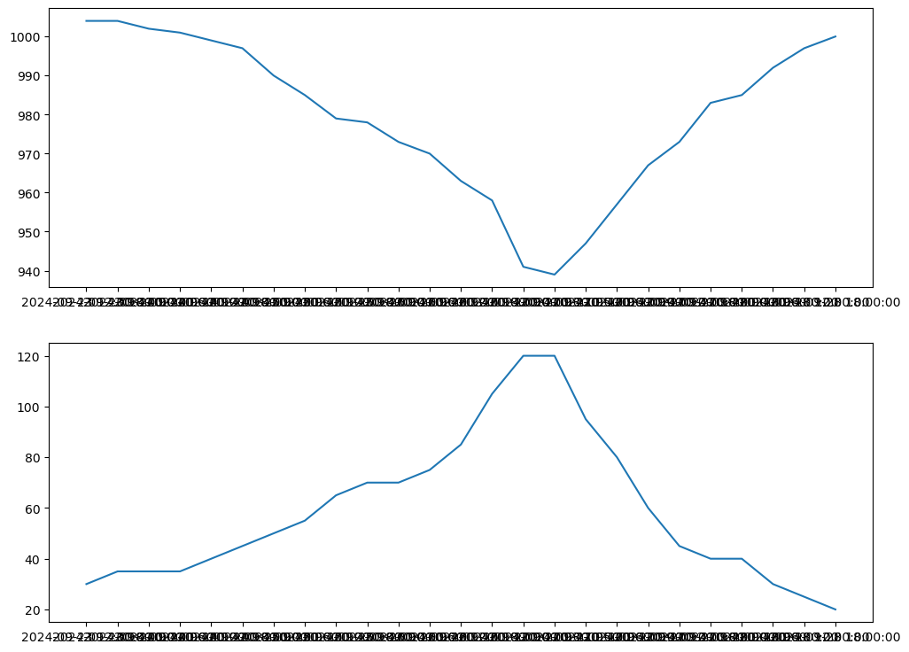
A quick and easy way to make the plot better looking is to import and apply the Seaborn package.
import seaborn as sns
sns.set()
fig = plt.figure(figsize=(12,9))
ax1 = fig.add_subplot (2,1,1)
ax1.plot(dattim, slp)
ax2 = fig.add_subplot(2,1,2)
ax2.plot(dattim, wspd)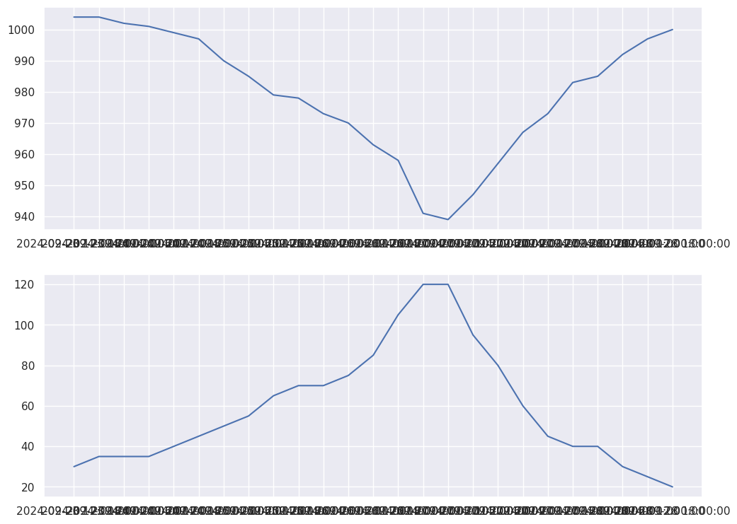
Add a title and axis labels
fig = plt.figure(figsize=(12,9))

fig.suptitle(f'{tc_name} ({tc_year}) Min. SLP, Max. Wind', fontsize=16)

ax1 = fig.add_subplot (2,1,1)
ax1.plot(dattim, slp)
ax1.set_xlabel('Date and time')
ax1.set_ylabel('SLP (hPa)')

ax2 = fig.add_subplot(2,1,2)
ax2.plot(dattim, wspd)
ax2.set_xlabel('Date and time')
ax2.set_ylabel('Windspeed (kts)');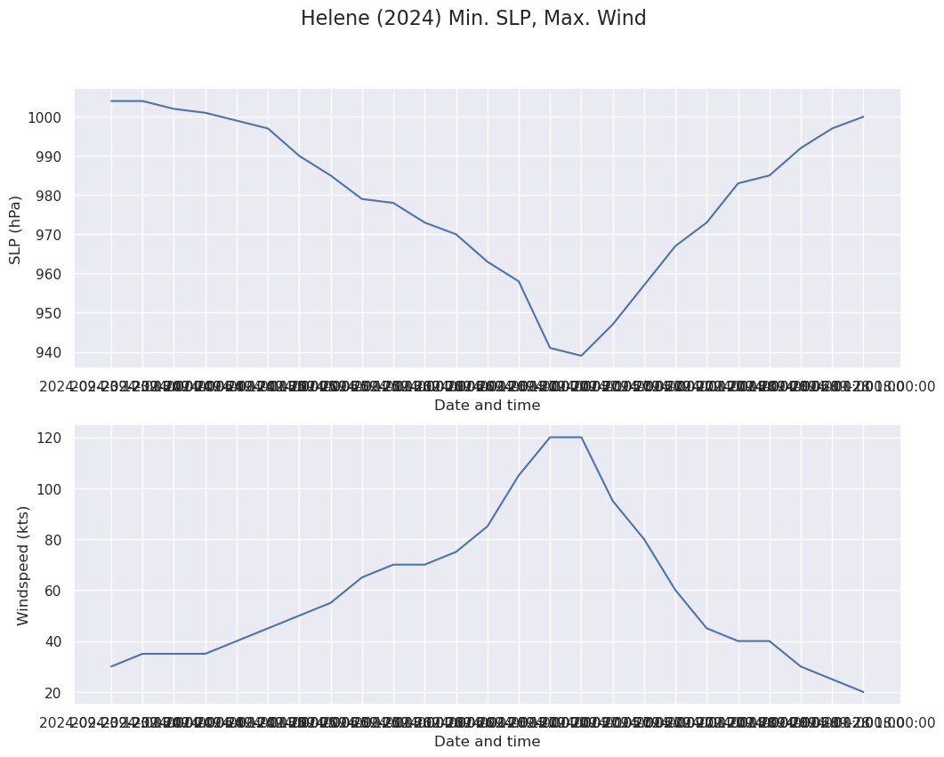
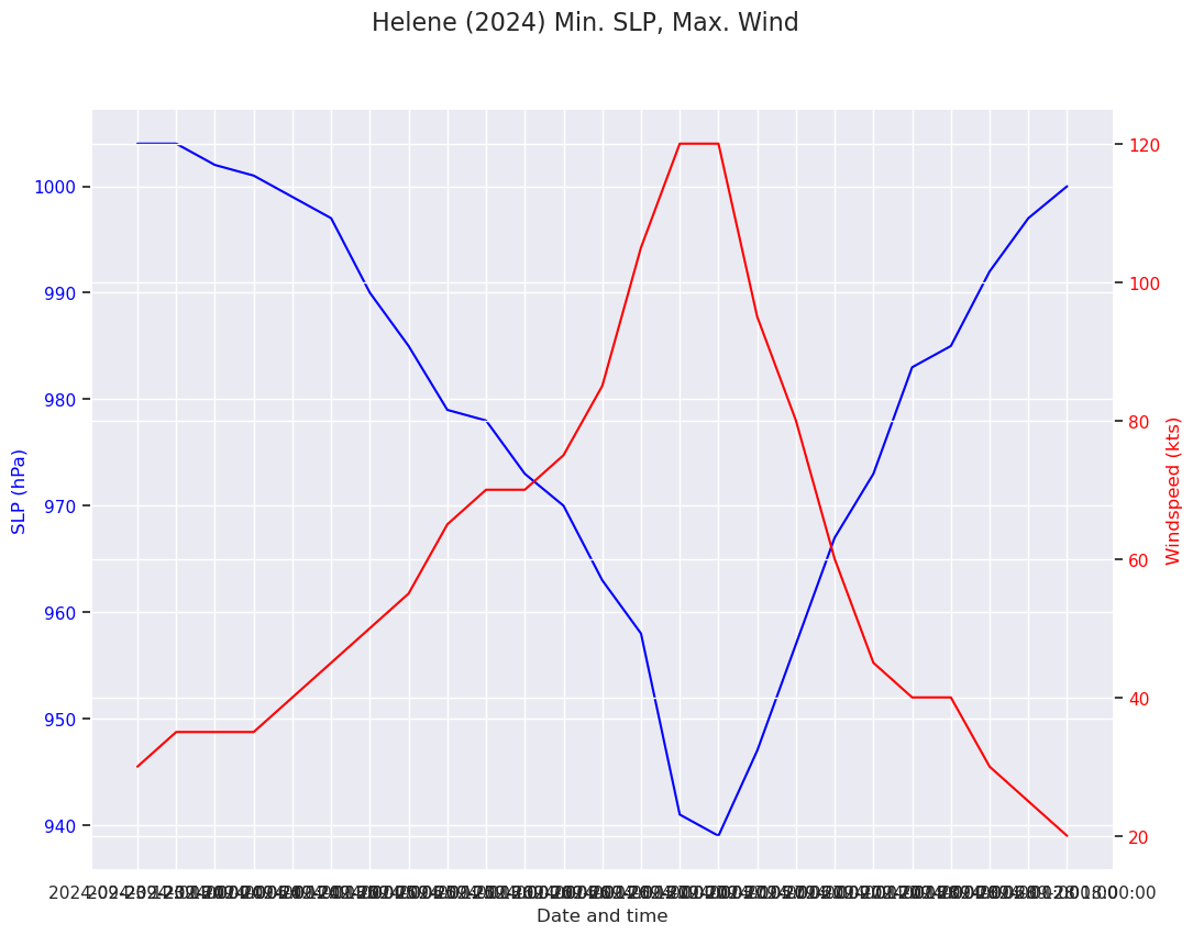
A better visualization:
Rather than placing SLP and wind speed in their own subplots, let's have them share a single subplot. We will need to add a legend, and also have a separate y-axis for each variable.fig = plt.figure(figsize=(12,9))
fig.suptitle(f'{tc_name} ({tc_year}) Min. SLP, Max. Wind', fontsize=16)
ax1 = fig.add_subplot (1,1,1)
ax1_color='blue'
ax1.plot(dattim, slp, label='SLP', color=ax1_color)
ax1.set_xlabel('Date and time')
ax1.set_ylabel('SLP (hPa)', color=ax1_color)
ax1.tick_params(axis='y', labelcolor=ax1_color)
ax2_color='red'
ax2 = ax1.twinx() # instantiate a second axes that shares the same x-axis
ax2.plot(dattim, wspd, label='Windspeed', color=ax2_color)
ax2.set_ylabel('Windspeed (kts)', color=ax2_color) # we already handled the x-label with ax1
ax2.tick_params(axis='y', labelcolor=ax2_color);
There are still a few things we can improve:
- Re-cast the x-axis from strings to
Datetimeobjects, using a handy Pandas method - Re-format the x-axis labels, now that they are
Datetimeobjects - Distinguish the y-axis gridlines
dattim_dt = pd.to_datetime(dattim,format="%Y-%m-%d %H:%M:%S")fig = plt.figure(figsize=(12,9))
fig.suptitle(f'{tc_name} ({tc_year}) Min. SLP, Max. Wind', fontsize=16)
ax1 = fig.add_subplot (1,1,1)
ax1_color='blue'
ax1.set_ylim(900,1020)
ax1.plot(dattim_dt, slp, label='SLP', color=ax1_color)
ax1.set_xlabel('Date')
ax1.set_ylabel('SLP (hPa)', color=ax1_color)
ax1.tick_params(axis='y', labelcolor=ax1_color)
ax1.grid(color=ax1_color, axis='y', linestyle='dashed', linewidth=0.5)
ax1.xaxis.set_major_locator(DayLocator(interval=1))
dateFmt = DateFormatter('%b %d')
ax1.xaxis.set_major_formatter(dateFmt)
ax2_color='red'
ax2 = ax1.twinx() # instantiate a second axes that shares the same x-axis
ax2.set_ylim(0, 160)
ax2.plot(dattim_dt, wspd, label='Windspeed', color=ax2_color)
ax2.set_ylabel('Windspeed (kts)', color=ax2_color) # we already handled the x-label with ax1
ax2.tick_params(axis='y', labelcolor=ax2_color)
ax2.grid(color=ax2_color, axis='y', linestyle='dotted', linewidth=0.3)
# ask matplotlib for the plotted objects and their labels
lines, labels = ax1.get_legend_handles_labels()
lines2, labels2 = ax2.get_legend_handles_labels()
ax2.legend(lines + lines2, labels + labels2, loc=0);
#ax1.legend()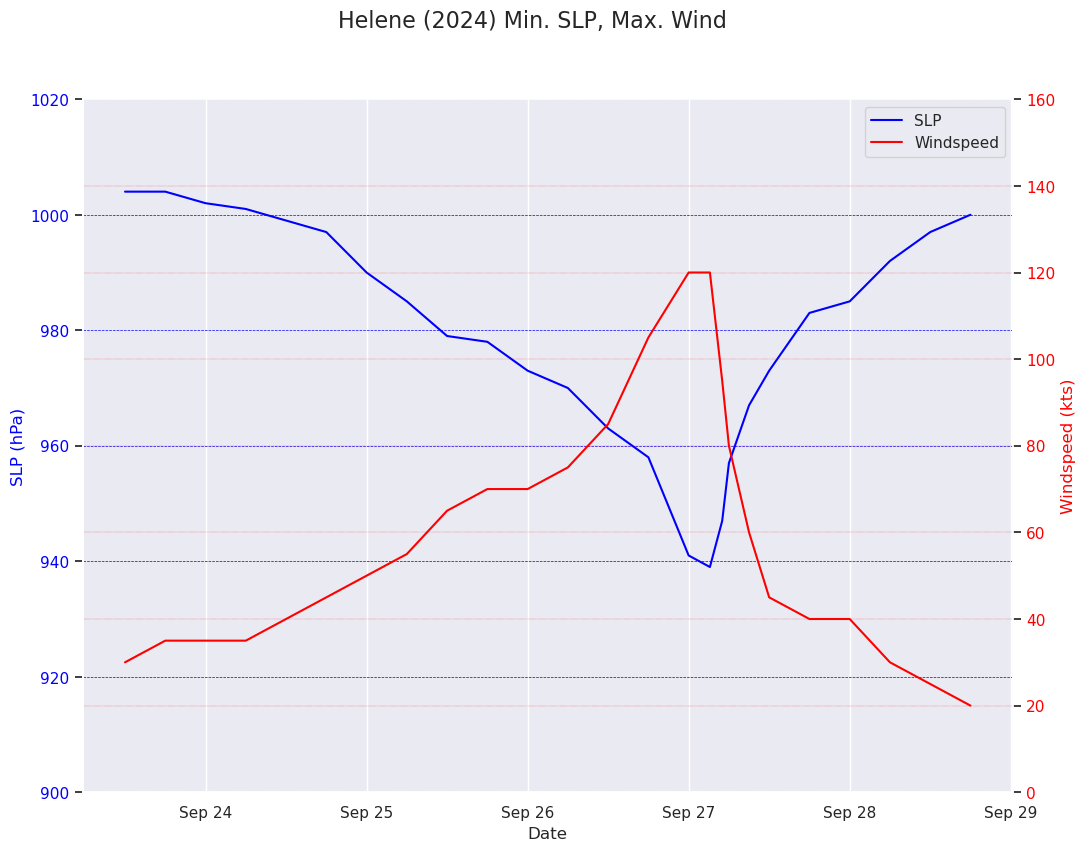
Save the figure as a PNG
fig.savefig(f'{tc_name}{tc_year}_TimeSeries_SLP_WSPD.png')Part 2: Plot the center of Franklin on a map
- Use Matplotlib and Cartopy to plot the locations of Franklin for the same time period you used in Part 1.
- Save your figure as a PNG
Define an object pointing to the Cartopy coordinate reference system in which the dataset is based. Since the data is in lat-lon coordinates, we’ll use PlateCarree.
projData = ccrs.PlateCarree()Define the bounds over which to plot the data
mapBounds = [-90,-50,10,40]Create the figure
fig = plt.figure(figsize=(12,9))
ax = fig.add_subplot (projection=projData)
ax.set_extent(mapBounds, crs=projData)
gl = ax.gridlines(
    draw_labels=True, linewidth=2, color='gray', alpha=0.5, linestyle='--'
)
ax.set_facecolor(cfeature.COLORS['water'])
ax.add_feature(cfeature.LAND)
ax.add_feature(cfeature.COASTLINE)
ax.add_feature(cfeature.BORDERS, linestyle='--')
ax.add_feature(cfeature.LAKES, alpha=0.5)
ax.add_feature(cfeature.STATES)
ax.add_feature(cfeature.RIVERS)
ax.set_title(f'Center locations of {tc_name} ({tc_year})')
ax.plot(lon,lat);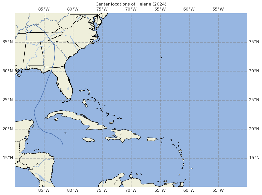
Let’s improve the look of the figure by making the track line more conspicuous:
fig = plt.figure(figsize=(12,9))
ax = fig.add_subplot (projection=projData)
ax.set_extent(mapBounds, crs=projData)
gl = ax.gridlines(
    draw_labels=True, linewidth=2, color='gray', alpha=0.5, linestyle='--'
)
ax.set_facecolor(cfeature.COLORS['water'])
ax.add_feature(cfeature.LAND)
ax.add_feature(cfeature.COASTLINE)
ax.add_feature(cfeature.BORDERS, linestyle='--')
ax.add_feature(cfeature.LAKES, alpha=0.5)
ax.add_feature(cfeature.STATES)
ax.add_feature(cfeature.RIVERS)
ax.set_xlabel('Latitude')
ax.set_title(f'Center locations of {tc_name} ({tc_year})')
ax.plot(lon,lat, color='darkgreen', marker='o', linestyle='dashed',
     linewidth=2, markersize=12);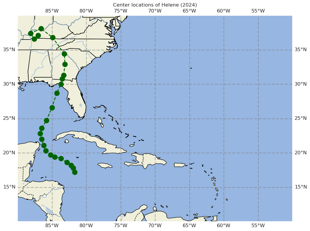
We’ll further improve the figure by using tropical cyclone symbols to mark the locations; the tcmarkers package works nicely!
import tcmarkersfig = plt.figure(figsize=(12,9))
ax = fig.add_subplot (projection=projData)
ax.set_extent(mapBounds, crs=projData)
gl = ax.gridlines(
draw_labels=True, linewidth=2, color='gray', alpha=0.5, linestyle='--'
)
ax.set_facecolor(cfeature.COLORS['water'])
ax.add_feature(cfeature.LAND)
ax.add_feature(cfeature.COASTLINE)
ax.add_feature(cfeature.BORDERS, linestyle='--')
ax.add_feature(cfeature.LAKES, alpha=0.5)
ax.add_feature(cfeature.STATES)
ax.add_feature(cfeature.RIVERS)
ax.set_title(f'Center locations of {tc_name} ({tc_year})')
ax.plot(lon,lat, color='darkgreen')
marker_kwargs = {'s': 40, 'color':'darkgreen', 'edgecolor':'darkgreen'}
for idx, value in enumerate (wspd):
if (value < 34):
sym = tcmarkers.TD
if (lat[idx] < 0):
sym = tcmarkers.SH_TD
elif (value < 64):
sym = tcmarkers.TS
if (lat[idx] < 0):
sym = tcmarkers.SH_TS
else:
sym = tcmarkers.HU
if (lat[idx] < 0):
sym = tcmarkers.SH_HU
ax.scatter(lon[idx], lat[idx], marker=sym, **marker_kwargs);
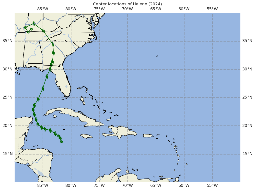
Save the figure as a PNG
fig.savefig(f'{tc_name}_{tc_year}_TrackMap.png')REMINDER
Remember to save, close and shutdown your notebook when you are not actively developing it!References
- Landsea, C. W., & Franklin, J. L. (2013). Atlantic Hurricane Database Uncertainty and Presentation of a New Database Format. Monthly Weather Review, 141(10), 3576–3592. 10.1175/mwr-d-12-00254.1