Xarray 2: Computations and Masks
Overview
- Do basic arithmetic with DataArrays and Datasets
- Perform aggregation (reduction) along one or multiple dimensions of a DataArray or Dataset
- Compute climatology and anomaly using xarray’s “split-apply-combine” approach via
.groupby() - Perform weighted reductions along one or multiple dimensions of a DataArray or Dataset
- Provide an overview of masking data in xarray
- Mask data using
.where()method
Imports
import matplotlib.pyplot as plt
import numpy as np
import xarray as xr
from pythia_datasets import DATASETS
/knight/pixi/sep24/sep25_env-5711917176091715257/envs/default/lib/python3.13/site-packages/pythia_datasets/__init__.py:4: UserWarning: pkg_resources is deprecated as an API. See https://setuptools.pypa.io/en/latest/pkg_resources.html. The pkg_resources package is slated for removal as early as 2025-11-30. Refrain from using this package or pin to Setuptools<81.
from pkg_resources import DistributionNotFound, get_distribution
Let’s open the monthly sea surface temperature dataset from the Community Earth System Model v2 (CESM2), which is a Global Climate Model:
filepath = DATASETS.fetch('CESM2_sst_data.nc')
ds = xr.open_dataset(filepath)
dsArithmetic Operations
Arithmetic operations with a single DataArray automatically apply over all array values (like NumPy). This process is called vectorization. Let’s convert the air temperature from degrees Celsius to kelvins:
ds.tos + 273.15Let’s square all values in tos:
ds.tos ** 2Aggregation Methods
A very common step during data analysis is to summarize the data in question by computing aggregations like sum(), mean(), median(), min(), max(). This reduced data provide insight into the nature of large datasets. Let’s explore some of these aggregation methods.
Compute the mean:
ds.tos.mean()Because we specified no dim argument the function was applied over all dimensions, computing the mean of every element of tos across time and space. It is possible to specify a dimension along which to compute an aggregation. For example, to calculate the mean in time for all locations, specify the time dimension as the dimension along which the mean should be calculated. Using Xarray’s plot function, visualize the mean SST.
ds.tos.mean(dim='time').plot(size=7);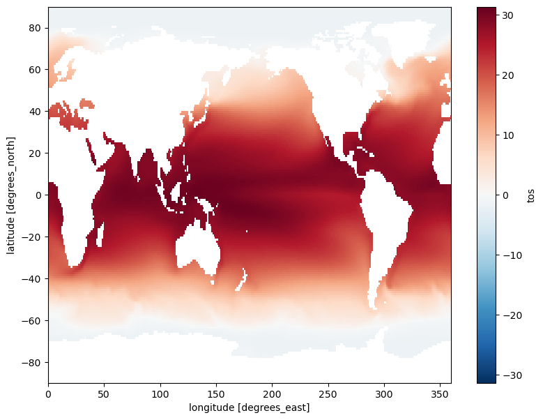
Compute the temporal min:
ds.tos.min(dim=['time'])Compute the spatial sum:
ds.tos.sum(dim=['lat', 'lon'])Compute the temporal median:
ds.tos.median(dim='time')The following table summarizes some other built-in xarray aggregations:
| Aggregation | Description |
|---|---|
count() | Total number of items |
mean(), median() | Mean and median |
min(), max() | Minimum and maximum |
std(), var() | Standard deviation and variance |
prod() | Compute product of elements |
sum() | Compute sum of elements |
argmin(), argmax() | Find index of minimum and maximum value |
GroupBy: Split, Apply, Combine
Simple aggregations can give useful summaries of our dataset, but often we would prefer to aggregate conditionally on some coordinate labels or groups. Xarray provides the so-called groupby operation which enables the split-apply-combine workflow on Xarray DataArrays and Datasets.
First, let’s select a gridpoint closest to a specified lat-lon, and plot a time series of SST at that point. The annual cycle will be quite evident.
ds.tos.sel(lon=310, lat=50, method='nearest').plot();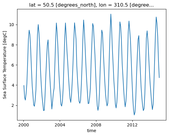
Split
Let’s group data by month, i.e. all Januaries in one group, all Februaries in one group, etc.
ds.tos.groupby(ds.time.dt.month)<DataArrayGroupBy, grouped over 1 grouper(s), 12 groups in total:
'month': UniqueGrouper('month'), 12/12 groups with labels 1, 2, 3, 4, 5, 6, 7, 8, 9, 10, 11, 12>DatetimeAccessor function to extract specific components of dates/times in our time coordinate dimension. For example, we can extract the year with: ds.time.dt.year.Xarray also offers a more concise syntax when the variable you’re grouping on is already present in the dataset. This is identical to ds.tos.groupby(ds.time.dt.month):
ds.tos.groupby('time.month')<DataArrayGroupBy, grouped over 1 grouper(s), 12 groups in total:
'month': UniqueGrouper('month'), 12/12 groups with labels 1, 2, 3, 4, 5, 6, 7, 8, 9, 10, 11, 12>Apply & Combine
Now that we have groups defined, it’s time to “apply” a calculation to the group. These calculations can either be:
- aggregation: reduces the size of the group
- transformation: preserves the group’s full size
At then end of the apply step, xarray will automatically combine the aggregated/transformed groups back into a single object.
Compute climatology
Let’s calculate the climatology at every point in the dataset:
tos_clim = ds.tos.groupby('time.month').mean()
tos_climPlot climatology at a specific point:
tos_clim.sel(lon=310, lat=50, method='nearest').plot();
Plot zonal mean climatology:
tos_clim.mean(dim='lon').transpose().plot.contourf(levels=12, robust=True, cmap='turbo');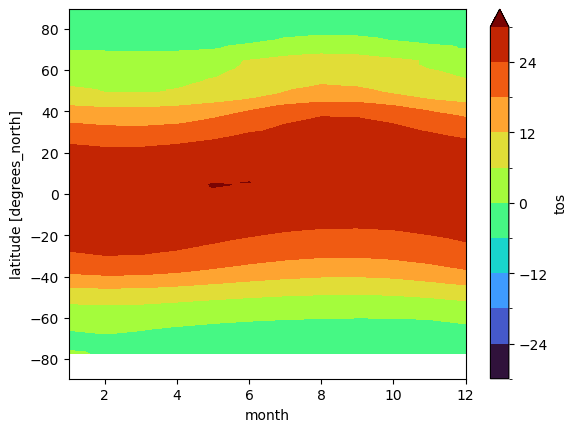
Calculate and plot the difference between January and December climatologies:
(tos_clim.sel(month=1) - tos_clim.sel(month=12)).plot(size=6, robust=True);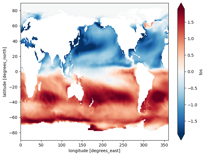
Compute anomaly
Now let’s combine the previous steps to compute climatology and use xarray’s groupby arithmetic to remove this climatology from our original data:
gb = ds.tos.groupby('time.month')
tos_anom = gb - gb.mean(dim='time')
tos_anomtos_anom.sel(lon=310, lat=50, method='nearest').plot();
Let’s compute and visualize the mean global anomaly over time. We need to specify both lat and lon dimensions in the dim argument to mean():
unweighted_mean_global_anom = tos_anom.mean(dim=['lat', 'lon'])
unweighted_mean_global_anom.plot();
weighted method to accomplish this.Let’s first load the cell area data, from another CESM2 dataset that contains the weights for the grid cells:
filepath2 = DATASETS.fetch('CESM2_grid_variables.nc')
areacello = xr.open_dataset(filepath2).areacello
areacelloAs before, let’s calculate area-weighted mean global anomaly:
weighted_mean_global_anom = tos_anom.weighted(areacello).mean(dim=['lat', 'lon'])Let’s plot both unweighted and weighted means:
unweighted_mean_global_anom.plot(size=7)
weighted_mean_global_anom.plot()
plt.legend(['unweighted', 'weighted']);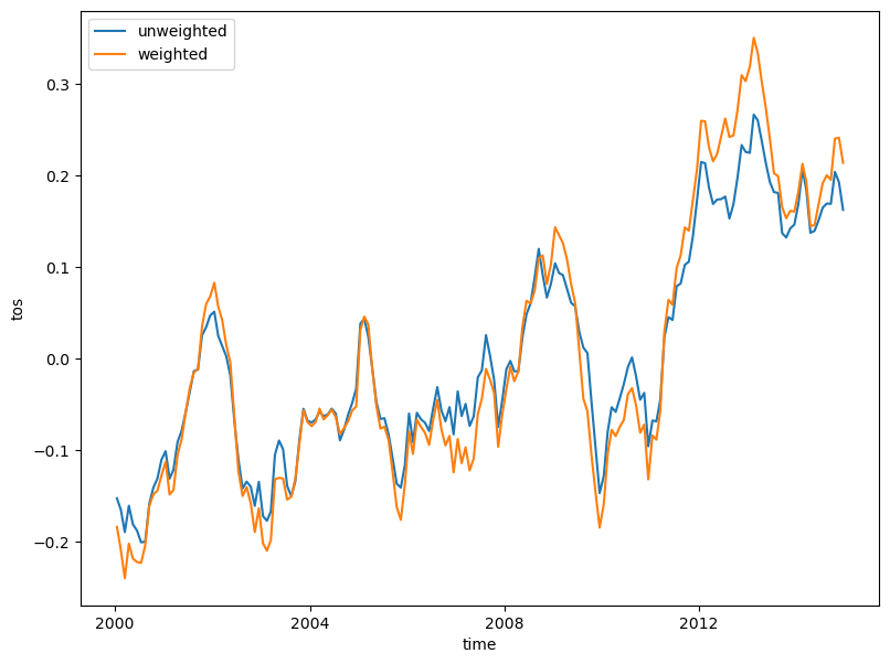
Other high level computation functionality
For example, resample to annual frequency:
r = ds.tos.resample(time='AS')
r
<string>:7: FutureWarning: 'AS' is deprecated and will be removed in a future version. Please use 'YS' instead of 'AS'.
<DataArrayResample, grouped over 1 grouper(s), 15 groups in total:
'__resample_dim__': TimeResampler('__resample_dim__'), 15/15 groups with labels 2000-01-01, 00:00:00, ..., 201...>r.mean()Compute a 5-month moving average:
m_avg = ds.tos.rolling(time=5, center=True).mean()
m_avglat = 50
lon = 310
m_avg.isel(lat=lat, lon=lon).plot(size=6)
ds.tos.isel(lat=lat, lon=lon).plot()
plt.legend(['5-month moving average', 'monthly data']);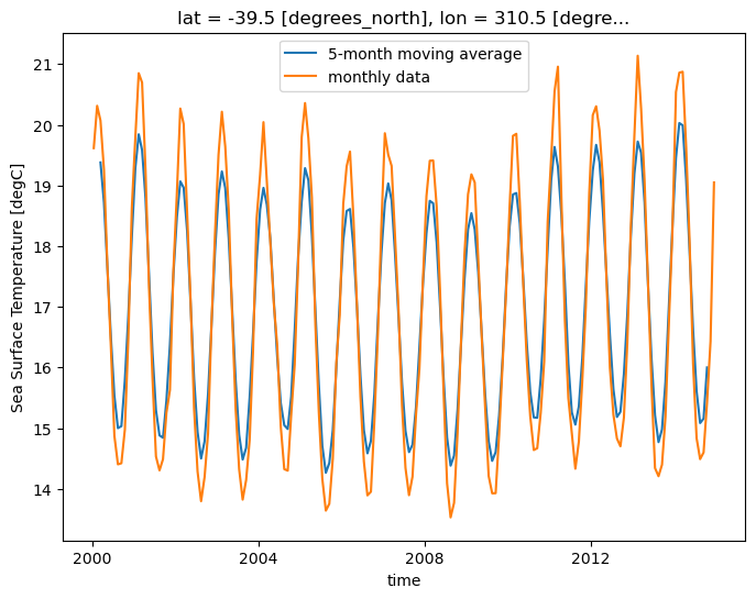
Masking Data
Using the xr.where() or .where() method, elements of an xarray Dataset or xarray DataArray that satisfy a given condition or multiple conditions can be replaced/masked. To demonstrate this, we are going to use the .where() method on the tos DataArray.
We will use the same sea surface temperature dataset:
dsUsing where with one condition
Imagine we wish to analyze just the last time in the dataset. We could of course use isel for this:
sample = ds.tos.isel(time=-1)
sampleUnlike .isel() and .sel() that change the shape of the returned results, .where() preserves the shape of the original data. It accomplishes this by returning values from the original DataArray or Dataset if the condition is True, and fills in values (by default nan) wherever the condition is False.
Before applying it, let’s look at the .where() documentation. As the documention points out, the conditional expression in .where() can be:
- a DataArray
- a Dataset
- a function
For demonstration purposes, let’s use .where() to mask locations with temperature values greater than 0:
masked_sample = sample.where(sample < 0.0)
masked_sampleLet’s plot both our original sample, and the masked sample:
fig, axes = plt.subplots(ncols=2, figsize=(19, 6))
sample.plot(ax=axes[0], robust=True)
masked_sample.plot(ax=axes[1], robust=True);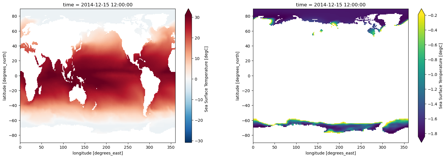
fig, axes = plt.subplots(ncols=2, figsize=(19, 6))
sample.plot(ax=axes[0])
masked_sample.plot(ax=axes[1]);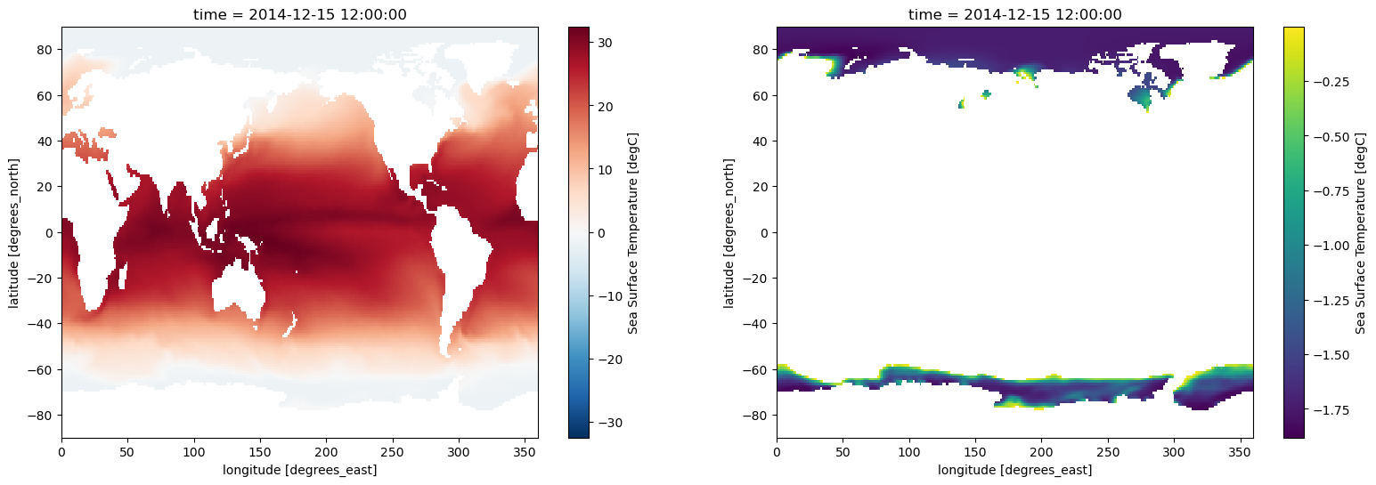
Using where with multiple conditions
.where() allows providing multiple conditions. To do this, we need to make sure each conditional expression is enclosed in (). To combine conditions, we use the bit-wise and (&) operator and/or the bit-wise or (|). Let’s use .where() to mask locations with temperature values less than 25 and greater than 30:
sample.where((sample > 25) & (sample < 30)).plot(size=6, robust=True);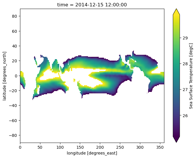
sample.where((sample > 25) & (sample < 30)).plot(size=6);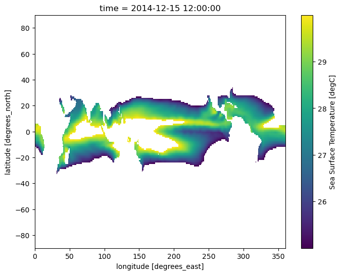
We can use coordinates to apply a mask as well. Below, we use the latitude and longitude coordinates to mask everywhere outside of the Niño 3.4 region:
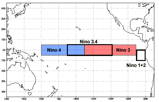
sample.where(
    (sample.lat < 5) & (sample.lat > -5) & (sample.lon > 190) & (sample.lon < 240)
).plot(size=6, robust=True);
Using where with a custom fill value
.where() can take a second argument, which, if supplied, defines a fill value for the masked region. Below we fill masked regions with a constant 0:
sample.where((sample > 25) & (sample < 30), 0).plot(size=6, robust=False);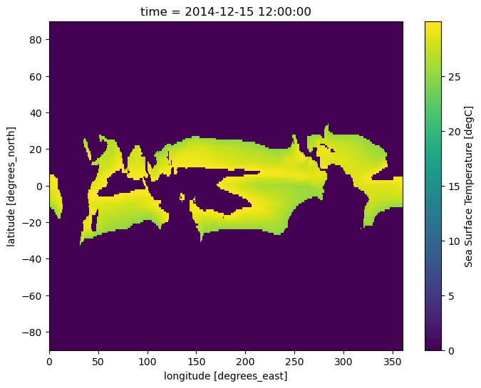
Summary
- Similar to NumPy, arithmetic operations are vectorized over a DataArray
- Xarray provides aggregation methods like
sum()andmean(), with the option to specify which dimension over which the operation will be done groupbyenables the convenient split-apply-combine workflow- The
.where()method allows for filtering or replacing of data based on one or more provided conditions
What’s next?
In an upcoming notebook, we will work through an example of plotting the Niño 3.4 Index.