Matplotlib Introduction
Contents

Matplotlib Introduction
Overview
We will cover the basics of plotting within Python, using the Matplotlib library, focusing on line plots based on meteorological data.
Create a basic line plot.
Add labels and grid lines to the plot.
Plot multiple time series of data.
Imports
Let’s import the matplotlib library’s pyplot interface; this interface is the simplest way to create new Matplotlib figures. To shorten this long name, we import it as plt to keep things short but clear.
import matplotlib.pyplot as plt
Info
Matplotlib is a python 2D plotting library which produces publication quality figures in a variety of hard-copy formats and interactive environments across platforms.
Plot some temperature data:
Let’s create two lists, corresponding to a day’s worth of hourly temperature data for Albany:
hours = range (0,24)
temps = [-4.4, -3.3, -3.3, -3.3, -3.9, -3.3, -4.4, -2.8, -2.8, -2.2, -1.1, 0.0, 1.7, 1.7, 2.2, 2.2, 2.2, 2.2, -0.6, -1.1, -1.7, -2.2, -3.3, -3.9]
Note:
We could have explicitly created the hours list object as follows: hours = [0, 1, 2, 3, 4, 5, 6, 7, 8, 9, 10, 11, 12, 13, 14, 15, 16, 17, 18, 19, 20, 21, 22, 23]
The way we did it, using the range function, is quicker, both in terms of typing and execution time.
Note that Python’s “range” function returns a sequence of numbers, starting with the first indicated integer, and ending with the second indicated integer NOT inclusive. Thus, in this example, range(0,24) yields a range of integers from 0 to 23.
Figure and Axes
Now let’s make our first plot with Matplotlib. Matplotlib has two core objects: the Figure and the Axes. The Axes is an individual plot with an x-axis, a y-axis, labels, etc; it has all of the various plotting methods we use. A Figure holds one or more Axes on which we draw; think of the Figure as the level at which things are saved to files (e.g. PNG, SVG)
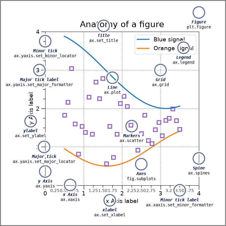
(source: https://matplotlib.org/gallery/showcase/anatomy.html)
Note:
The terminology takes a bit of getting used to as axes are not the same thing as an x- and y-axis. Instead, think of axes as one distinct plot on a canvas, where the canvas is represented by figure.
Line plots
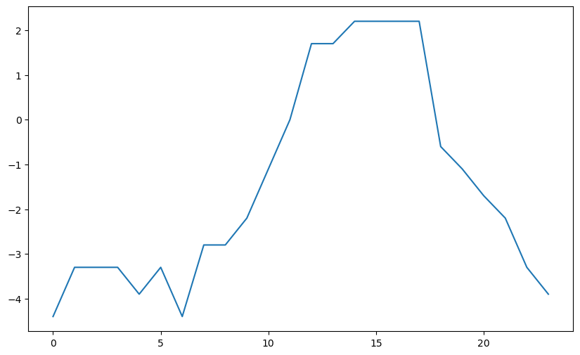
Let’s create a Figure whose dimensions, if printed out on hardcopy, would be 10 inches wide and 6 inches long (assuming a landscape orientation). We then create an Axes, consisting of a single subplot, on the Figure. After that, we call plot, with hours as the data along the x-axis (independent values) and temps as the data along the y-axis (the dependent values).
Info
By default, ax.plot will create a line plot, as seen below
# Create a figure (the container, aka the canvas, for the resulting graphic)
fig = plt.figure(figsize=(10, 6))

# On this figure, create an axes object. The figure will contain just this one axes.
ax = fig.add_subplot(1, 1, 1)

# Plot hours as x-variable and temperatures as y-variable
ax.plot(hours, temps)
[<matplotlib.lines.Line2D at 0x15354e517010>]
Question
Let’s say you added one more time value to the hours array above, while not adding a corresponding value to the temps array. Do you think the plot you made above would still work? Why or why not? Copy the code cell above into a new code cell below to test your hypothesis.
Adding axes labels
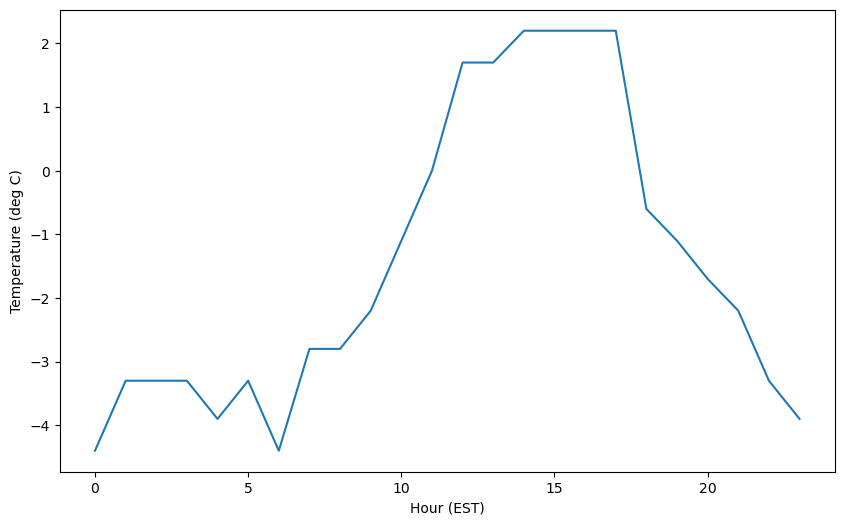
Next, add x- and y-axis labels to our Axes object.
# Add some labels to the plot
ax.set_xlabel('Hour (EST)')
ax.set_ylabel('Temperature (deg C)')

# Prompt the notebook to re-display the figure after we modify it
fig
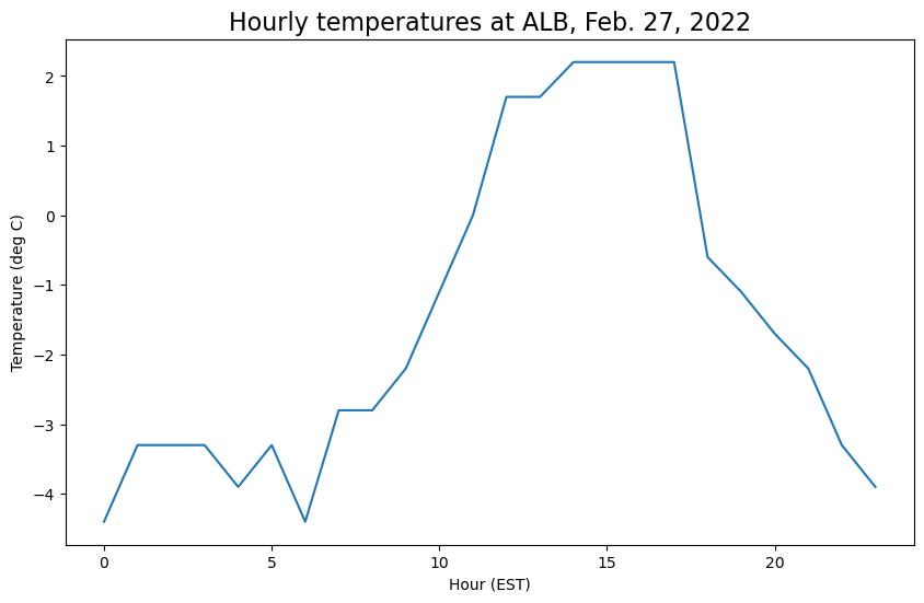
We can also add a title to the plot and specify the title’s fontsize:
ax.set_title('Hourly temperatures at ALB, Feb. 27, 2022',fontsize=16)

fig
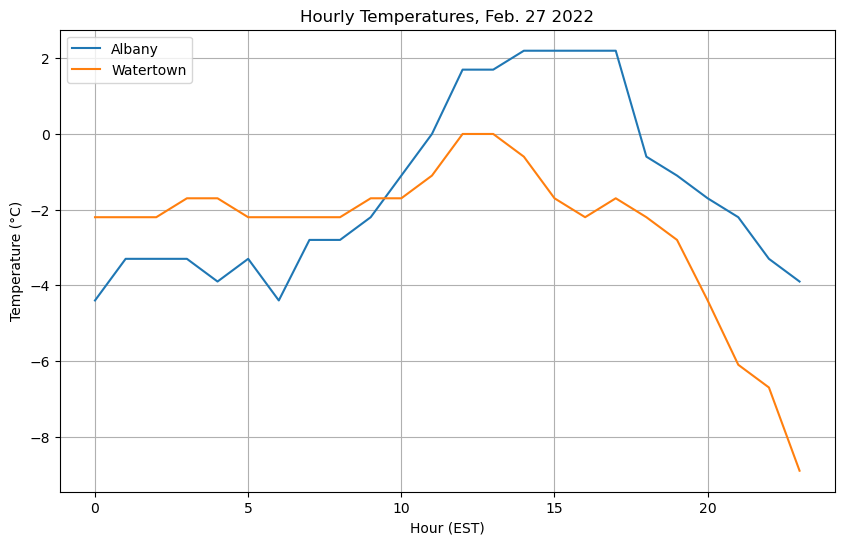
Let’s set up another array; this one contains 24 hours’ worth of temperatures for Watertown, NY (KART)
We start by setting up another temperature array
temps_ART = [-2.2, -2.2, -2.2, -1.7, -1.7, -2.2, -2.2, -2.2, -2.2, -1.7, -1.7, -1.1, 0.0, 0.0, -0.6, -1.7, -2.2, -1.7, -2.2, -2.8, -4.4, -6.1, -6.7, -8.9]
Adding labels and a grid
Here we call plot more than once to plot multiple series of temperature on the same plot; when plotting we pass label to plot to facilitate automatic creation of legend labels. This is added with the legend call. We also add gridlines to the plot using the grid() call.
fig = plt.figure(figsize=(10, 6))
ax = fig.add_subplot(1, 1, 1)

# Plot two series of data
# The label argument is used when generating a legend.
ax.plot(hours, temps, label='Albany')
ax.plot(hours, temps_ART, label='Watertown')

# Add labels and title
ax.set_xlabel('Hour (EST)')
ax.set_ylabel('Temperature (°C)')
ax.set_title('Hourly Temperatures, Feb. 27 2022')

# Add gridlines
ax.grid(True)

# Add a legend to the upper left corner of the plot
ax.legend(loc='upper left')
<matplotlib.legend.Legend at 0x15354e20cbb0>
Note
In theax.set_ylabel call, we represented the degree symbol using
Customizing colors
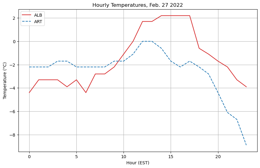
We’re not restricted to the default look of the plots, but rather we can override style attributes, such as linestyle and color. color can accept a wide array of options for color, such as red or blue or HTML color codes. Here we use some different shades of red taken from the Tableau color set in matplotlib, by using tab:red for color. For more details, see https://matplotlib.org/stable/gallery/color/named_colors.html
fig = plt.figure(figsize=(10, 6))
ax = fig.add_subplot(1, 1, 1)

# Specify how our lines should look
ax.plot(hours, temps, color='tab:red', label='ALB')
ax.plot(
    hours,
    temps_ART,
    color='tab:blue',
    linestyle='--',
    label='ART',
)

# Set the labels and title
ax.set_xlabel('Hour (EST)')
ax.set_ylabel('Temperature (°C)')
ax.set_title('Hourly Temperatures, Feb. 27 2022')

# Add the grid
ax.grid(True)

# Add a legend to the upper left corner of the plot
ax.legend(loc='upper left')
<matplotlib.legend.Legend at 0x15354e2324d0>
Working with multiple panels in a figure
Now let’s add some dewpoint data at the same times for the two locations.
dewp_ALB = [-11.1, -11.7, -11.1, -10.6, -10.6, -11.1, -10.6, -10.6, -10.6, -10.0, -10.0, -9.4, -8.9, -8.9, -8.9, -8.3, -7.8, -7.8, -3.3, -9.4, -11.7, -12.8, -12.8, -9.4]
dewp_ART = [-6.1, -5.0, -5.6, -5.6, -6.1, -3.9, -5.6, -6.1, -5.6, -5.6, -3.9, -3.9, -4.4, -3.9, -4.4, -6.1, -5.0, -10.6, -10.0, -11.7, -12.2, -13.3, -13.3, -15.6]
Let’s also make the temperature array for Albany have an object name that fits the other three list objects.
temps_ALB = temps
Now, let’s plot it up, with the other temperature data!
Using add_subplot to create two different subplots within the figure
We can use the .add_subplot() method to add multiple Axes, i.e. subplots, to our figure! The add_subplot arguments are formatted as follows:
(rows, columns, subplot_number)
For example, if we want a single row, with two columns, we use the following code block
fig = plt.figure(figsize=(10, 6))

# Create a plot for temperature
ax = fig.add_subplot(1, 2, 1)
ax.plot(hours, temps_ALB, color='tab:red')

# Create a plot for dewpoint
ax2 = fig.add_subplot(1, 2, 2)
ax2.plot(hours, dewp_ALB, color='tab:green')
[<matplotlib.lines.Line2D at 0x15354e112830>]
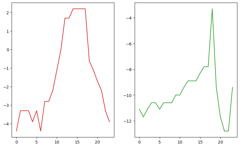
Warning:
It’s very easy to make a figure that either intentionally or unintentionally deceives the viewer! In this case, at first glance it appears that the temperature and dewpoint span the same range of values. But note the different y-axes!
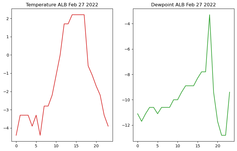
Adding titles to each subplot
We can add titles to these plots too - notice how these subplots are titled separately, each using ax.set_title after each subplot
fig = plt.figure(figsize=(10, 6))

# Create a plot for temperature
ax = fig.add_subplot(1, 2, 1)
ax.plot(hours, temps_ALB, color='tab:red')
ax.set_title('Temperature ALB Feb 27 2022')

# Create a plot for dewpoint
ax2 = fig.add_subplot(1, 2, 2)
ax2.plot(hours, dewp_ALB, color='tab:green')
ax2.set_title('Dewpoint ALB Feb 27 2022')
Text(0.5, 1.0, 'Dewpoint ALB Feb 27 2022')
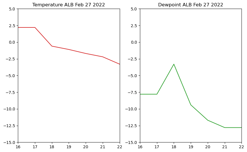
Using ax.set_xlim and ax.set_ylim to control the plot boundaries
You may want to specify the ranges of the x- and/or y-axes of each plot, which you can do by using .set_xlim and set_ylim on the axes you are editing.
fig = plt.figure(figsize=(10, 6))

# Create a plot for temperature
ax = fig.add_subplot(1, 2, 1)
ax.plot(hours, temps_ALB, color='tab:red')
ax.set_title('Temperature ALB Feb 27 2022')
ax.set_xlim(16, 22)
ax.set_ylim(-15,5)

# Create a plot for dewpoint
ax2 = fig.add_subplot(1, 2, 2)
ax2.plot(hours, dewp_ALB, color='tab:green')
ax2.set_title('Dewpoint ALB Feb 27 2022')
ax2.set_xlim(16,22)
ax2.set_ylim(-15,5)
(-15.0, 5.0)
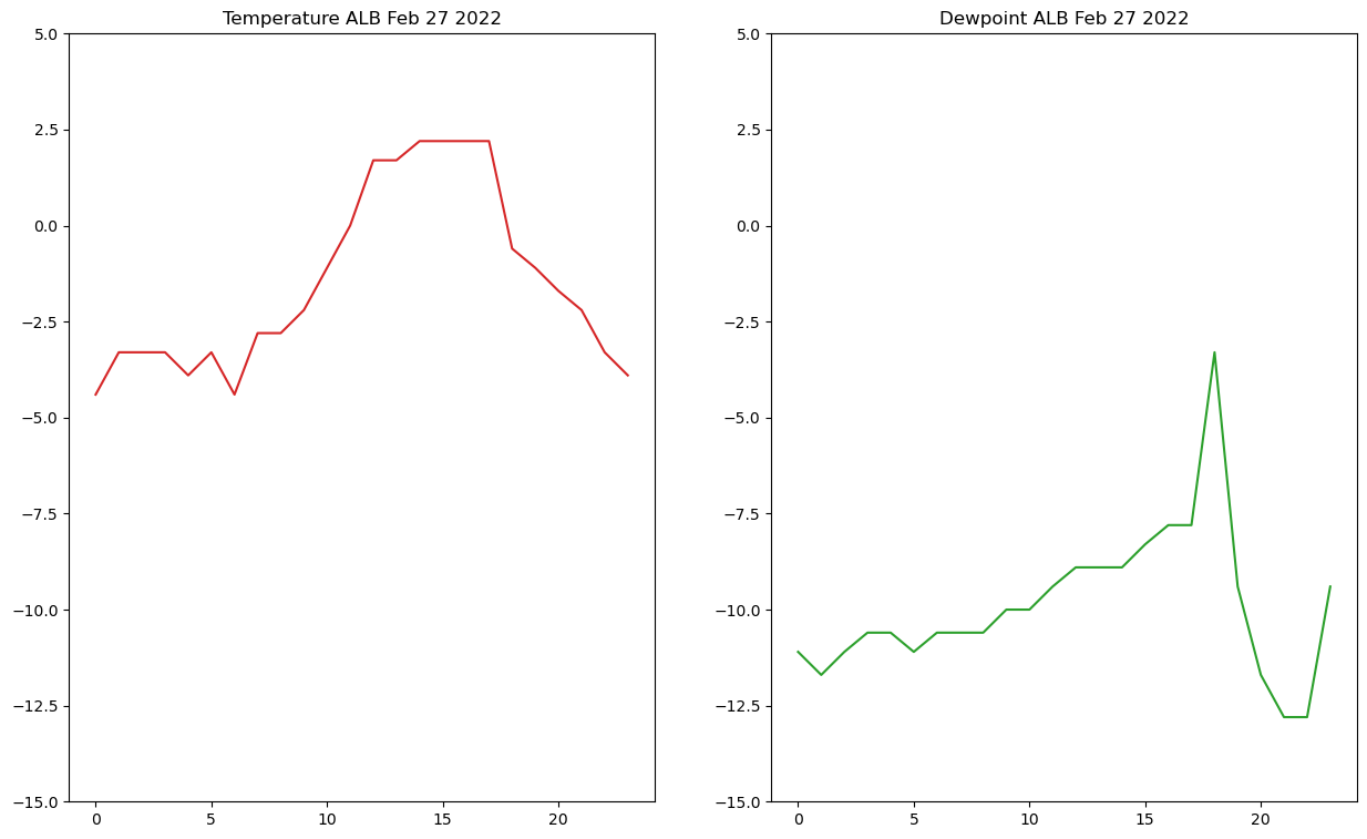
Using sharex and sharey to share plot limits
You may want to have both subplots share the same x/y axis limits - you can do this by adding sharex=ax and sharey=ax as arguments when adding a new axis (ex. ax2 = fig.add_subplot()) where ax is the axis you want your new axis to share limits with
Let’s take a look at an example
fig = plt.figure(figsize=(15, 9))

# Create a plot for temperature
ax = fig.add_subplot(1, 2, 1)
ax.plot(hours, temps_ALB, color='tab:red')
ax.set_title('Temperature ALB Feb 27 2022')
ax.set_ylim(-15,5)

# Create a plot for dewpoint
ax2 = fig.add_subplot(1, 2, 2, sharex=ax, sharey=ax)
ax2.plot(hours, dewp_ALB, color='tab:green')
ax2.set_title('Dewpoint ALB Feb 27 2022')
Text(0.5, 1.0, 'Dewpoint ALB Feb 27 2022')
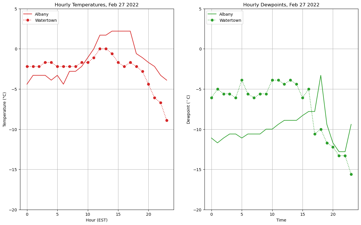
Putting this all together
Info
You may wish to move around the location of your legend - you can do this by changing the loc argument in ax.legend()
fig = plt.figure(figsize=(15, 9))
ax = fig.add_subplot(1, 2, 1)

# Specify how our lines should look
ax.plot(hours, temps_ALB, color='tab:red', label='Albany')
ax.plot(
    hours,
    temps_ART,
    color='tab:red',
    linestyle=':',
    marker='o',
    label='Watertown',
)

# Add labels, grid, and legend
ax.set_xlabel('Hour (EST)')
ax.set_ylabel('Temperature (°C)')
ax.set_title('Hourly Temperatures, Feb 27 2022')
ax.grid(True)
ax.legend(loc='upper left')
ax.set_ylim(-20,5)


# Add our second plot - for dewpoint, changing the colors and labels
ax2 = fig.add_subplot(1, 2, 2, sharey=ax)
ax2.plot(hours, dewp_ALB, color='tab:green', label='Albany')
ax2.plot(
    hours,
    dewp_ART,
    color='tab:green',
    linestyle=':',
    marker='o',
    label='Watertown',
)

ax2.set_xlabel('Time')
ax2.set_ylabel('Dewpoint ($^\circ$C)')
ax2.set_title('Hourly Dewpoints, Feb 27 2022')
ax2.grid(True)
ax2.legend(loc='upper left')
<matplotlib.legend.Legend at 0x153545ddd9c0>
Summary
Matplotlibcan be used to visualize datasets you are working withYou can customize various features such as labels and styles
Besides line plots (
plot), there are a wide variety of plotting options available, including (but not limited to)Scatter plots (
scatter)Imshow (
imshow)Contour line and contour fill plots (
contour,contourf)
What’s Next?
Next, instead of “hard-coding” a series of meteorological observations, we will do a lab exercise where we read in observations from a file, using the pandas library. We will then make more plots with Matplotlib.
Resources and References
The goal of this notebook was to provide an overview of the use of the Matplotlib library. It focuses on simple line plots and touches on additional types of Matplotlib plotting methods, but it is by no means comprehensive. For more information, check out the following links: