COMPLETED Lab Exercise: Plot temperature data from the NYS Mesonet
Contents

COMPLETED Lab Exercise: Plot temperature data from the NYS Mesonet
Overview
You will replicate the workflow in a portion of the 01_MatplotlibIntro notebook, but use recent NYSM temperature data.
Create a basic line plot.
Add labels and grid lines to the plot.
Plot multiple time series of data.
Imports
Let’s import the matplotlib library’s pyplot interface; this interface is the simplest way to create new Matplotlib figures. To shorten this long name, we import it as plt to keep things short but clear. We also import the pandas library, using its standard alias of pd. Finally, we import the datetime library, which allows for efficient operations on time-based variables and datasets.
TASK 1:
In the code cell below, add a line that imports the matplotlib library’s pyplot interface with its standard alias.
import matplotlib.pyplot as plt
import pandas as pd
from datetime import datetime
Read in the most recent hour’s worth of NYSM observations using pandas.
# First define the format and then define the lambda function
timeFormat = "%Y-%m-%d %H:%M:%S UTC"
# This function will iterate over each string in a 1-d array
# and use Pandas' implementation of strptime to convert the string into a datetime object.
parseTime = lambda x: datetime.strptime(x, timeFormat)
df = pd.read_csv('/data1/nysm/latest.csv',parse_dates=['time'], date_parser=parseTime).set_index('time')
/tmp/ipykernel_2111113/3002352139.py:6: FutureWarning: The argument 'date_parser' is deprecated and will be removed in a future version. Please use 'date_format' instead, or read your data in as 'object' dtype and then call 'to_datetime'.
  df = pd.read_csv('/data1/nysm/latest.csv',parse_dates=['time'], date_parser=parseTime).set_index('time')
df
| station | temp_2m [degC] | temp_9m [degC] | relative_humidity [percent] | precip_incremental [mm] | precip_local [mm] | precip_max_intensity [mm/min] | avg_wind_speed_prop [m/s] | max_wind_speed_prop [m/s] | wind_speed_stddev_prop [m/s] | ... | snow_depth [cm] | frozen_soil_05cm [bit] | frozen_soil_25cm [bit] | frozen_soil_50cm [bit] | soil_temp_05cm [degC] | soil_temp_25cm [degC] | soil_temp_50cm [degC] | soil_moisture_05cm [m^3/m^3] | soil_moisture_25cm [m^3/m^3] | soil_moisture_50cm [m^3/m^3] | |
|---|---|---|---|---|---|---|---|---|---|---|---|---|---|---|---|---|---|---|---|---|---|
| time | |||||||||||||||||||||
| 2024-04-30 00:50:00 | ADDI | 17.9 | 20.9 | 71.6 | 0.0 | 0.0 | 0.0 | 0.7 | 1.1 | 0.2 | ... | 0.0 | 0.0 | 0.0 | 0.0 | 13.7 | 10.2 | 8.9 | 0.53 | 0.46 | 0.44 |
| 2024-04-30 00:55:00 | ADDI | 17.9 | 19.7 | 75.2 | 0.0 | 0.0 | 0.0 | 0.1 | 0.5 | 0.2 | ... | 0.0 | 0.0 | 0.0 | 0.0 | 13.7 | 10.2 | 8.9 | 0.52 | 0.46 | 0.44 |
| 2024-04-30 01:00:00 | ADDI | 17.8 | 19.4 | 78.2 | 0.0 | 0.0 | 0.0 | 0.0 | 0.0 | 0.0 | ... | 0.0 | 0.0 | 0.0 | 0.0 | 13.7 | 10.2 | 8.9 | 0.52 | 0.45 | 0.44 |
| 2024-04-30 01:05:00 | ADDI | 18.0 | 19.3 | 79.9 | 0.0 | 0.0 | 0.0 | 0.0 | 0.0 | 0.0 | ... | 0.0 | 0.0 | 0.0 | 0.0 | 13.7 | 10.2 | 8.9 | 0.53 | 0.45 | 0.44 |
| 2024-04-30 01:10:00 | ADDI | 17.8 | 19.3 | 80.4 | 0.0 | 0.0 | 0.0 | 0.0 | 0.0 | 0.0 | ... | 0.0 | 0.0 | 0.0 | 0.0 | 13.7 | 10.2 | 8.9 | 0.52 | 0.46 | 0.44 |
| ... | ... | ... | ... | ... | ... | ... | ... | ... | ... | ... | ... | ... | ... | ... | ... | ... | ... | ... | ... | ... | ... |
| 2024-04-30 01:30:00 | YORK | 14.0 | 14.3 | 81.0 | 0.0 | 0.0 | 0.0 | 1.4 | 2.0 | 0.3 | ... | 0.0 | 0.0 | 0.0 | 0.0 | 13.0 | 11.3 | 9.9 | 0.25 | 0.28 | 0.33 |
| 2024-04-30 01:35:00 | YORK | 14.2 | 14.2 | 79.7 | 0.0 | 0.0 | 0.0 | 1.1 | 1.7 | 0.3 | ... | 0.0 | 0.0 | 0.0 | 0.0 | 13.0 | 11.3 | 9.9 | 0.25 | 0.28 | 0.33 |
| 2024-04-30 01:40:00 | YORK | 14.1 | 14.1 | 79.4 | 0.0 | 0.0 | 0.0 | 1.2 | 1.6 | 0.2 | ... | 1.0 | 0.0 | 0.0 | 0.0 | 13.0 | 11.4 | 9.9 | 0.25 | 0.28 | 0.33 |
| 2024-04-30 01:45:00 | YORK | 14.1 | 14.1 | 79.3 | 0.0 | 0.0 | 0.0 | 1.2 | 1.9 | 0.3 | ... | 1.0 | 0.0 | 0.0 | 0.0 | 13.0 | 11.3 | 9.9 | 0.25 | 0.28 | 0.33 |
| 2024-04-30 01:50:00 | YORK | 14.0 | 14.0 | 79.0 | 0.0 | 0.0 | 0.0 | 0.9 | 1.4 | 0.2 | ... | 0.0 | 0.0 | 0.0 | 0.0 | 13.0 | 11.3 | 9.9 | 0.25 | 0.28 | 0.33 |
1638 rows × 29 columns
Plot some temperature data:
Instead of “hard-coding” lists of variables and hours, Pandas creates “list-like” objects, called Series. First, let’s specify a couple of NYSM sites, and then retrieve time and temperature data from the data file.
site1 = 'RUSH'
site2 = 'BEAC'
Read in 2 meter temperature for these sites.
site1_t2m = df.query('station == @site1')['temp_2m [degC]']
site2_t2m = df.query('station == @site2')['temp_2m [degC]']
site1_t2m
time
2024-04-30 00:50:00    14.4
2024-04-30 00:55:00    14.3
2024-04-30 01:00:00    14.3
2024-04-30 01:05:00    14.1
2024-04-30 01:10:00    13.9
2024-04-30 01:15:00    13.8
2024-04-30 01:20:00    13.7
2024-04-30 01:25:00    13.6
2024-04-30 01:30:00    13.5
2024-04-30 01:35:00    13.3
2024-04-30 01:40:00    13.2
2024-04-30 01:45:00    13.2
2024-04-30 01:50:00    13.1
Name: temp_2m [degC], dtype: float64
times = site1_t2m.index
temps = site1_t2m
times
DatetimeIndex(['2024-04-30 00:50:00', '2024-04-30 00:55:00',
               '2024-04-30 01:00:00', '2024-04-30 01:05:00',
               '2024-04-30 01:10:00', '2024-04-30 01:15:00',
               '2024-04-30 01:20:00', '2024-04-30 01:25:00',
               '2024-04-30 01:30:00', '2024-04-30 01:35:00',
               '2024-04-30 01:40:00', '2024-04-30 01:45:00',
               '2024-04-30 01:50:00'],
              dtype='datetime64[ns]', name='time', freq=None)
TASK 2:
Choose your own two NYSM sites and repeat the execution of the above four code cells.
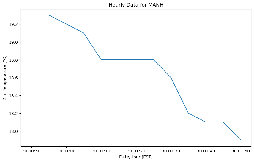
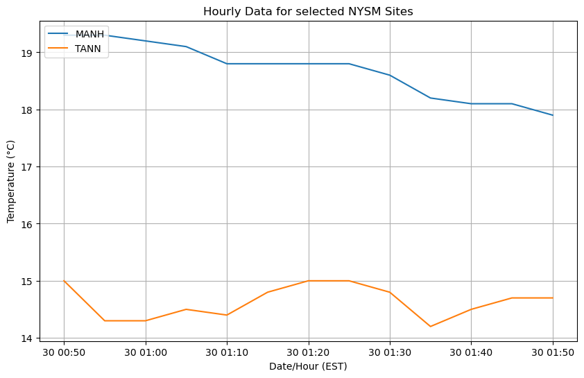
site3 = 'MANH'
site4 = 'TANN'
site3_t2m = df.query('station == @site3')['temp_2m [degC]']
site4_t2m = df.query('station == @site4')['temp_2m [degC]']
site3_t2m
time
2024-04-30 00:50:00    19.3
2024-04-30 00:55:00    19.3
2024-04-30 01:00:00    19.2
2024-04-30 01:05:00    19.1
2024-04-30 01:10:00    18.8
2024-04-30 01:15:00    18.8
2024-04-30 01:20:00    18.8
2024-04-30 01:25:00    18.8
2024-04-30 01:30:00    18.6
2024-04-30 01:35:00    18.2
2024-04-30 01:40:00    18.1
2024-04-30 01:45:00    18.1
2024-04-30 01:50:00    17.9
Name: temp_2m [degC], dtype: float64
times
DatetimeIndex(['2024-04-30 00:50:00', '2024-04-30 00:55:00',
               '2024-04-30 01:00:00', '2024-04-30 01:05:00',
               '2024-04-30 01:10:00', '2024-04-30 01:15:00',
               '2024-04-30 01:20:00', '2024-04-30 01:25:00',
               '2024-04-30 01:30:00', '2024-04-30 01:35:00',
               '2024-04-30 01:40:00', '2024-04-30 01:45:00',
               '2024-04-30 01:50:00'],
              dtype='datetime64[ns]', name='time', freq=None)
Line plots
Let’s create a Figure whose dimensions, if printed out on hardcopy, would be 10 inches wide and 6 inches long (assuming a landscape orientation). We then create an Axes, consisting of a single subplot, on the Figure. After that, we call plot, with times as the data along the x-axis (independent values) and temps as the data along the y-axis (the dependent values).
TASK 3:
Insert a code cell and use Matplotlib to create a time series plot of 2m temperature versus time for the first NYSM site you chose.
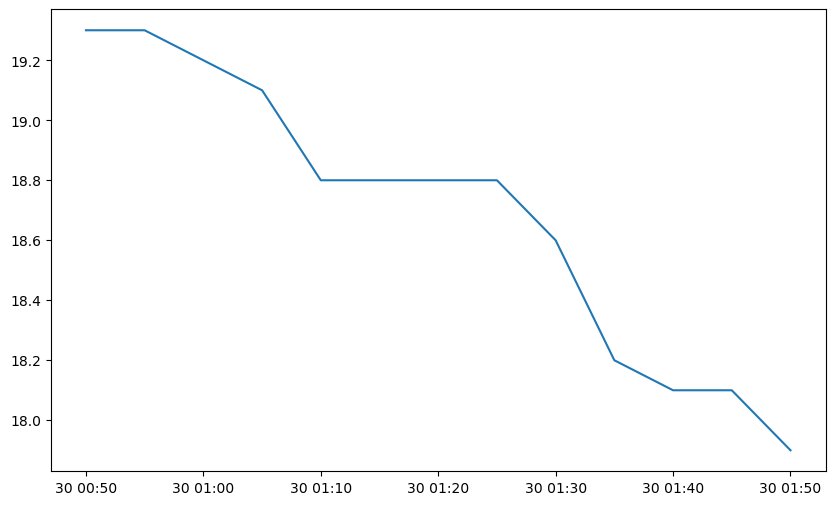
fig = plt.figure(figsize=(10, 6))
ax = fig.add_subplot(1, 1, 1)

ax.plot(times, site3_t2m)
[<matplotlib.lines.Line2D at 0x14f6f5abbdd0>]
TASK 4:
Insert a code cell and add x- and y-axis labels to your Axes object you just created. Also, add a meaningful title with an appropriately-readable font size.
Adding labels and a title
# Add labels and title
ax.set_xlabel('Date/Hour (EST)')
ax.set_ylabel('2 m Temperature (°C)')
ax.set_title(f'Hourly Data for {site3}')

fig
Plot multiple sites
TASK 5:
Insert a code cell and plot 2 meter temperatures for both NYSM sites on the same plot. Include a legend and gridlines.
fig = plt.figure(figsize=(10, 6))
ax = fig.add_subplot(1, 1, 1)

# Plot two series of data
# The label argument is used when generating a legend.
ax.plot(times, site3_t2m, label=site3)
ax.plot(times, site4_t2m, label=site4)

# Add labels and title
ax.set_xlabel('Date/Hour (EST)')
ax.set_ylabel('Temperature (°C)')
ax.set_title('Hourly Data for selected NYSM Sites')

# Add gridlines
ax.grid(True)

# Add a legend to the upper left corner of the plot
ax.legend(loc='upper left')
<matplotlib.legend.Legend at 0x14f6f5b2cf10>
Try to plot another variable
TASK 6:
Next, insert code cells to import data from two different stations, using a different variable (be sure to enter the exact text corresponding to the variable you are interested in importing, at the top of each column in the dataframe). Plot the data using different colors and/or line types.
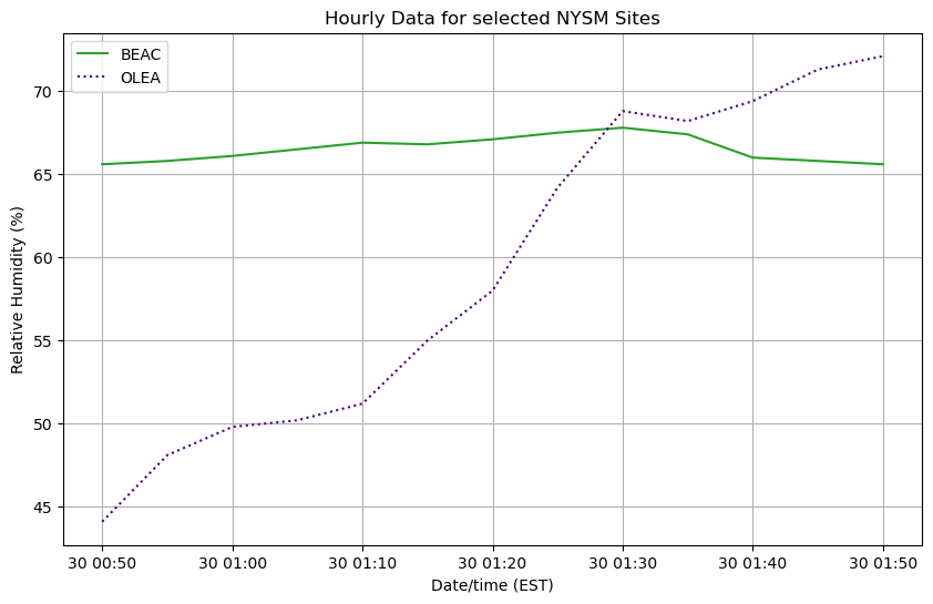
variable2 = 'relative_humidity [percent]'
site5 = 'BEAC'
site6 = 'OLEA'
data5 = df.query('station == @site5')[variable2]
data6 = df.query('station == @site6')[variable2]
fig = plt.figure(figsize=(10, 6))
ax = fig.add_subplot(1, 1, 1)

# Plot two series of data
# The label argument is used when generating a legend.
ax.plot(times, data5, label=site5, color='tab:green', linestyle='-')
ax.plot(times, data6, label=site6, color='indigo', linestyle=':')

# Add labels and title
ax.set_xlabel("Date/time (EST)")
ax.set_ylabel('Relative Humidity (%)')
ax.set_title('Hourly Data for selected NYSM Sites')

# Add gridlines
ax.grid(True)

# Add a legend to the upper left corner of the plot
ax.legend(loc='upper left');