Problem 1:
Contents
Problem 1:
ATM350 Homework 3, Spring 2023
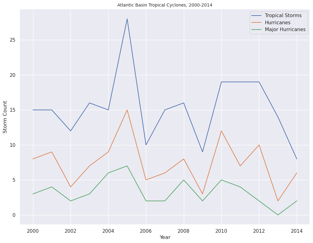
Create a notebook and name it q1.ipynb. Using the table found in: https://www.nhc.noaa.gov/climo/images/AtlanticStormTotalsTable.pdf, first create three list objects for the numbers of tropical storms, hurricanes, and major hurricanes, from the year 2000-2014. Then, use Matplotlib to create one figure with three separate line graphs (with number, or count, on the y-axis, and year on the x-axis), using a different color for each line.
Imports
import matplotlib.pyplot as plt
import seaborn as sns
Create lists for each of the three TC classes
tropical_storms = [15, 15, 12, 16, 15, 28, 10, 15, 16, 9, 19, 19, 19, 14, 8]
hurricanes = [8, 9, 4, 7, 9, 15, 5, 6, 8, 3, 12, 7, 10, 2, 6]
major_hurricanes = [3, 4, 2, 3, 6, 7, 2, 2, 5, 2, 5, 4, 2, 0, 2]
Create a range object for the years
years = range(2000, 2015) # Recall that the last item in the range is excluded!
Create the figure
sns.set() # For these types of plots, Seaborn's default style works well
fig = plt.figure(figsize=(12, 9))

ax = fig.add_subplot(1, 1, 1)

ax.plot(years, tropical_storms, label='Tropical Storms')
ax.plot(years, hurricanes, label='Hurricanes')
ax.plot(years, major_hurricanes, label='Major Hurricanes')

ax.set_xlabel('Year')
ax.set_ylabel('Storm Count')
ax.legend(loc='best')

ax.set_title('Atlantic Basin Tropical Cyclones, 2000-2014',fontsize=10);