02_Xarray: Plotting
Contents
02_Xarray: Plotting
Overview
Work with an Xarray
DatasetSelect a variable from the dataset
Create a contour plot of gridded CFSR reanalysis data
Imports
import xarray as xr
import pandas as pd
import numpy as np
from metpy.units import units
import metpy.calc as mpcalc
import cartopy.crs as ccrs
import cartopy.feature as cfeature
import matplotlib.pyplot as plt
ERROR 1: PROJ: proj_create_from_database: Open of /knight/anaconda_aug22/envs/aug22_env/share/proj failed
Work with an Xarray Dataset
An Xarray Dataset consists of one or more DataArrays. Let’s continue to work with the CFSR NetCDF files from the previous notebook.
year = 1993
ds_slp = xr.open_dataset(f'/cfsr/data/{year}/pmsl.1993.0p5.anl.nc')
ds_g = xr.open_dataset(f'/cfsr/data/{year}/g.1993.0p5.anl.nc')
Examine the SLP dataset
ds_slp
<xarray.Dataset>
Dimensions:  (time: 1460, lat: 361, lon: 720)
Coordinates:
  * time     (time) datetime64[ns] 1993-01-01 ... 1993-12-31T18:00:00
  * lat      (lat) float32 -90.0 -89.5 -89.0 -88.5 -88.0 ... 88.5 89.0 89.5 90.0
  * lon      (lon) float32 -180.0 -179.5 -179.0 -178.5 ... 178.5 179.0 179.5
Data variables:
    pmsl     (time, lat, lon) float32 ...
Attributes:
    description:    pmsl as a single level variable
    year:           1993
    source:         http://nomads.ncdc.noaa.gov/data.php?name=access#CFSR-data
    references:     Saha, et. al., (2010)
    created_by:     User: kgriffin
creation_date: Wed Apr 4 05:59:11 UTC 2012One attribute of a dataset is its size. We can access that via its nbytes attribute.
print (f'Size of dataset: {ds_slp.nbytes / 1e6} MB')
Size of dataset: 1517.948804 MB
Select a variable from the dataset and assign it to a DataArray object
slp = ds_slp['pmsl'] # Similar to selecting a Series in Pandas
slp
<xarray.DataArray 'pmsl' (time: 1460, lat: 361, lon: 720)>
[379483200 values with dtype=float32]
Coordinates:
  * time     (time) datetime64[ns] 1993-01-01 ... 1993-12-31T18:00:00
  * lat      (lat) float32 -90.0 -89.5 -89.0 -88.5 -88.0 ... 88.5 89.0 89.5 90.0
  * lon      (lon) float32 -180.0 -179.5 -179.0 -178.5 ... 178.5 179.0 179.5
Attributes:
    level_type:  single level variable
    units:       Pa
long_name: pressure reduced mean sea levelWe see that slp is a 3-dimensional DataArray, with time (‘time’) as the first dimension.
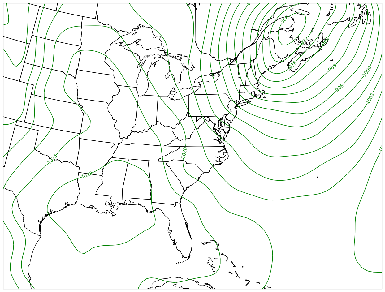
Create a contour plot of gridded data
We got a quick plot in the previous notebook. Let’s now customize the map, and focus on a particular region. We will use Cartopy and Matplotlib to plot our SLP contours. Matplotlib has two contour methods:
We will draw contour lines in hPa, with a contour interval of 4.
As we’ve done before, let’s first define some variables relevant to Cartopy.
The CFSR data’s x- and y- coordinates are longitude and latitude … thus, its projection is Plate Carree. However, we wish to display the data on a regional map that uses Lambert Conformal. So we will define two Cartopy projection objects here. We will need to transform the data from its native projection to the map’s projection when it comes time to draw the contours.
cLon = -80
cLat = 35
lonW = -100
lonE = -60
latS = 20
latN = 50
proj_data = ccrs.PlateCarree() # Our data is lat-lon; thus its native projection is Plate Carree.
proj_map = ccrs.LambertConformal(central_longitude=cLon, central_latitude=cLat) # Map projection
res = '50m'
Now define the range of our contour values and a contour interval. 4 hPa is standard for a sea-level pressure map on a synoptic-scale region.
minVal = 900
maxVal = 1076
cint = 4
cintervals = np.arange(minVal, maxVal, cint)
cintervals
array([ 900,  904,  908,  912,  916,  920,  924,  928,  932,  936,  940,
        944,  948,  952,  956,  960,  964,  968,  972,  976,  980,  984,
        988,  992,  996, 1000, 1004, 1008, 1012, 1016, 1020, 1024, 1028,
       1032, 1036, 1040, 1044, 1048, 1052, 1056, 1060, 1064, 1068, 1072])
Matplotlib’s contour methods require three arrays to be passed to them … x- and y- arrays (longitude and latitude in our case), and a 2-d array (corresponding to x- and y-) of our data variable. So we need to extract the latitude and longitude coordinate variables from our DataArray. We’ll also extract the third coordinate value, time.
lats = ds_slp.lat
lons = ds_slp.lon
times = ds_slp.time
Let’s use Xarray’s sel method to specify one time from the DataArray.
slp_singleTime = slp.sel(time='1993-03-14-18:00:00')
slp_singleTime
<xarray.DataArray 'pmsl' (lat: 361, lon: 720)>
[259920 values with dtype=float32]
Coordinates:
    time     datetime64[ns] 1993-03-14T18:00:00
  * lat      (lat) float32 -90.0 -89.5 -89.0 -88.5 -88.0 ... 88.5 89.0 89.5 90.0
  * lon      (lon) float32 -180.0 -179.5 -179.0 -178.5 ... 178.5 179.0 179.5
Attributes:
    level_type:  single level variable
    units:       Pa
long_name: pressure reduced mean sea levelNote the units are in Pascals. We will exploit MetPy’s unit conversion library soon, but for now let’s just divide the array by 100.
slp_singleTimeHPA = slp_singleTime / 100
We’re set to make our map. After creating our figure, setting the bounds of our map domain, and adding cartographic features, we will plot the contours. We’ll assign the output of the contour method to an object, which will then be used to label the contour lines.
fig = plt.figure(figsize=(18,12))
ax = plt.subplot(1,1,1,projection=proj_map)
ax.set_extent ([lonW,lonE,latS,latN])
ax.add_feature(cfeature.COASTLINE.with_scale(res))
ax.add_feature(cfeature.STATES.with_scale(res))
CL = ax.contour(lons,lats,slp_singleTimeHPA,cintervals,transform=proj_data,linewidths=1.25,colors='green')
ax.clabel(CL, inline_spacing=0.2, fontsize=11, fmt='%.0f');