CFSR Data and Graphics Preparation for the Science-on-a-Sphere
Contents
CFSR Data and Graphics Preparation for the Science-on-a-Sphere
This notebook will create all the necessary files and directories for a visualization on NOAA’s Science-on-a-Sphere. For this example, we will produce a map of 850 hPa geopotential heights, temperature, and horizontal wind and sea-level pressure, using the Climate Forecast System Reanalysis (CFSR), for the March 13-14 1993 winter storm, aka Superstorm ‘93.
Overview:
Set up output directories for SoS
Specify the date/time range for your case
Use Cartopy’s
add_cyclic_pointmethod to avoid a blank seam at the datelineCreate small and large thumbnail graphics.
Create a standalone colorbar
Create a set of labels for each plot
Create 24 hours worth of Science-on-a-Sphere-ready plots
Create an SoS playlist file
Prerequisites
Concepts |
Importance |
Notes |
|---|---|---|
Matplotlib |
Necessary |
|
Cartopy |
Necessary |
|
Xarray |
Necessary |
|
Metpy |
Necessary |
|
Linux command line / directory structure |
Helpful |
Time to learn: 30 minutes
Imports
import xarray as xr
import numpy as np
import pandas as pd
import cartopy.feature as cfeature
import cartopy.crs as ccrs
import cartopy.util as cutil
from datetime import datetime as dt
import warnings
import metpy.calc as mpcalc
from metpy.units import units
import matplotlib.pyplot as plt
ERROR 1: PROJ: proj_create_from_database: Open of /knight/anaconda_aug22/envs/aug22_env/share/proj failed
Do not output warning messages
warnings.simplefilter("ignore")
Set up output directories for SoS
The software that serves output for the Science-on-a-Sphere expects a directory structure as follows:
Top level directory: choose a name that is consistent with your case, e.g.: SS93
2nd level directory: choose a name that is consistent with the graphic, e.g.: SLP_500Z
3rd level directories:
2048: Contains the graphics (resolution: 2048x1024) that this notebook generates
labels: Contains one or two files:
(required) A text file,
labels.txt, which has as many lines as there are graphics in the 2048 file. Each line functions as the title of each graphic.(optional) A PNG file,
colorbar.png, which colorbar which will get overlaid on your map graphic.
media: Contains large and small thumbnails (
thumbnail_small.jpg,thumbnail_large.jpg) that serve as icons on the SoS iPad and SoS computer appsplaylist: A text file,
playlist.sos, which tells the SoS how to display your product
As an example, here is how the directory structure on our SoS looks for the products generated by this notebook. Our SoS computer stores locally-produced content in the /shared/sos/media/site-custom directory (note: the SoS directories are not network-accessible, so you won’t be able to cd into them). The CFSR visualizations go in the CFSR subfolder. Your top-level directory sits within the CFSR folder.
sos@sos1:/shared/sos/media/site-custom/CFSR/cle_superbomb/SLP_500Z$ ls -R
.:
2048  labels  media  playlist

./2048:
CFSR_1978012600-fs8.png  CFSR_1978012606-fs8.png  CFSR_1978012612-fs8.png  CFSR_1978012618-fs8.png
CFSR_1978012601-fs8.png  CFSR_1978012607-fs8.png  CFSR_1978012613-fs8.png  CFSR_1978012619-fs8.png
CFSR_1978012602-fs8.png  CFSR_1978012608-fs8.png  CFSR_1978012614-fs8.png  CFSR_1978012620-fs8.png
CFSR_1978012603-fs8.png  CFSR_1978012609-fs8.png  CFSR_1978012615-fs8.png  CFSR_1978012621-fs8.png
CFSR_1978012604-fs8.png  CFSR_1978012610-fs8.png  CFSR_1978012616-fs8.png  CFSR_1978012622-fs8.png
CFSR_1978012605-fs8.png  CFSR_1978012611-fs8.png  CFSR_1978012617-fs8.png  CFSR_1978012623-fs8.png

./labels:
colorbar.png  labels.txt

./media:
thumbnail_big.jpg  thumbnail_small.jpg

./playlist:
playlist.sos
Define the 1st and 2nd-level directories.
# You define these
caseDir = 'SS1993'
prodDir = '850T_Z_Wind'
The 3rd-level directories follow from the 1st and 2nd.
# These remain as is
graphicsDir = caseDir + '/' + prodDir + '/2048/'
labelsDir = caseDir + '/' + prodDir + '/labels/'
mediaDir = caseDir + '/' + prodDir + '/media/'
playlistDir = caseDir + '/' + prodDir + '/playlist/'
Create these directories via a Linux command
! mkdir -p {graphicsDir} {labelsDir} {mediaDir} {playlistDir}
! magic indicates that what follows is a Linux command.The
-p option for mkdir will create all subdirectories, and also will do nothing if the directories already exist.1) Specify a starting and ending date/time, and access several CFSR Datasets
# Date/Time specification
startYear = 1993
startMonth = 3
startDay = 9
startHour = 0
startMinute = 0
startDateTime = dt(startYear,startMonth,startDay, startHour, startMinute)
startDateTimeStr = dt.strftime(startDateTime, format="%Y%m%d")

endYear = 1993
endMonth = 3
endDay = 15
endHour = 18
endMinute = 0
endDateTime = dt(endYear,endMonth,endDay, endHour, endMinute)
Create Xarray Dataset objects, each pointing to their respective NetCDF files in the /cfsr/data directory tree, using Xarray’s open_dataset method.¶¶
dsZ = xr.open_dataset (f'/cfsr/data/{startYear}/g.{startYear}.0p5.anl.nc')
dsT = xr.open_dataset (f'/cfsr/data/{startYear}/t.{startYear}.0p5.anl.nc')
dsU = xr.open_dataset (f'/cfsr/data/{startYear}/u.{startYear}.0p5.anl.nc')
dsV = xr.open_dataset (f'/cfsr/data/{startYear}/v.{startYear}.0p5.anl.nc')
#dsW = xr.open_dataset (f'/cfsr/data/{startYear}/w.{startYear}.0p5.anl.nc')
#dsQ = xr.open_dataset (f'/cfsr/data/{startYear}/q.{startYear}.0p5.anl.nc')
#dsSLP = xr.open_dataset (f'/cfsr/data/{startYear}/pmsl.{startYear}.0p5.anl.nc')
Subset the desired Datasets along their temporal and (if applicable) vertical dimensions. Since we will be displaying over the entire globe, we will not subset over latitudes nor longitudes!
dateList = pd.date_range(startDateTime, endDateTime,freq="6H")
dateList
DatetimeIndex(['1993-03-09 00:00:00', '1993-03-09 06:00:00',
               '1993-03-09 12:00:00', '1993-03-09 18:00:00',
               '1993-03-10 00:00:00', '1993-03-10 06:00:00',
               '1993-03-10 12:00:00', '1993-03-10 18:00:00',
               '1993-03-11 00:00:00', '1993-03-11 06:00:00',
               '1993-03-11 12:00:00', '1993-03-11 18:00:00',
               '1993-03-12 00:00:00', '1993-03-12 06:00:00',
               '1993-03-12 12:00:00', '1993-03-12 18:00:00',
               '1993-03-13 00:00:00', '1993-03-13 06:00:00',
               '1993-03-13 12:00:00', '1993-03-13 18:00:00',
               '1993-03-14 00:00:00', '1993-03-14 06:00:00',
               '1993-03-14 12:00:00', '1993-03-14 18:00:00',
               '1993-03-15 00:00:00', '1993-03-15 06:00:00',
               '1993-03-15 12:00:00', '1993-03-15 18:00:00'],
              dtype='datetime64[ns]', freq='6H')
Set a variable corresponding to the number of times in the desired time range
nTimes = len(dateList)
nTimes
28
# Vertical level specificaton
pLevel = 850
levelStr = f'{pLevel}' # Use for the figure title


# Data variable selection; modify depending on what variables you are interested in

T = dsT['t'].sel(time=dateList,lev=pLevel)
U = dsU['u'].sel(time=dateList,lev=pLevel)
V = dsV['v'].sel(time=dateList,lev=pLevel)
Z = dsZ['g'].sel(time=dateList,lev=pLevel)
Examine the datasets
T
<xarray.DataArray 't' (time: 28, lat: 361, lon: 720)>
[7277760 values with dtype=float32]
Coordinates:
  * time     (time) datetime64[ns] 1993-03-09 ... 1993-03-15T18:00:00
  * lat      (lat) float32 -90.0 -89.5 -89.0 -88.5 -88.0 ... 88.5 89.0 89.5 90.0
  * lon      (lon) float32 -180.0 -179.5 -179.0 -178.5 ... 178.5 179.0 179.5
    lev      float32 850.0
Attributes:
    level_type:  isobaric_level (hPa)
    units:       K
long_name: temperatureU
<xarray.DataArray 'u' (time: 28, lat: 361, lon: 720)>
[7277760 values with dtype=float32]
Coordinates:
* time (time) datetime64[ns] 1993-03-09 ... 1993-03-15T18:00:00
* lat (lat) float32 -90.0 -89.5 -89.0 -88.5 -88.0 ... 88.5 89.0 89.5 90.0
* lon (lon) float32 -180.0 -179.5 -179.0 -178.5 ... 178.5 179.0 179.5
lev float32 850.0
Attributes:
level_type: isobaric_level (hPa)
units: m s^-1
long_name: zonal windZ
<xarray.DataArray 'g' (time: 28, lat: 361, lon: 720)>
[7277760 values with dtype=float32]
Coordinates:
* time (time) datetime64[ns] 1993-03-09 ... 1993-03-15T18:00:00
* lat (lat) float32 -90.0 -89.5 -89.0 -88.5 -88.0 ... 88.5 89.0 89.5 90.0
* lon (lon) float32 -180.0 -179.5 -179.0 -178.5 ... 178.5 179.0 179.5
lev float32 850.0
Attributes:
level_type: isobaric_level (hPa)
units: gpm
long_name: heightPerform unit conversions
Z = Z.metpy.convert_units('dam')
U = U.metpy.convert_units('kts')
V = V.metpy.convert_units('kts')
T = T.metpy.convert_units('degC')
Set contour levels for T, after first inspecting its range of values.
T.min(),T.max()
(<xarray.DataArray 't' ()>
<Quantity(-45.54998779296875, 'degree_Celsius')>
Coordinates:
lev float32 850.0,
<xarray.DataArray 't' ()>
<Quantity(35.25, 'degree_Celsius')>
Coordinates:
lev float32 850.0)
tLevels = np.arange(-45,39,3)
For the purposes of plotting geopotential heights in decameters, choose an appropriate contour interval and range of values … for geopotential heights, a common convention is: from surface up through 700 hPa: 3 dam; above that, 6 dam to 400 and then 9 or 12 dam from 400 and above.
if (pLevel == 1000):
zLevels= np.arange(-90,63, 3)
elif (pLevel == 850):
zLevels = np.arange(60, 183, 3)
elif (pLevel == 700):
zLevels = np.arange(201, 339, 3)
elif (pLevel == 500):
zLevels = np.arange(468, 606, 6)
elif (pLevel == 300):
zLevels = np.arange(765, 1008, 9)
elif (pLevel == 200):
zLevels = np.arange(999, 1305, 9)
Create objects for the relevant coordinate arrays; in this case, longitude, latitude, and time.
lons, lats, times= T.lon, T.lat, T.time
Take a peek at a couple of these coordinate arrays.
lons
<xarray.DataArray 'lon' (lon: 720)>
array([-180. , -179.5, -179. , ..., 178.5, 179. , 179.5], dtype=float32)
Coordinates:
* lon (lon) float32 -180.0 -179.5 -179.0 -178.5 ... 178.5 179.0 179.5
lev float32 850.0
Attributes:
actual_range: [-180. 179.5]
delta_x: 0.5
coordinate_defines: center
mapping: cylindrical_equidistant_projection_grid
grid_resolution: 0.5_degrees
long_name: longitude
units: degrees_eastadd_cyclic_point method to eliminate the resulting seam.times
<xarray.DataArray 'time' (time: 28)>
array(['1993-03-09T00:00:00.000000000', '1993-03-09T06:00:00.000000000',
       '1993-03-09T12:00:00.000000000', '1993-03-09T18:00:00.000000000',
       '1993-03-10T00:00:00.000000000', '1993-03-10T06:00:00.000000000',
       '1993-03-10T12:00:00.000000000', '1993-03-10T18:00:00.000000000',
       '1993-03-11T00:00:00.000000000', '1993-03-11T06:00:00.000000000',
       '1993-03-11T12:00:00.000000000', '1993-03-11T18:00:00.000000000',
       '1993-03-12T00:00:00.000000000', '1993-03-12T06:00:00.000000000',
       '1993-03-12T12:00:00.000000000', '1993-03-12T18:00:00.000000000',
       '1993-03-13T00:00:00.000000000', '1993-03-13T06:00:00.000000000',
       '1993-03-13T12:00:00.000000000', '1993-03-13T18:00:00.000000000',
       '1993-03-14T00:00:00.000000000', '1993-03-14T06:00:00.000000000',
       '1993-03-14T12:00:00.000000000', '1993-03-14T18:00:00.000000000',
       '1993-03-15T00:00:00.000000000', '1993-03-15T06:00:00.000000000',
       '1993-03-15T12:00:00.000000000', '1993-03-15T18:00:00.000000000'],
      dtype='datetime64[ns]')
Coordinates:
* time (time) datetime64[ns] 1993-03-09 ... 1993-03-15T18:00:00
lev float32 850.0
Attributes:
actual_range: [1691808. 1700562.]
last_time: 1993-12-31 18:00:00
first_time: 1993-1-1 00:00:00
delta_t: 0000-00-00 06:00:00
long_name: initial timeCreate a plot of temperature, wind, and geopotential height.
Let’s create a plot for a single time, just to ensure all looks good.
Additionally, the sphere expects its graphics to have a resolution of 2048x1024.
Finally, by default, Matplotlib includes a border frame around each
Axes. We don't want that included on the sphere-projected graphic either.timeIdx = 0
Subset the DataArrays for that single time (thus, eliminating the time dimension)
Z0 = Z.isel(time=timeIdx)
T0 = T.isel(time=timeIdx)
U0 = U.isel(time=timeIdx)
V0 = V.isel(time=timeIdx)
proj_data = ccrs.PlateCarree() # The dataset's x- and y- coordinates are lon-lat
res = '110m'
dpi = 100
fig = plt.figure(figsize=(2048/dpi, 1024/dpi))
ax = plt.subplot(1,1,1,projection=ccrs.PlateCarree(), frameon=False)
ax.set_global()
ax.add_feature(cfeature.COASTLINE.with_scale(res))
ax.add_feature(cfeature.BORDERS.with_scale(res))
ax.add_feature(cfeature.STATES.with_scale(res))

# Temperature (T) contour fills

# Note we don't need the transform argument since the map/data projections are the same, but we'll leave it in
CF = ax.contourf(lons,lats,T0,levels=tLevels,cmap=plt.get_cmap('coolwarm'), extend='both', transform=proj_data)

# Height (Z) contour lines
CL = ax.contour(lons,lats,Z0,zLevels,linewidths=1.25,colors='yellow', transform=proj_data)
ax.clabel(CL, inline_spacing=0.2, fontsize=8, fmt='%.0f')
fig.tight_layout(pad=.01)

# Plotting wind barbs uses the ax.barbs method. Here, you can't pass in the DataArray directly; you can only pass in the array's values.
# Also need to sample (skip) a selected # of points to keep the plot readable.
skip = 8
ax.barbs(lons[::skip],lats[::skip],U0[::skip,::skip].values, V0[::skip,::skip].values, transform=proj_data);
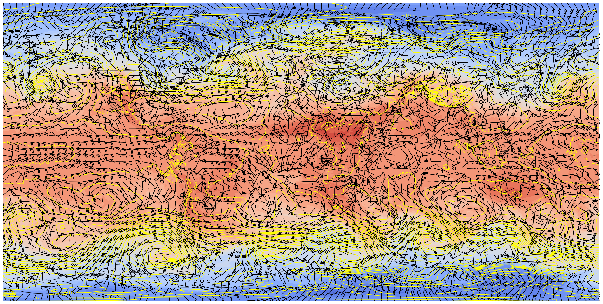
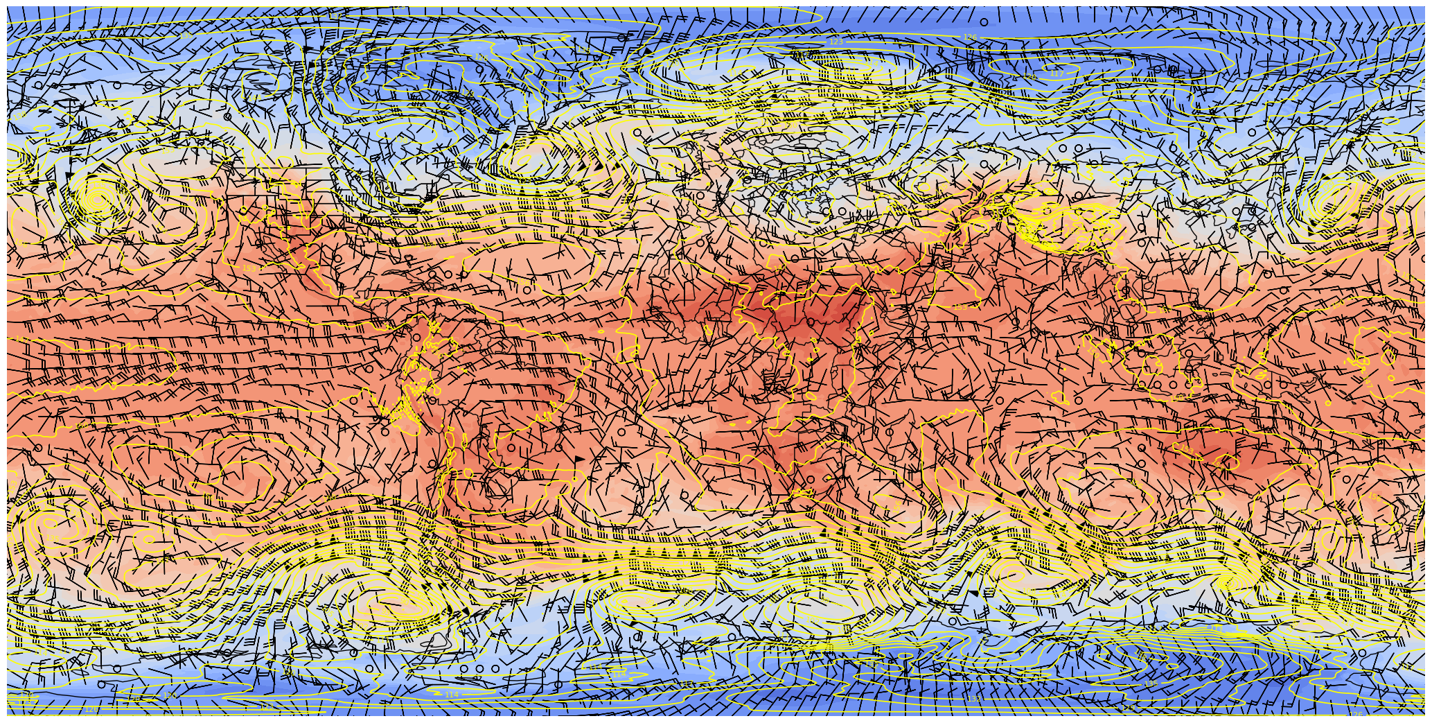
At first glance, this looks good. But let’s re-center the map at the international dateline instead of the Greenwich meridian.
res = '110m'
dpi = 100
fig = plt.figure(figsize=(2048/dpi, 1024/dpi))
ax = plt.subplot(1,1,1,projection=ccrs.PlateCarree(central_longitude=180), frameon=False)
ax.set_global()
ax.add_feature(cfeature.COASTLINE.with_scale(res))
ax.add_feature(cfeature.BORDERS.with_scale(res))
ax.add_feature(cfeature.STATES.with_scale(res))

# Temperature (T) contour fills

# Note we don't need the transform argument since the map/data projections are the same, but we'll leave it in
CF = ax.contourf(lons,lats,T0,levels=tLevels,cmap=plt.get_cmap('coolwarm'), extend='both', transform=proj_data)

# Height (Z) contour lines
CL = ax.contour(lons,lats,Z0,zLevels,linewidths=1.25,colors='yellow', transform=proj_data)
ax.clabel(CL, inline_spacing=0.2, fontsize=8, fmt='%.0f')
fig.tight_layout(pad=.01)

# Plotting wind barbs uses the ax.barbs method. Here, you can't pass in the DataArray directly; you can only pass in the array's values.
# Also need to sample (skip) a selected # of points to keep the plot readable.
skip = 8
ax.barbs(lons[::skip],lats[::skip],U0[::skip,::skip].values, V0[::skip,::skip].values, transform=proj_data);
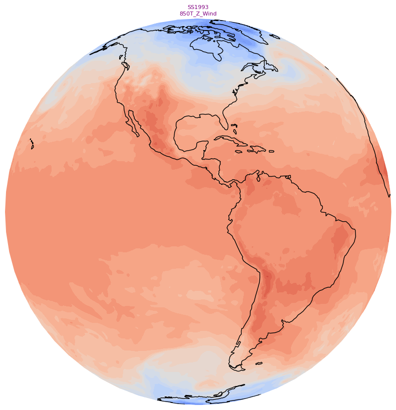
Hmmm, maybe not so good? Let’s now try plotting on an orthographic projection, somewhat akin to how it would look on the sphere.
res = '110m'
dpi = 100
fig = plt.figure(figsize=(2048/dpi, 1024/dpi))
ax = plt.subplot(1,1,1,projection=ccrs.Orthographic(central_longitude=180), frameon=False)
ax.set_global()
ax.add_feature(cfeature.COASTLINE.with_scale(res))
ax.add_feature(cfeature.BORDERS.with_scale(res))
ax.add_feature(cfeature.STATES.with_scale(res))

# Temperature (T) contour fills

# Note we don't need the transform argument since the map/data projections are the same, but we'll leave it in
CF = ax.contourf(lons,lats,T0,levels=tLevels,cmap=plt.get_cmap('coolwarm'), extend='both', transform=proj_data)

# Height (Z) contour lines
CL = ax.contour(lons,lats,Z0,zLevels,linewidths=1.25,colors='yellow', transform=proj_data)
ax.clabel(CL, inline_spacing=0.2, fontsize=8, fmt='%.0f')
fig.tight_layout(pad=.01)

# Plotting wind barbs uses the ax.barbs method. Here, you can't pass in the DataArray directly; you can only pass in the array's values.
# Also need to sample (skip) a selected # of points to keep the plot readable.
skip = 8
ax.barbs(lons[::skip],lats[::skip],U0[::skip,::skip].values, V0[::skip,::skip].values, transform=proj_data);
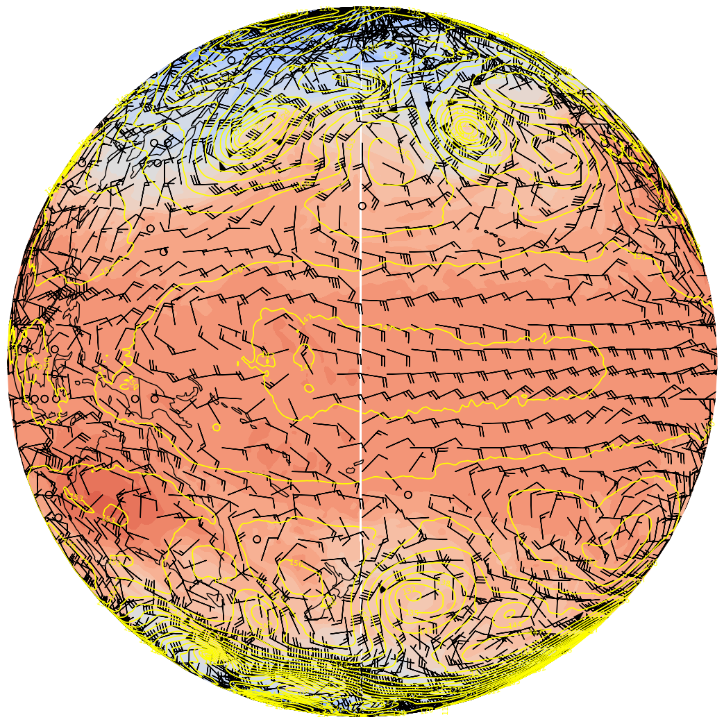
There “seams” to be a problem close to the dateline. This is because the longitude ends at 179.5 E … leaving a gap between 179.5 and 180 degrees. Fortunately, Cartopy includes the add_cyclic_point method in its utilities class to deal with this rather common phenomenon in global gridded datasets.
res = '110m'
dpi = 100
fig = plt.figure(figsize=(2048/dpi, 1024/dpi))
ax = plt.subplot(1,1,1,projection=ccrs.Orthographic(central_longitude=180), frameon=False)
ax.set_global()
ax.add_feature(cfeature.COASTLINE.with_scale(res))
ax.add_feature(cfeature.BORDERS.with_scale(res))
ax.add_feature(cfeature.STATES.with_scale(res))

# add cyclic points to data and longitudes
# latitudes are unchanged in 1-dimension
Zcyc, clons = cutil.add_cyclic_point(Z0, lons)
Tcyc, clons = cutil.add_cyclic_point(T0, lons)
Ucyc, clons = cutil.add_cyclic_point(U0, lons)
Vcyc, clons = cutil.add_cyclic_point(V0, lons)

# Temperature (T) contour fills

# Note we don't need the transform argument since the map/data projections are the same, but we'll leave it in
CF = ax.contourf(clons,lats,Tcyc,levels=tLevels,cmap=plt.get_cmap('coolwarm'), extend='both', transform=proj_data)

# Height (Z) contour lines
CL = ax.contour(clons,lats,Zcyc,zLevels,linewidths=1.25,colors='yellow', transform=proj_data)
ax.clabel(CL, inline_spacing=0.2, fontsize=8, fmt='%.0f')
fig.tight_layout(pad=.01)

# Plotting wind barbs uses the ax.barbs method. Here, you can't pass in the DataArray directly; you can only pass in the array's values.
# Also need to sample (skip) a selected # of points to keep the plot readable.
skip = 8

# The U and V arrays produced by add_cyclic_point do not have units attached, so we do not
# extract the values attribute as in the previous cells.

ax.barbs(clons[::skip],lats[::skip],Ucyc[::skip,::skip], Vcyc[::skip,::skip], transform=proj_data);

res = '110m'
dpi = 100
fig = plt.figure(figsize=(2048/dpi, 1024/dpi))
ax = plt.subplot(1,1,1,projection=ccrs.PlateCarree(), frameon=False)
ax.set_global()
ax.add_feature(cfeature.COASTLINE.with_scale(res))
ax.add_feature(cfeature.BORDERS.with_scale(res))
ax.add_feature(cfeature.STATES.with_scale(res))

# add cyclic points to data and longitudes
# latitudes are unchanged in 1-dimension
Zcyc, clons = cutil.add_cyclic_point(Z0, lons)
Tcyc, clons = cutil.add_cyclic_point(T0, lons)
Ucyc, clons = cutil.add_cyclic_point(U0, lons)
Vcyc, clons = cutil.add_cyclic_point(V0, lons)

# Temperature (T) contour fills

# Note we don't need the transform argument since the map/data projections are the same, but we'll leave it in
CF = ax.contourf(clons,lats,Tcyc,levels=tLevels,cmap=plt.get_cmap('coolwarm'), extend='both', transform=proj_data)

# Height (Z) contour lines
CL = ax.contour(clons,lats,Zcyc,zLevels,linewidths=1.25,colors='yellow', transform=proj_data)
ax.clabel(CL, inline_spacing=0.2, fontsize=8, fmt='%.0f')
fig.tight_layout(pad=.01)

# Plotting wind barbs uses the ax.barbs method. Here, you can't pass in the DataArray directly; you can only pass in the array's values.
# Also need to sample (skip) a selected # of points to keep the plot readable.
skip = 8

# The U and V arrays produced by add_cyclic_point do not have units attached, so we do not
# extract the values attribute as in the previous cells.

ax.barbs(clons[::skip],lats[::skip],Ucyc[::skip,::skip], Vcyc[::skip,::skip], transform=proj_data)
# Save this figure to your current directory
fig.savefig('test_CFSR_SOS.png')
If you’d like, go to https://maptoglobe.com and view how your graphic might look on the sphere.
If it still fails, try http://maptoglobe.com
Follow these steps:
Download the
test_CFSR_SOS.pngfile to your local computerClick on the Images tab on the maptoglobe site
Next to Surface, click on Choose a file
Navigate to the folder in which you downloaded the PNG, select the PNG, and click on OK
You should then see your map! Use your mouse to move the globe around; also use the mouse wheel to zoom in and out.
If the image looks good, you’re ready to move forward!
You should see the following after successfully connecting to the maptoglobe site:

Then, follow these steps:
Download the
test_CFSR_SOS.pngfile to your local computerClick on the Images tab on the maptoglobe site
Next to Surface, click on Choose a file


Create small (128x128) and large (800x800) thumbnails. These will serve as icons in the SoS iPad and computer apps that go along with your particular product.
We’ll use the orthographic projection and omit the contour lines and some of the cartographic features, and add a title string.
res = '110m'
dpi = 100
for size in (128, 800):
    if (size == 128):
        sizeStr = 'small'
    else:
        sizeStr ='big'

    fig = plt.figure(figsize=(size/dpi, size/dpi))
    ax = plt.subplot(1,1,1,projection=ccrs.Orthographic(central_longitude=-90), frameon=False)
    ax.set_global()
    ax.add_feature(cfeature.COASTLINE.with_scale(res))
    tl1 = caseDir
    tl2 = prodDir
    ax.set_title(tl1 + '\n' + tl2, color='purple', fontsize=8)

    # Contour fills

    CF = ax.contourf(clons,lats,Tcyc,levels=tLevels,cmap=plt.get_cmap('coolwarm'), extend='both', transform=proj_data)

    fig.tight_layout(pad=.01)
    fig.savefig(mediaDir + 'thumbnail_' + sizeStr + '.jpg')
Create a standalone colorbar
Visualizations on the Science-on-a-Sphere consist of a series of image files, layered on top of each other. In this example, instead of having the colorbar associated with 500 hPa heights adjacent to the map, let’s use a technique by which we remove the contour plot, leaving only the colorbar to be exported as an image. We change the colorbar’s orientation to horizontal, and also change its tick label colors so they will be more visible on the sphere’s display.
# draw a new figure and replot the colorbar there
fig,ax = plt.subplots(figsize=(14,2), dpi=125)
# set tick and ticklabel color
tick_color='black'
label_color='orange'
cbar = fig.colorbar(CF, ax=ax, orientation='horizontal')
cbar.ax.xaxis.set_tick_params(color=tick_color, labelcolor=label_color)
# Remove the Axes object ... essentially the contours and cartographic features ... from the figure.
ax.remove()
# All that remains is the colorbar ... save it to disk. Make the background transparent.
fig.savefig(labelsDir + 'colorbar.png',transparent=True)
Create a set of labels for each plot
labelFname = labelsDir + 'labels.txt'
Define a function to create the plot for each hour.
The function accepts a time array element as its argument.
def make_sos_map (timeIdx):

    res = '110m'
    dpi = 100
    fig = plt.figure(figsize=(2048/dpi, 1024/dpi))
    ax = plt.subplot(1,1,1,projection=ccrs.PlateCarree(), frameon=False)
    ax.set_global()
    ax.add_feature(cfeature.COASTLINE.with_scale(res))
    ax.add_feature(cfeature.BORDERS.with_scale(res))
    ax.add_feature(cfeature.STATES.with_scale(res))

#   add cyclic points to data and longitudes
#   latitudes are unchanged in 1-dimension
    Zcyc, clons= cutil.add_cyclic_point(Z.isel(time=timeIdx), lons)
    Tcyc, clons = cutil.add_cyclic_point(T.isel(time=timeIdx), lons)
    Ucyc, clons = cutil.add_cyclic_point(U.isel(time=timeIdx), lons)
    Vcyc, clons = cutil.add_cyclic_point(V.isel(time=timeIdx), lons)

#   Temperature (T) contour fills

#   Note we don't need the transform argument since the map/data projections are the same, but we'll leave it in
    CF = ax.contourf(clons,lats,Tcyc,levels=tLevels,cmap=plt.get_cmap('coolwarm'), extend='both', transform=proj_data)

#   Height (Z) contour lines
    CL = ax.contour(clons,lats,Zcyc,zLevels,linewidths=1.25,colors='yellow', transform=proj_data)
    ax.clabel(CL, inline_spacing=0.2, fontsize=8, fmt='%.0f')
    fig.tight_layout(pad=.01)

#   Plotting wind barbs uses the ax.barbs method. Here, you can't pass in the DataArray directly; you can only pass in the array's values.
#   Also need to sample (skip) a selected # of points to keep the plot readable.
    skip = 8
    ax.barbs(clons[::skip],lats[::skip],Ucyc[::skip,::skip], Vcyc[::skip,::skip], transform=proj_data)
    frameNum = f'{timeIdx}'.zfill(2)
    figName = f'{graphicsDir}CFSR_{startDateTimeStr}{frameNum}.png'
    fig.savefig(figName)

    # Reduce the size of the PNG image via the Linux pngquant utility. The -f option overwites the resulting file if it already exists.
    # The output file will end in "-fs8.png"
    ! pngquant -f {figName}

    # Remove the original PNG
    ! rm -f {figName}

    # Do not show the graphic in the notebook
    plt.close()
Create the graphics and titles
Open a handle to the labels file
Define the time dimension index’s start, end, and increment values
Loop over the period of interest
Perform any necessary unit conversions
Create each timestep’s graphic
Write the title line to the text file.
Close the handle to the labels file
nFrames to nTimes so all times are processed. labelFileObject = open(labelFname, 'w')
nFrames = 2
nFrames = nTimes
for timeIdx in range(0, nFrames, 1):
make_sos_map(timeIdx)
# Construct the title string and write it to the file
valTime = pd.to_datetime(times[timeIdx].values).strftime("%m/%d/%Y %H UTC")
tl1 = f'CFSR {pLevel} hPa Z/T/Wind {valTime} \n' # \n is the newline character
labelFileObject.write(tl1)
print(tl1)
# Close the text file
labelFileObject.close()
CFSR 850 hPa Z/T/Wind 03/09/1993 00 UTC
CFSR 850 hPa Z/T/Wind 03/09/1993 06 UTC
CFSR 850 hPa Z/T/Wind 03/09/1993 12 UTC
CFSR 850 hPa Z/T/Wind 03/09/1993 18 UTC
CFSR 850 hPa Z/T/Wind 03/10/1993 00 UTC
CFSR 850 hPa Z/T/Wind 03/10/1993 06 UTC
CFSR 850 hPa Z/T/Wind 03/10/1993 12 UTC
CFSR 850 hPa Z/T/Wind 03/10/1993 18 UTC
CFSR 850 hPa Z/T/Wind 03/11/1993 00 UTC
CFSR 850 hPa Z/T/Wind 03/11/1993 06 UTC
CFSR 850 hPa Z/T/Wind 03/11/1993 12 UTC
CFSR 850 hPa Z/T/Wind 03/11/1993 18 UTC
CFSR 850 hPa Z/T/Wind 03/12/1993 00 UTC
CFSR 850 hPa Z/T/Wind 03/12/1993 06 UTC
CFSR 850 hPa Z/T/Wind 03/12/1993 12 UTC
CFSR 850 hPa Z/T/Wind 03/12/1993 18 UTC
CFSR 850 hPa Z/T/Wind 03/13/1993 00 UTC
CFSR 850 hPa Z/T/Wind 03/13/1993 06 UTC
CFSR 850 hPa Z/T/Wind 03/13/1993 12 UTC
CFSR 850 hPa Z/T/Wind 03/13/1993 18 UTC
CFSR 850 hPa Z/T/Wind 03/14/1993 00 UTC
CFSR 850 hPa Z/T/Wind 03/14/1993 06 UTC
CFSR 850 hPa Z/T/Wind 03/14/1993 12 UTC
CFSR 850 hPa Z/T/Wind 03/14/1993 18 UTC
CFSR 850 hPa Z/T/Wind 03/15/1993 00 UTC
CFSR 850 hPa Z/T/Wind 03/15/1993 06 UTC
CFSR 850 hPa Z/T/Wind 03/15/1993 12 UTC
CFSR 850 hPa Z/T/Wind 03/15/1993 18 UTC
Create an SoS playlist file
We follow the guidelines in https://sos.noaa.gov/support/sos/manuals/datasets/playlists/#dataset-playlist.sos-files
playlistFname = playlistDir + 'playlist.sos'
Open a file handle to the playlist file
Add each line of the playlist. Modify as needed for your case and product; in general you will only need to modify the name and description values!
Close the file handle
plFileObject = open(playlistFname, 'w')
subCat = "CFSR"
cRet = "\n" # New line character code

##Modify these next three lines to fit your case
nameStr = "CFSR T/Z/Wind Superstorm 93"
descriptionStr = '{{CFSR T/Z/Wind Superstorm 93}}'
creaName = "Rovin Lazyle" # Put your name here!

plFileObject.write("name = " + nameStr + cRet )
plFileObject.write("description = " + descriptionStr + cRet)

plFileObject.write("pip = ../labels/colorbar.png" + cRet)
plFileObject.write("pipheight = 10" + cRet)
plFileObject.write("pipvertical = -35" + cRet)

plFileObject.write("label = ../labels/labels.txt" + cRet)
plFileObject.write("layer = Grids" + cRet)
plFileObject.write("layerdata = ../2048" + cRet)

plFileObject.write("firstdwell = 2000" + cRet)
plFileObject.write("lastdwell = 3000" + cRet)
plFileObject.write("fps = 8" + cRet)

plFileObject.write("zrotationenable = 1" + cRet)
plFileObject.write("zfps = 30" + cRet)

plFileObject.write("subcategory = " + subCat + cRet)
plFileObject.write("Creator = " + creaName + cRet)

plFileObject.close()
Display the contents of the playlist file
! cat {playlistFname}
name = CFSR T/Z/Wind Superstorm 93
description = {{CFSR T/Z/Wind Superstorm 93}}
pip = ../labels/colorbar.png
pipheight = 10
pipvertical = -35
label = ../labels/labels.txt
layer = Grids
layerdata = ../2048
firstdwell = 2000
lastdwell = 3000
fps = 8
zrotationenable = 1
zfps = 30
subcategory = CFSR
Creator = Rovin Lazyle
- The name and description of the product, which are used in the SoS iPad and computer apps
- The three components of what is displayed on the screen:
- The colorbar (a picture-in-picture, aka pip), with its height and vertical position
- The label, or title, which describes the graphic
- The graphic layer itself. Multiple graphic layers, each with its own layer name and directory path, could be included; in this case, there is just one.
- The dwell times, in ms, for the first frame, last frame, and all frames in-between.