Problem 2:
Contents
Problem 2:
ATM350 Homework 3, Spring 2023
Create a notebook, q2.ipynb that analyzes and visualizes Albany climate data from 2022, using the same file used in class during the Pandas lectures.
Imports
import pandas as pd
import numpy as np
import matplotlib.pyplot as plt
import seaborn as sns
file = '/spare11/atm350/common/data/climo_alb_2022.csv'
Read in the file. Specify that each column’s values should be read in as strings.
df = pd.read_csv(file, dtype='string')
Examine the Dataframe
df
| DATE | MAX | MIN | AVG | DEP | HDD | CDD | PCP | SNW | DPT | |
|---|---|---|---|---|---|---|---|---|---|---|
| 0 | 2022-01-01 | 51 | 41 | 46.0 | 19.7 | 19 | 0 | 0.12 | 0.0 | 0 |
| 1 | 2022-01-02 | 49 | 23 | 36.0 | 9.9 | 29 | 0 | 0.07 | 0.2 | 0 |
| 2 | 2022-01-03 | 23 | 13 | 18.0 | -7.9 | 47 | 0 | T | T | T |
| 3 | 2022-01-04 | 29 | 10 | 19.5 | -6.2 | 45 | 0 | T | 0.1 | T |
| 4 | 2022-01-05 | 38 | 28 | 33.0 | 7.5 | 32 | 0 | 0.00 | 0.0 | T |
| ... | ... | ... | ... | ... | ... | ... | ... | ... | ... | ... |
| 360 | 2022-12-27 | 34 | 22 | 28.0 | 0.6 | 37 | 0 | 0.00 | 0.0 | T |
| 361 | 2022-12-28 | 41 | 22 | 31.5 | 4.3 | 33 | 0 | 0.00 | 0.0 | T |
| 362 | 2022-12-29 | 48 | 22 | 35.0 | 8.1 | 30 | 0 | 0.00 | 0.0 | T |
| 363 | 2022-12-30 | 57 | 43 | 50.0 | 23.3 | 15 | 0 | 0.00 | 0.0 | 0 |
| 364 | 2022-12-31 | 53 | 44 | 48.5 | 22.0 | 16 | 0 | 0.08 | 0.0 | 0 |
365 rows × 10 columns
Part a:
After reading in minimum and maximum daily temperature, create a new object defined as the daily temperature difference, or diurnal range. Include a cell that prints out the maximum diurnal range, minimum diurnal range, and mean diurnal range for the year 2022.
maxT = df['MAX'].astype("float32")
minT = df['MIN'].astype("float32")
diRange = maxT - minT
Examine the diurnal range series
diRange
0      10.0
1      26.0
2      10.0
3      19.0
4      10.0
       ...
360    12.0
361    19.0
362    26.0
363    14.0
364     9.0
Length: 365, dtype: float32
Compute and output the maximum/minimum single daily values of diurnal temperature range, and also the mean over the year.
diMax = diRange.max()
diMin = diRange.min()
diMean = diRange.mean()
diMax, diMin, diMean
(44.0, 2.0, 20.424657821655273)
print(f'ALB 2022: Greatest, least, and average diurnal temperature range: {diMax}, {diMin}, {diMean:.1f} °F' )
ALB 2022: Greatest, least, and average diurnal temperature range: 44.0, 2.0, 20.4 °F
Part b:
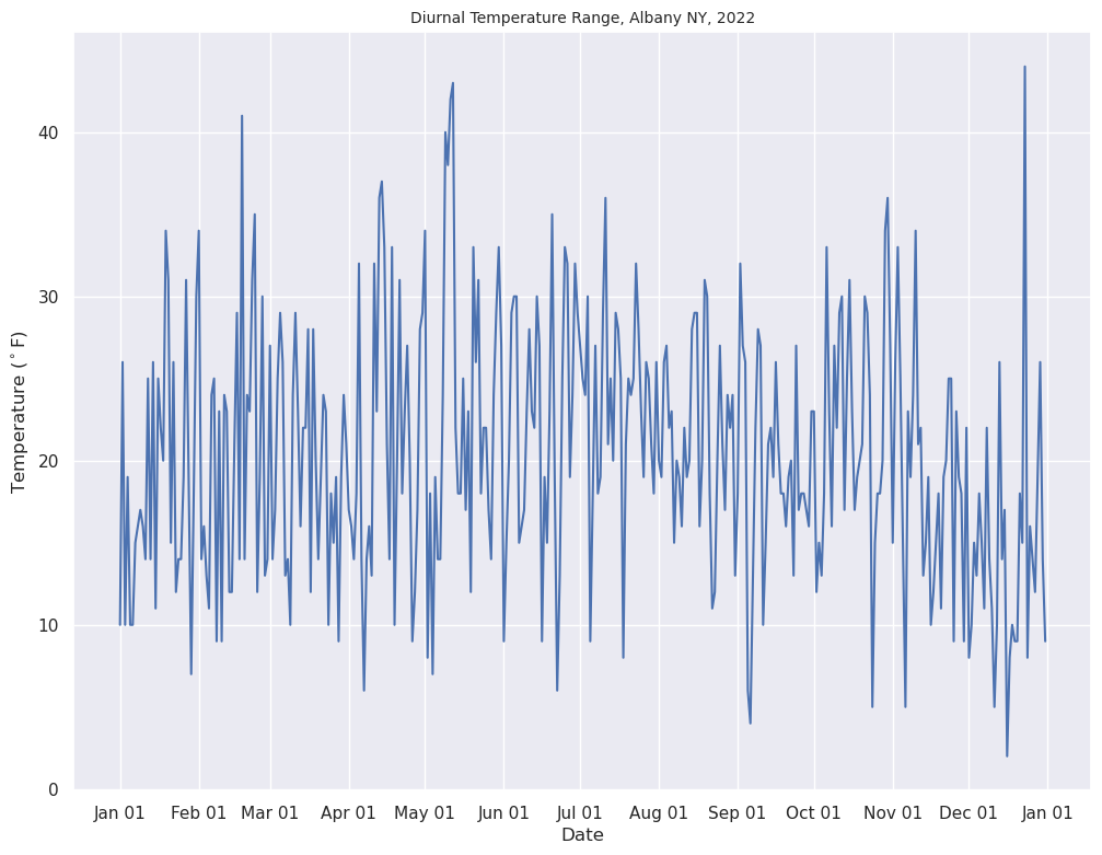
On one figure, plot the daily diurnal range over the entire year. Save this figure to your hw3 directory as albDiurnalRange2022.png.
Import Matplotlib functions designed for time-series plots
from matplotlib.dates import DateFormatter, AutoDateLocator,HourLocator,DayLocator,MonthLocator
Create an object for the DATE column, and then express it as type Datetime.
date = df['DATE']
date = pd.to_datetime(date, format="%Y-%m-%d")
Create the figure
sns.set()
fig = plt.figure(figsize=(12, 9))
ax = fig.add_subplot() # Default is one axes per figure

ax.plot(date, diRange)

ax.xaxis.set_major_locator(MonthLocator(interval=1))
dateFmt = DateFormatter('%b %d')
ax.xaxis.set_major_formatter(dateFmt)
ax.set_xlabel('Date')
ax.set_ylabel('Temperature ($^\circ$F)')
ax.set_title('Diurnal Temperature Range, Albany NY, 2022',fontsize=10);
Save the figure to your current directory.
fig.savefig('albDiurnalRange2022.png')
Part c:
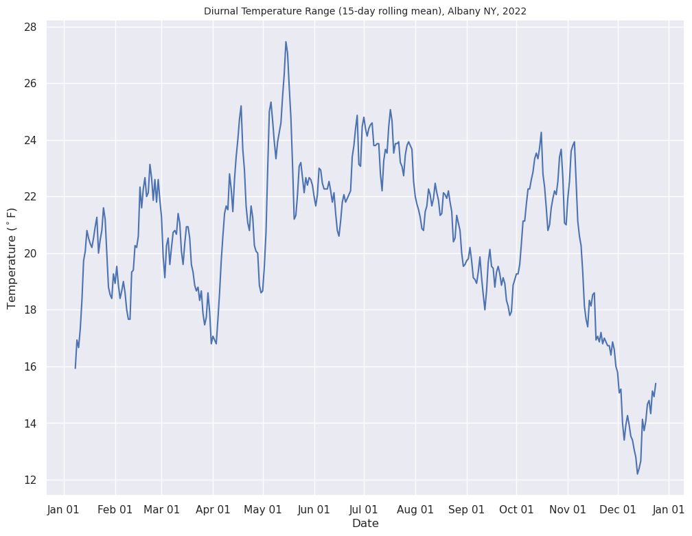
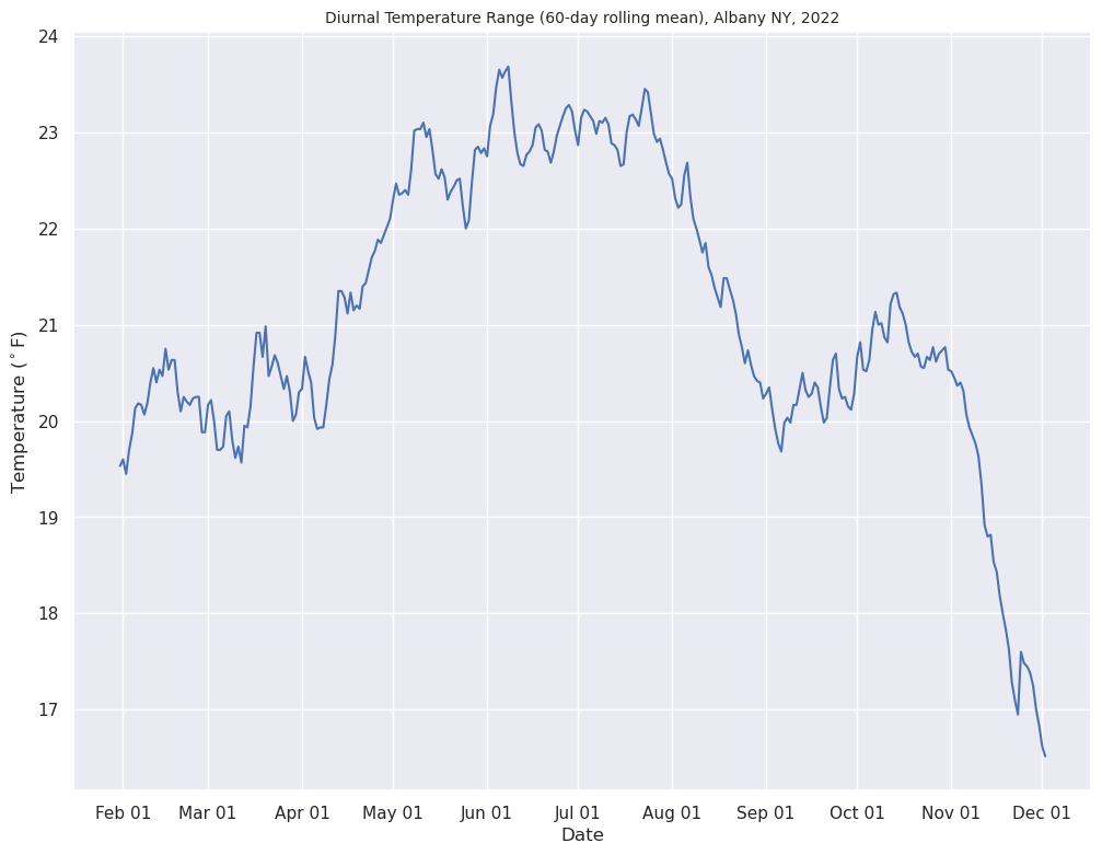
On a separate figure, plot the 15-day and 60-day rolling means of diurnal range, named albDiurnalRange2022_15d.png and albDiurnalRange2022_60d.png, respectively.
Compute the 15- and 60-day rolling means
diRange15 = diRange.rolling(window=15, center=True)
diRange60 = diRange.rolling(window=60, center=True)
diRange15Mean = diRange15.mean()
diRange60Mean = diRange60.mean()
Plot the 15-day rolling mean
fig = plt.figure(figsize=(12, 9))
ax = fig.add_subplot()

ax.plot(date, diRange15Mean)

ax.xaxis.set_major_locator(MonthLocator(interval=1))
dateFmt = DateFormatter('%b %d')
ax.xaxis.set_major_formatter(dateFmt)
ax.set_xlabel('Date')
ax.set_ylabel('Temperature ($^\circ$F)')
ax.set_title('Diurnal Temperature Range (15-day rolling mean), Albany NY, 2022',fontsize=10);
Save the figure to your current directory.
fig.savefig('albDiurnalRange2022_15d.png')
Plot the 60-day rolling mean
fig = plt.figure(figsize=(12, 9))
ax = fig.add_subplot()

ax.plot(date, diRange60Mean)

ax.xaxis.set_major_locator(MonthLocator(interval=1))
dateFmt = DateFormatter('%b %d')
ax.xaxis.set_major_formatter(dateFmt)
ax.set_xlabel('Date')
ax.set_ylabel('Temperature ($^\circ$F)')
ax.set_title('Diurnal Temperature Range (60-day rolling mean), Albany NY, 2022',fontsize=10);
Save the figure to your current directory.
fig.savefig('albDiurnalRange2022_60d.png')
Part d:
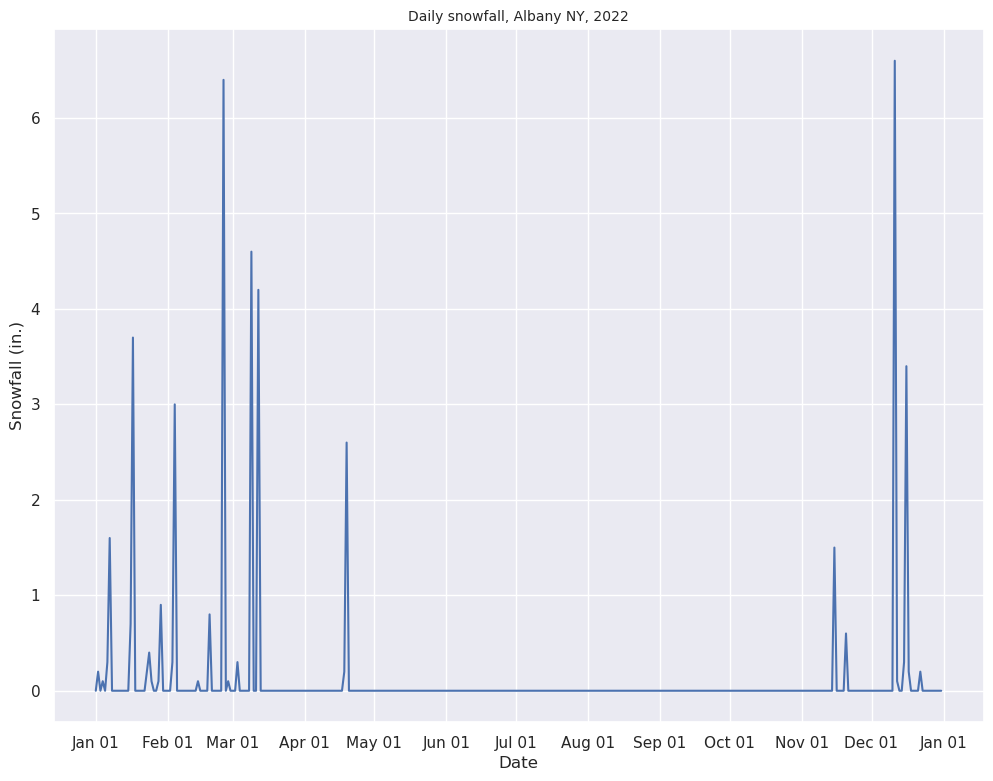
Read in the daily snowfall. Then, plot the daily total of snowfall (not the cumulative sum) over the year on a final figure. Save this figure to your hw3 directory as albDailySnow2022.png.
Read in the daily snowfall total
snow = df['SNW']
Find those days where a trace of snow fell
Set all values of ‘T’ to ‘0.00’, and recast the series as floating point values.
df.loc[df['SNW'] =='T', ['SNW']] = '0.0'
df['SNW'] = df['SNW'].astype("float32")
Redefine the snow object, now that its values are floating points, with T set to 0.0
snow = df['SNW']
Create the figure
fig = plt.figure(figsize=(12, 9))
ax = fig.add_subplot()

ax.plot(date, snow)

ax.xaxis.set_major_locator(MonthLocator(interval=1))
dateFmt = DateFormatter('%b %d')
ax.xaxis.set_major_formatter(dateFmt)
ax.set_xlabel('Date')
ax.set_ylabel('Snowfall (in.)')
ax.set_title('Daily snowfall, Albany NY, 2022',fontsize=10);
Save the figure to your current directory.
fig.savefig('albDailySnow2022.png')